![]()
12K’s of Christmas RUN is coming to Coeur d’Alene this winter. Announcement will be made soon… Who’s excited to RUN with Santa, his elves and reindeer?

![]()
12K’s of Christmas RUN is coming to Coeur d’Alene this winter. Announcement will be made soon… Who’s excited to RUN with Santa, his elves and reindeer?

![]()
TUNSTALL Healthcare America ( www.tunstall.com ) has recently acquired KUPUNA Monitoring Systems in Hawaii, a company specialized in medical alarm and medical management tools. TUNSTALL hired Tran Creative to provide a brand refresh: logo, corporate print collateral and a new & responsive web site.
After extensive research and many logo variations, the final chosen logo captures the K, alert signal, and an abstract floral element to honor the company’s Hawaii root. Colors Blue & Red communicate experience in healthcare, alert, alarm and derive from Tunstall corporate logo colors.
SEE the new site: http://www.kupunamonitoring.com/

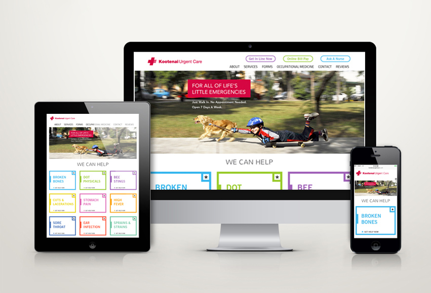

Kootenai Urgent Care has 3 clinics in CDA, Hayden and Post Falls. KUC has hired Tran Creative to create a fresh new site. We want to focus more on lifestyle rather than the clinical side of urgent care. People can live life, do what they love. When they get hurt with minor injuries, come see KUC. The new site is responsive to mobile devices. www.kootenaiurgentcare.com


Founded in 1979, Welch Comer Engineers has grown from a 2-person office to nearly 30 employees. WC has hired Tran Creative to create a fresh new web site for their firm. The new site is responsive to mobile devices. Thank you for checking it out: www.WelchComer.com

![]()
LaunchPad Trampoline Park is a series of indoor Trampoline Parks being built throughout CANADA. Trampoline Parks are relatively newer concepts to the area. The partners at LaunchPad Trampoline Park hired our firm to provide full branding services.
After much exploration, including abstract and conceptual logo variations, the chosen solution is straightforward, fun, and full of energy. The chosen logo does not need much of an explanation, which is fitting for the newer market. The mark portrays a flying rocket-man with upward movement. We chose a fun color scheme for the entire family. Orange is for energy and excitement. Blue is for bouncing to the sky. The new logo is applied on all marketing & promotional pieces and the new web site.
LaunchPad Trampoline Park’s brand new 24,000 square feet facility is NOW OPEN in Edmonton, Canada. They hired Tran Creative to revamp their site. INTRODUCING the fresh, new and mobile responsive web site for one of Canada’s premiere trampoline parks. It’s party time!
Check it out: www.launchpadtrampoline.co


Established in 2007, Alternative Molding Concepts (AMC) is the leading injection molder in the Northwest. AMC has hired Tran Creative to create a new web site to help tell their story. The new site is responsive to mobile devices and gives AMC staff the ability to make updates easily.
SEE the NEW SITE: www.amconcepts-inc.com
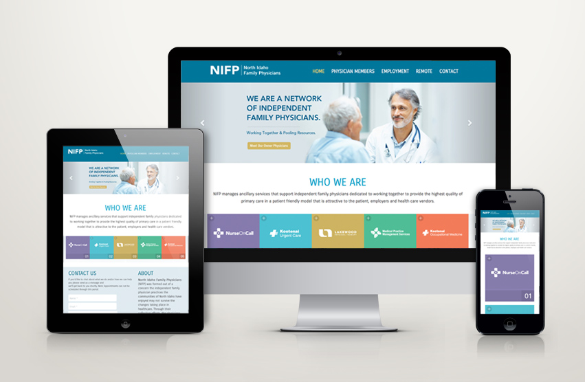

We just launched a new and responsive web site for NIFP (North Idaho Family Physicians), a network of physicians and clinics. NIFP is also HIRING, especially in medical billing/coding. Pass it on if you know of someone looking for work: www.nifp.com


![]()
Enliven is a healing center: holistic life coaching, nutrition counseling, meditation, yoga,… Tran Creative has been hired to create a new logo and tell the story. The new logo consists of 3 letters “e”. Weaving and working together, they convey: balance, flexibility, movement, nature, and flow of life. Sea foam Green provides healing, freshness and hope. Gray portrays stability and experience. The new logo will be applied on all printed materials and a new & responsive web site launching soon…

Our friends at INFA hired Tran Creative to provide branding services including the the new & responsive web site. Dr. Bryan Thompson, Foot & Ankle Surgeon has established a well-known clinic in the region for the past decade. Visit the new website: inlandfoot.com.


