Hayden Triathlon

Hayden_Triathlon

Hayden View Triathlon started in the summer of 2008. After 3 years of establishment, its brand has taken a toll. Series of events in 2010 have led to a substantial drop in brand equity. Many people enjoyed the beautiful race venue, but wondered about the uncertainty of the brand. Will it still go on…?

Tran Creative has revitalized the brand.

The Strategy:

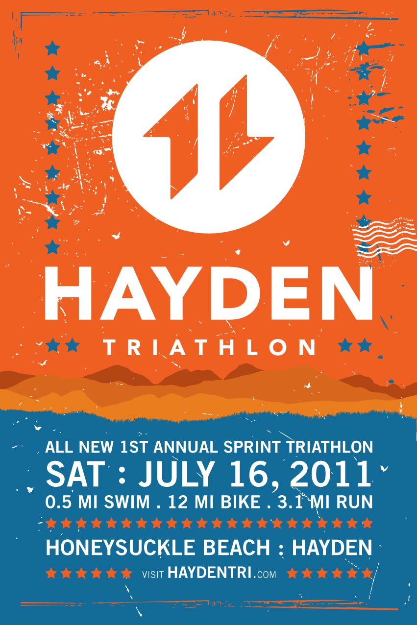
A new group of motivated & community minded individuals have joined together to reorganize the event. We decided to give the event a new name, a shorter but more direct version from the original name. Since race organizers will be working closely with the City of Hayden, we view it best to call it the All-New Hayden Triathlon.

We wanted to start building brand equity for Hayden. Therefore, the word “View” was dropped because it now signifies a whole new beginning. Obviously, the venue is known for its majestic lake and scenic backdrop of Hayden Lake. “View” is no longer necessary.

The Ideas + Execution:

Research shows that most triathlon logos often have the 3 swim/bike/run figures. We wanted to be professional but unique and different than the rest.

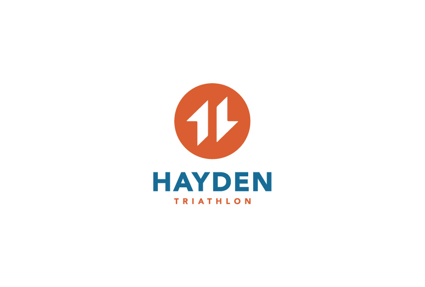
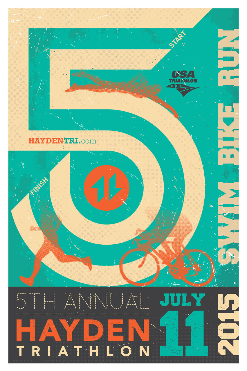
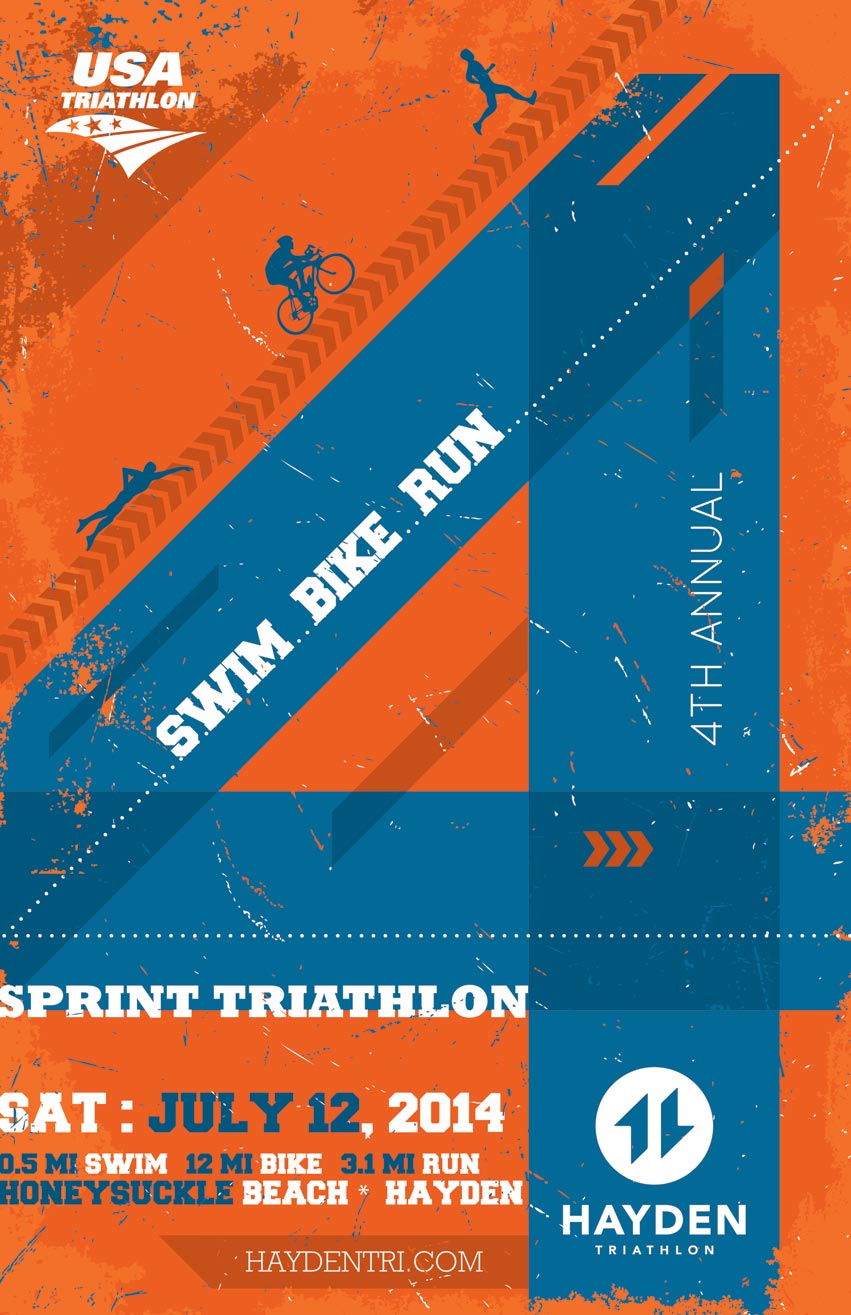
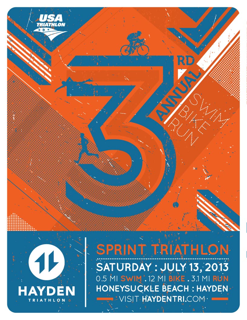
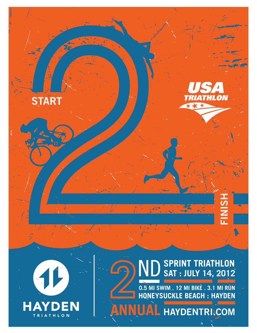
2 active shapes form letter “H” for Hayden. The 2 shapes also read “11”. It signifies the year the event entering into a new era. Orange = Sun + Energy + Passion. Blue = Water + Lake. The typography is clean and timeless so it could exist another 10-20 years.

Many of the local logos often feature pine trees, mountains, and elements that people are expected to see with first thoughts. In this design, we pushed the concept much further and took parts of these elements and applied them in a subtle style. Ex.: the left shape has character of the peak of a mountain. We added the diagonal lines to also communicate the mountain range that we have here in the area. The right shape is part of a person’s leg striking in running form.

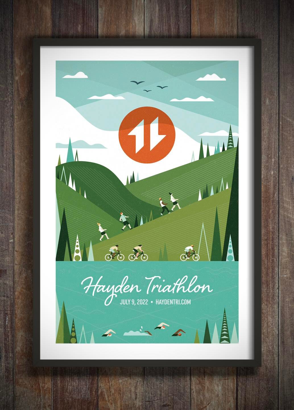
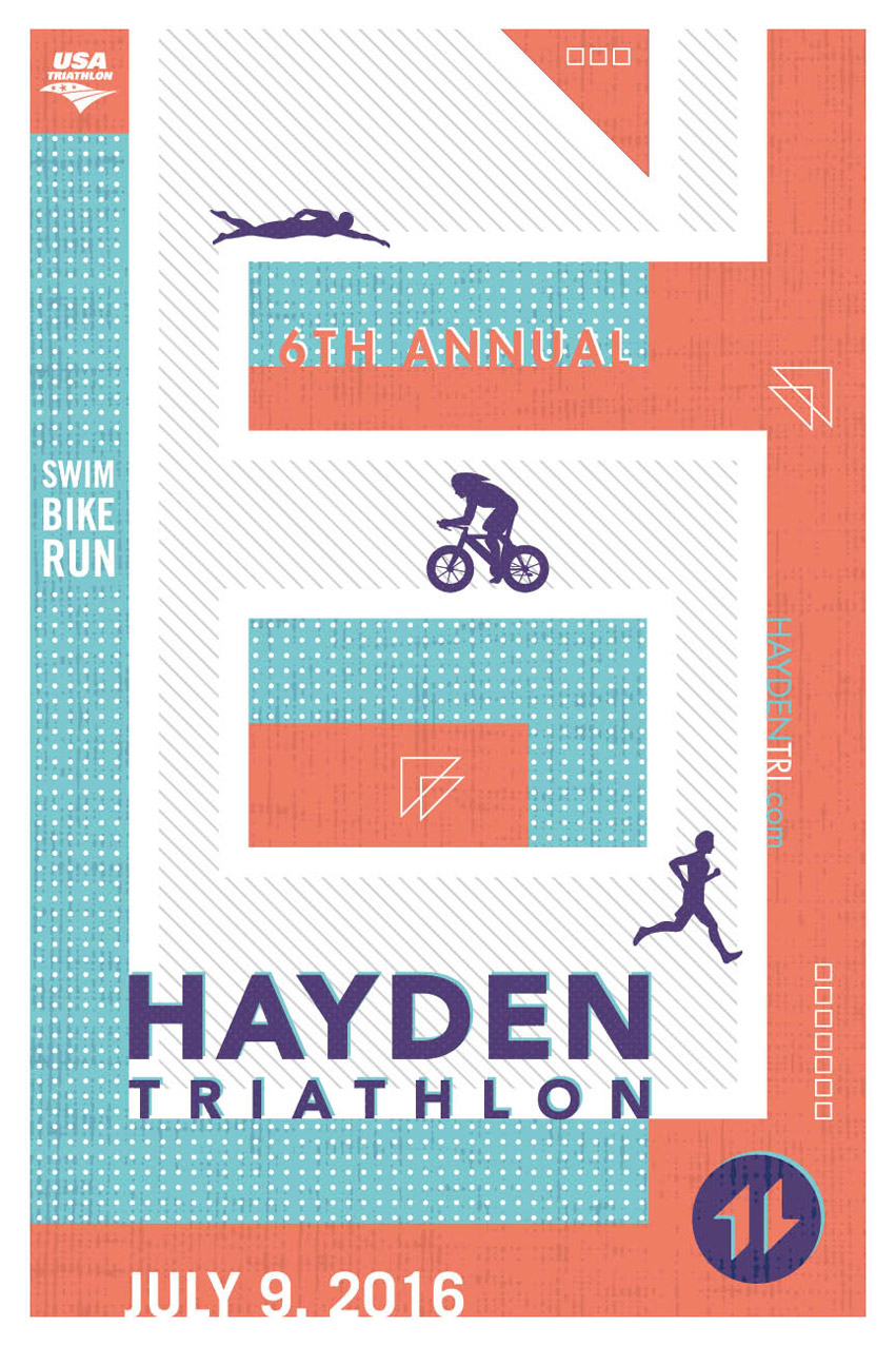
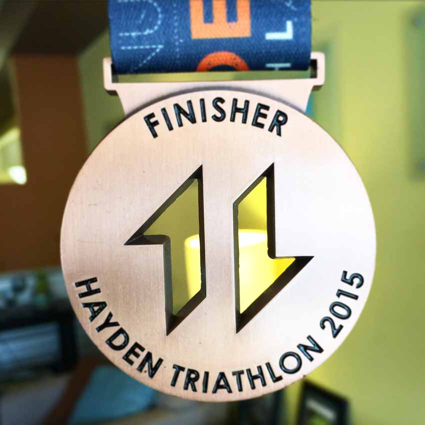
Overall, Tran Creative made the logo easy to apply onto different applications + promotional items.

Visit the web site to learn more: www.HaydenTri.com

Hayden_Tri_Poster_design_2016_tran_creativeHayden_Tri_Medal_2015Hayden_Tri_Poster_5th_Annual_Tran_CreativeHayden_Tri_Poster_4rd_Annual_Tran_CreativeHayden_Tri_flyer_2013Hayden_Tri_flyer_2012hayden_triathlon_2011_poster_tran_creativeHayden_Triathlon_Identity_tran_creativetran_creative_website_design_hayden_Triathlon

Stauffer & Associates

Stauffer & Associates brochure design by tran creative

Tran Creative provides Branding services for Stauffer & Associates, a steadfast growing team of CPAs with offices in Liberty Lake, WA and Lewiston, ID serving clients nationwide. The logo features letters S & A working together to form a shield shape which represents safety, protection in taxes and financial. Stauffer has the most equity in the name so we put more emphasis on Letter S with the A being smaller. Blue is for trust, experience and stability. Gold is for excellence and quality. We also created stationery set, brochures, proposals, tax packets, and a new website: Stauffer-CPA.com

Fluid Roofing

Fluid Roofing Logo Design on a T-shirt

Tran Creative creates the new identity for Fluid Roofing (formerly Fluid Applied Roofing). Fluid has grown into a full service commercial roofing shop in the Pacific Northwest. The logo captures: letter F for Fluid, 3D roof lines in the shape of a shield for protection from weather. New website: https://fluidroofing.net

Fluid Applied Roofing, LLC in Airway Heights, WA specializes in industrial & commercial roofing using silicone and elastomeric systems on old roofs and renew into seamless, low maintenance monolithic system with long lasting performance. Found in 1990, Fluid, a division of Paintcrafters Plus, hired Tran Creative to rebrand the company as they are growing and expanding to serve the Northwest. See the new website at: fluidappliedroofing.net

Research shows that most “FLUID” logo have the splash or liquid drop. After over 100 logo concepts, the new & chosen logo captures 3D perspective spray lines, with exactness, precision to form a letter F.

Candela Construction

Candela Construction specializes in Healthcare interior construction and maintenance. The company has been growing steadily since 1997. Candela Construction hired Tran Creative to provide branding services as they’re planning on expanding the company.

After much research and over 100 logo variations, the chosen new logo consists of 4 shapes aligning together to form shape of a “C”. The new mark resembles equipments and materials needed to swiftly complete quality projects, whether it be tools, panels, rails or accessories.

The chosen colors capture the spirit of quality construction. Blue represents stability, experience and hard working culture. Orange is for innovation and passion for new ideas.

The design execution is to be easily identifiable and produced on all corporate collateral, web site, and other promotional products.

See the new site: www.candela-construction.com

Del Rio Academy

Del Rio Academy, a child development campus in New Mexico has hired Tran Creative to rebrand the organization. The new logo is constructed of letters D, R and River (Rio). The flavorful, earthy color palette communicates that the road to learning and education can be fun, enjoyable and is inspired by New Mexico colors with the river in fresh turquoise.

Coeur d’Fondo

Coeur_d_Fondo

Tran Creative is excited to team up with Coeur d’Fondo for the 6th consecutive year since its inception for one of the most scenic bike rides in the country around Lake CDA with over 1,000 cyclists lining up on Sherman Ave.

Coeur d’Fondo is a Bike Ride Around Lake Coeur d’Alene that features 4 Options: Gran (108 Miles), Medio (84 Miles), Piccolo (35 Miles), and Family (15 Miles). Piccolo participants will finish in Harrison and enjoy a cruise aboard the Mish-an-Nock back to the Oktoberfest celebration in downtown Coeur d’Alene.

After many logo variations, the final logo carries initials CDF. Fondo has the most name equity so we emphasize it most. Letters C & D help form an oval around the F. This suggests the Ride Around the Lake concept. And thus, Coeur d’Fondo Brand Identity is introduced.

To learn more about the race, visit: CDAgranfondo.com

CDF_Coeur_d_Fondo_start_image_graphic_design_tran_creative1


CDF_Poster_2016CDF_Coeur_d_Fondo_Poster_design_tran_creativeCDF_Coeur_d_Fondo_jersey_design_tran_creative
CDF_Medal_2015
CDF_Tee_2015CDF_Coeur_d_Fondo_banner5_design_tran_creativeCDF_Coeur_d_Fondo_banner4_design_tran_creativeCDF_Coeur_d_Fondo_banner3_design_tran_creativeCDF_Coeur_d_Fondo_banner2_design_tran_creativeCDF_Coeur_d_Fondo_banner1_design_tran_creativeCDF_Coeur_d_Fondo_Poster_2014_design_tran_creativeCDF_Coeur_d_Fondo_jersey_2014_design_tran_creativeCDF_Coeur_d_Fondo_Poster_2013_design_tran_creativeCDF_Coeur_d_Fondo_Poster_2012_design_tran_creativeCDF_Coeur_d_Fondo_website_design_tran_creative_idaho_spokane

Tessendorf Family Chiropractic

Tessendorf_Family_Chiropractic_logo_design_tran_creative

Tessendorf Family Chiropractic has over 30 years of combined experience between Dr. Joe and Dr. Tom Tessendorf. In a short time since opening up their practice in Hayden, Idaho, Tessendorf has made a positive impact in our local community through patient satisfaction, fundraising efforts and service to local nonprofits.

Tessendorf hired Tran Creative to provide branding services: Logo, Print Collateral, Web Site. After much research and over 100 logo variations, the final chosen logo features 2 “t” side by side. Working together, they form a united “t” with movement, flexibility, working one-on-one, spine, nerves.

We chose a multi earthy color palette to capture feelings of community, comfort, caring, passion for excellence and natural colors of the Pacific Northwest.

See new site: www.TessendorfFamilyChiro.com

Madison Home

Madison Home is an upscale furniture store in Spokane, WA. It has been around for over 10 years. Madison asked Tran Creative to help create a new visual identity that is elegant, modern, and classy. The result is a stylized signature “M” for Madison positioned inside a square shape.

The idea: Square shape = Exactness, Precision. At Madison Home, we are committed to take great care of our customers by providing exceptional services + quality products. We put our signature mark on each home we design & each item we sell.

Thank you for checking out the new site: www.MadisonHomenw.com


Madison_Home_stationery_design_tran_creativeMadison_Home_graphic_design_tran_creative

Marketing Series

Princess Pedalfest

Tran Creative is excited to team up with Princess Pedalfest for the 4th consecutive year to bring this fabulous Women’s Bike Ride to the Inland NW. This event gives back to our community: Union Gospel Mission, Josie’s Warriors (Cystic Fibrosis) and more.

Tran Creative is teaming up with Princess Pedalfest for the 3rd year for an epic women’s bike ride, with 4 distances to choose from. Join over 500 cyclists to fundraise and give back to our local community. We are happy to support this great cause.

Princess_Pedalfest_Logo_Design_Tran_Creative_Coeur_d_Alene_Idaho

Tran Creative is excited to team up with Princess Pedalfest to bring you an epic and scenic bike ride on August 6, 2016. Proceeds to support Josie’s Warriors and help raise awareness about Cystic Fibrosis.

WHO’S IN? www.princesspedalfest.com

Princess_Pedalfest_BIKE_EVENT_Poster_2016_Tran_Creative_Graphic_Design_Hayden_Idaho

Inland Botanicals

Congrats to Inland Botanicals on your fresh new look. Tran Creative has developed the new logo and packaging system. Inland Botanicals is an all natural health solutions company. After an extensive process, the newly chosen logo is constructed of letters I, B, fresh, natural, botanical. The clean yet meaningful logo accommodates IB to expand onto product packaging design for many new products as the company is experiencing rapid growth.

CONGRATULATIONS to Inland Botanicals on your new logo designed by Tran Creative. Inland Botanicals provides customers with the highest quality of all natural health solutions. After an extensive process, the newly chosen logo is constructed of letters I, B, fresh, natural, botanical. The clean yet conceptual look accommodates IB to expand onto product packaging design for many new products as the company is experiencing rapid growth.

Get In Touch

Interested in working with us?
We would love to help TELL YOUR STORY.

Logo

Create an identity to break the generic mold.

Web

Provide sleek and modern resources for your clients.

Marketing

Tell your story and increase your revenue.