Northwest Hospital Alliance is a group of hospitals united to network, share resources, and provide better care for patients. Currently, the alliance includes 5 hospitals: Kootenai Health, Benewah Community Hospital, Bonner General Health, Boundary Community Hospital and Shoshone Medical Center, with room to add more hospitals in the future.
Tran Creative was hired to develop a branding system including: naming, logo, print collateral and logo standard guide.
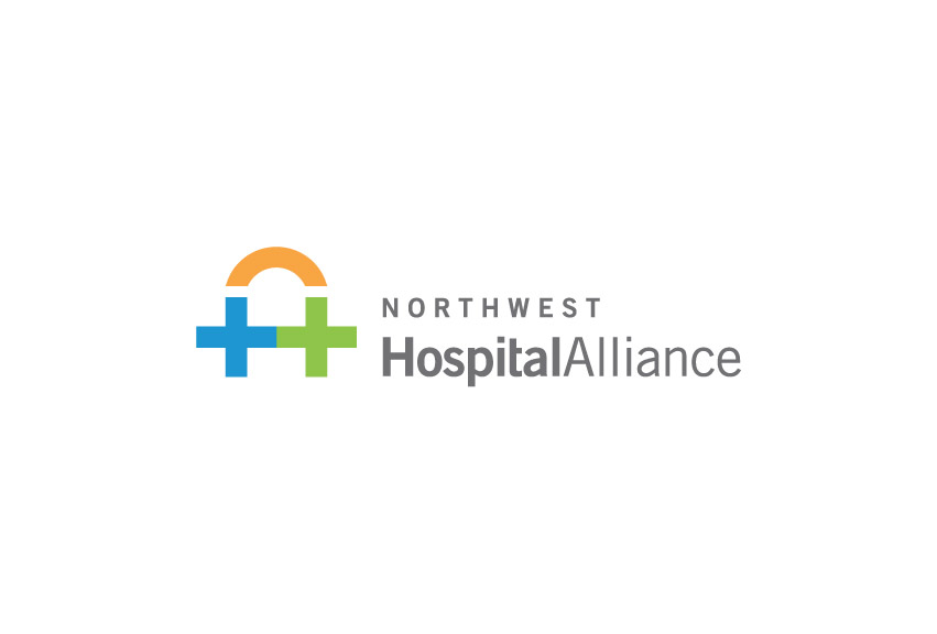
After several months of extensive research and hundreds of logo concepts, the final logo was voted and chosen by the 5 CEOs of 5 hospitals. The new Northwest Hospital Alliance logo captures letters “H” and “A” (the short name will be referred to as the Hospital Alliance). The 2 linking hospital crosses convey working together, the bridge and connection between hospitals.
Blue and green capture the Northwest colors. Blue is for healthcare, experience and stability. Green is for healing and recovery. Orange radiates hope, energy, passion and innovation.
The logo was given an ADDY award at 2015 American Ad Fed.