A FRESH NEW LOOK
With over 60 years devoted to the vision and eye health of patients throughout the Inland Northwest, Empire Eye Physicians is continuing to grow, evolve, and moving forward. They felt that their old visual identity system no longer fully represented their clinic. They have asked Tran Creative to freshen up their visual identity system.
Tran Creative and the team at Empire Eye Physicians would like to introduce to you the fresh new look – a timeless representation of growth and dedication to excellence in providing exceptional care to patients.
THE STORY BEHIND THE NEW LOOK
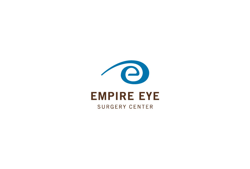
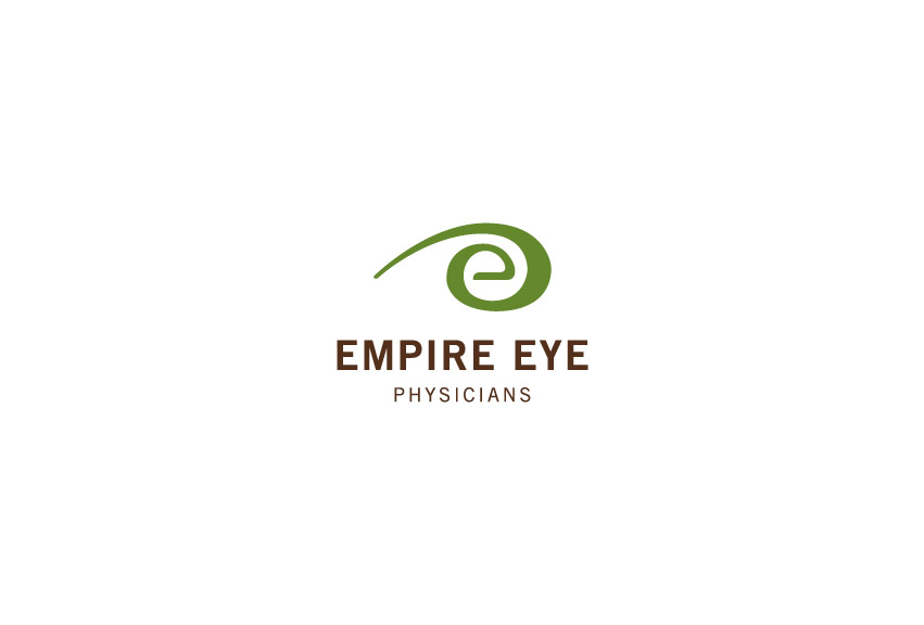
Research showed that there were thousands of eye-illustrated logos in the field of eye clinics. We wanted an identity that is fresh, friendly, approachable, memorable, and capture Empire Eye’s unique characteristics.
After hundreds of logo variations, the final result is a stylization of “the eye” without showing the actual eye. Letter “e” is for “Empire”. The mark has movement which conveys the idea that Empire Eye Physicians is moving ahead toward the future with forward thinking and commitment to ALWAYS strive to provide the best possible care for patients.
The sans serif typography is clean, friendly, and timeless.
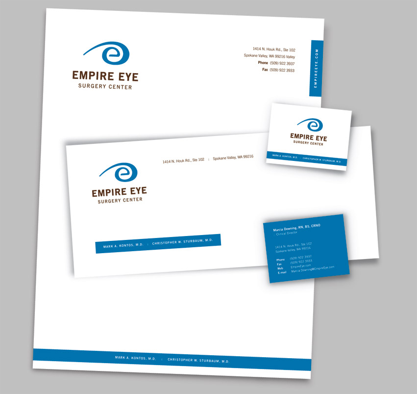
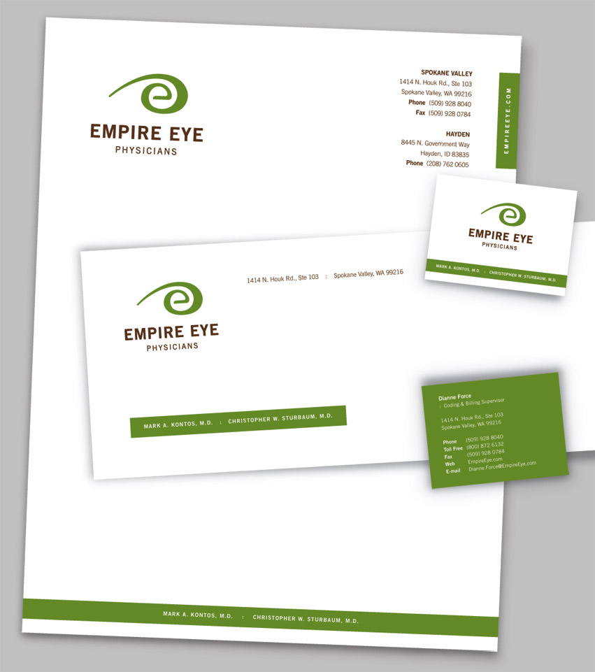
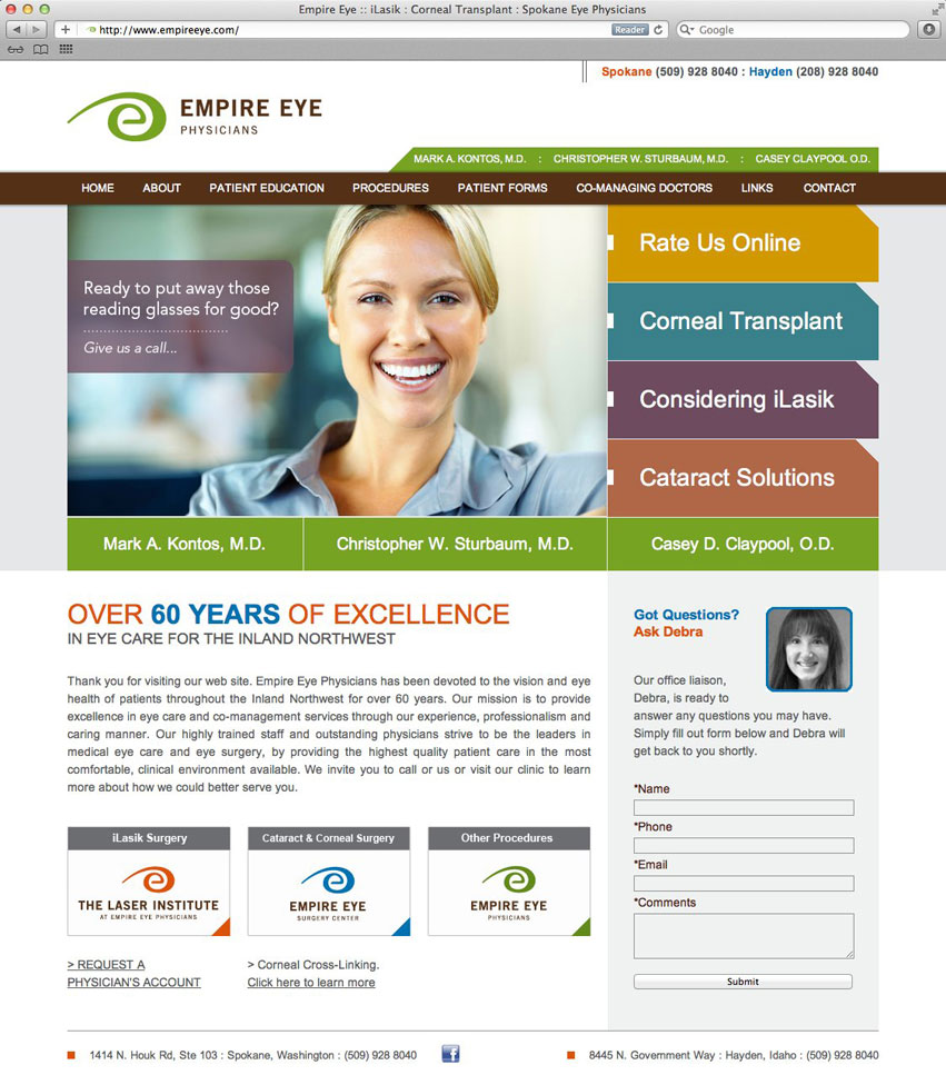
The design execution is easily identifiable and produced on corporate collateral, web site and other promotional products.
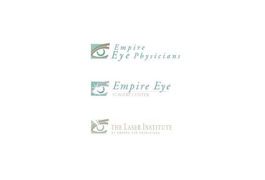
We created a color code system for the brand since the group currently has 3 entities. Green for Empire Eye Physicians; Blue for Surgery Center; Orange for Laser Institute. This way, if/when they decide to add more entities, they would still have the flexibility to simply add more colors to the color system.