![]()
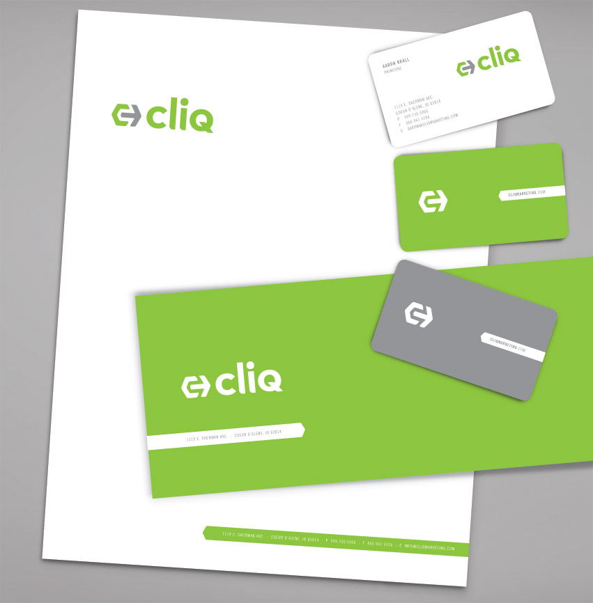
What is Cliq? Cliq is the action that makes an impact, the sound of perfect fit. Cliq is a company focusing on marketing solutions in SEO, Social Media, Video, and Apps.
The logo consists of letter C and an arrow. The arrow represents clicking: the click of the mouse or the click of a perfect fit. The arrow fits in perfectly with the C. This represents fitting well with the client while providing effective marketing solutions. Green is for progressiveness, innovation & fresh ideas. Gray symbolizes dependability and experience.
Visit the website to learn more: www.cliqmarketing.com