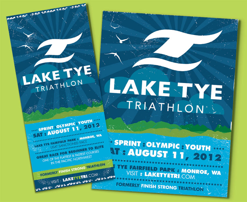
The race takes place at Lake Tye Park in Monroe, Washington. Some say it is the flattest and fastest course in the Pacific Northwest. It will be the same great race, with a new and exciting look. Research showed that most triathlons often displayed the “swim bike run” symbol. Tran Creative was hired to providing branding services for the race. We wanted to create a unique mark without being too apparent.
The final chosen logo portrays an active and aggressive mark. It forms a “T” for Tye, with a wave underneath. The blue wave also helps complete letter “L” for Lake. It also can be described as a body of an athlete in the race. Blue represent the beautiful waters of Lake Tye, and the Green represents endurance, full of life, and nature.
To learn more about the race, please visit: http://


