Avenue 54 Advertising Agency Brand Identity
Admin
Atrium Professional Building
ATRIUM is a 40,000+ SF Professional Office Building. The interior is designed with tropical lush plants & a river running through. Imagine working in a tropical paradise – all year round, yes, even in the snowy winters of North Idaho.
After research & consultation with the client, we wanted to create a logo mark that would capture the characteristics of the building: Professional, Relaxing, and Fresh. The challenge is to keep the graphic minimal to reflect the professionalism and would be simple to apply onto signage/landmark monument, but at the same time, bring out the tropical nature feel.
The result is the wordmark in a clean type treatment with a wavy shape as the crossbar of the “A”. This minimal design element conveys: plant, water, freshness, all in one.
To learn more about the building or if you’d like to work in tropical paradise all year round, please visit:
http://www.nwcre.org/jsp/
Empire Eye Physicians
A FRESH NEW LOOK
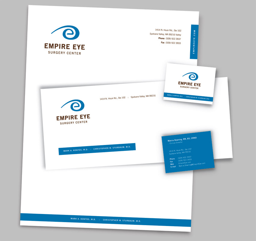
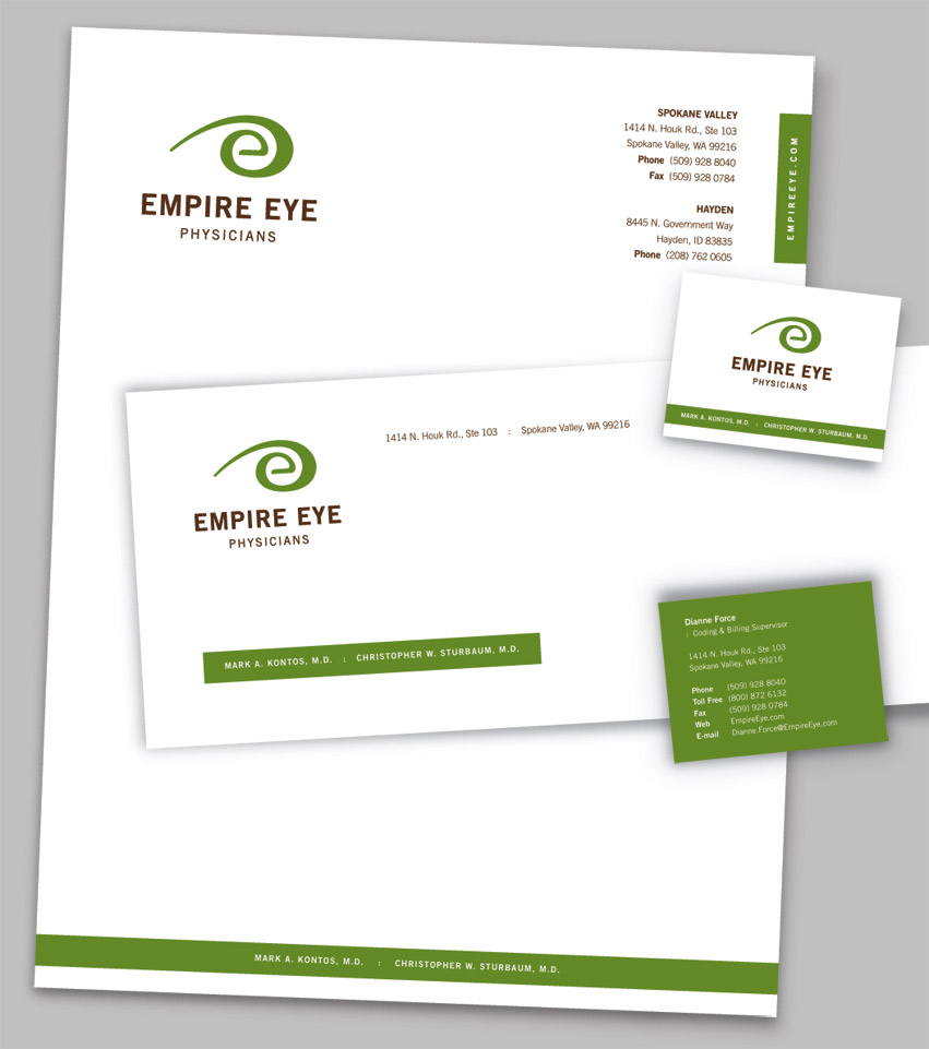
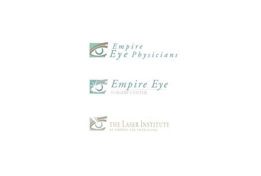
With over 60 years devoted to the vision and eye health of patients throughout the Inland Northwest, Empire Eye Physicians is continuing to grow, evolve, and moving forward. They felt that their old visual identity system no longer fully represented their clinic. They have asked Tran Creative to freshen up their visual identity system.
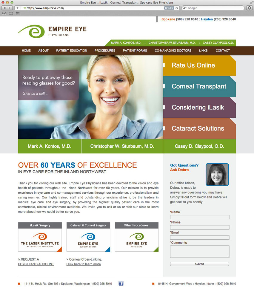
Tran Creative and the team at Empire Eye Physicians would like to introduce to you the fresh new look – a timeless representation of growth and dedication to excellence in providing exceptional care to patients.
THE STORY BEHIND THE NEW LOOK
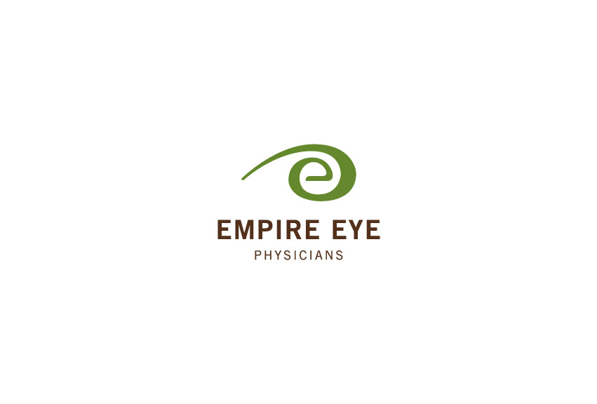
Research showed that there were thousands of eye-illustrated logos in the field of eye clinics. We wanted an identity that is fresh, friendly, approachable, memorable, and capture Empire Eye’s unique characteristics.
After hundreds of logo variations, the final result is a stylization of “the eye” without showing the actual eye. Letter “e” is for “Empire”. The mark has movement which conveys the idea that Empire Eye Physicians is moving ahead toward the future with forward thinking and commitment to ALWAYS strive to provide the best possible care for patients.
The sans serif typography is clean, friendly, and timeless.
The design execution is easily identifiable and produced on corporate collateral, web site and other promotional products.
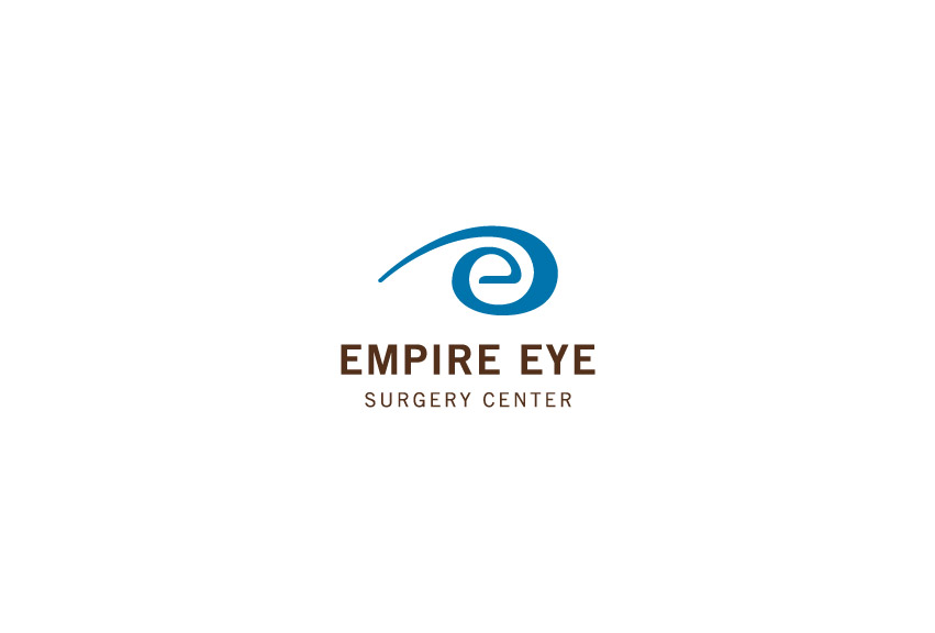
We created a color code system for the brand since the group currently has 3 entities. Green for Empire Eye Physicians; Blue for Surgery Center; Orange for Laser Institute. This way, if/when they decide to add more entities, they would still have the flexibility to simply add more colors to the color system.
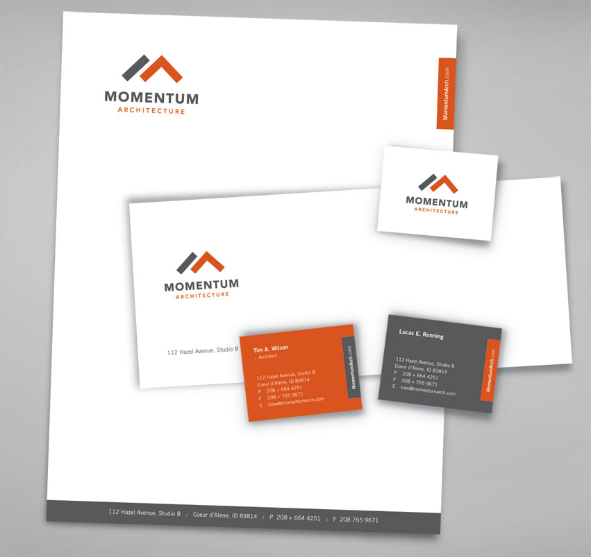
Momentum Architecture
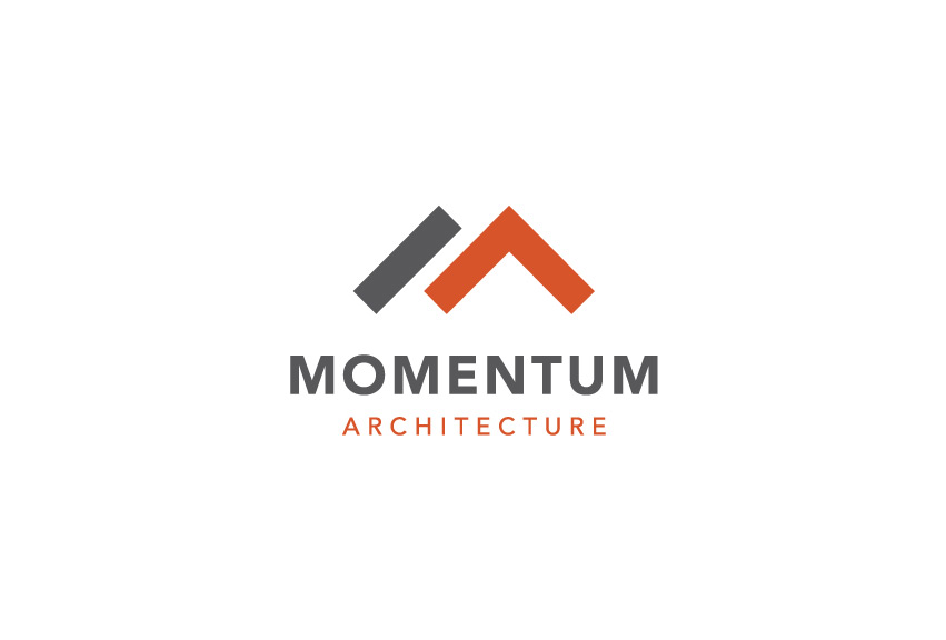
The Ideas: Using a ruler and a T-square, we created letter “M” for Momentum and “A” for Architecture. The T-square = exactness. The subtle and orange “A” is also an arrow with upward momentum. The logo mark has a subtle reference to roof top of houses/buildings.
The typography is clean, strong, and timeless. Gray = experience. Orange = innovative, progressive, and passion for new ideas in architecture and design.
Momentum Architecture logo was recognized with an award from the American Advertising Awards under logo category.
Brian Hadley
Brian Hadley is a professional triathlete. As a veteran and 7x Ironman, he finished 4th overall at 2011 Ironman Coeur d’Alene and gave 2x Ironman World Champion and fellow competitor from Australia, Craig Alexander, a run for his money. Brian has also won numerous races at different distances.
Brian reached out to Tran Creative (creator of the Hayden Triathlon Brand) and asked us to provide him with a Visual Identity.
We wanted to create a brand that has a global appeal since Brian Hadley’s next big race happens to be Ironman Frankfurt in Germany. We also wanted an identity that reflects professionalism, friendliness, and appeal to all ages.
After over a hundred design concepts, the final result is a stylization of “b” and “h” for Brian Hadley. The round circle is molded into the “b” and “h” to reflect the subtle bike wheel element.
The colors red and black help identify the logomark with the wordmark. The lowercase typography speaks “down to earth, informal, and approachable”. Now, Brian Hadley, professional triathlete, has a brand identity to build upon as a solid foundation to acquire sponsorship, perform triathlon coaching, and other possible opportunities.
Canton Asian Restaurant
Tran Creative was asked to give Canton a fresh new Brand Identity awhile back. Canton recently asked Tran Creative to design a new menu system for them.
The Challenge:
How do you design a fresh asian restaurant visual identity without using Buddha, Dragon, or Bamboo?
The Ideas:
A pair of chopstick crossing into a round plate to form letter “C” for Canton. We also incorporated a series of design patterns into the brand to give it freshness, flavors, and flexibility to apply onto other design + marketing collateral. The typography is modern, clean, classy, timeless, and appeal to all demographic.
White Pine Wealth
The Challenge:
How do you differentiate White Pine Wealth from millions of other existing tree logos?
The Ideas:
As a wealth management company, White Pine Wealth deals with lots of data, numbers, and analysis. Taking this into consideration, we played with the negative space and stacked 6 triangles from big to small to come up with a white pine tree. In a way, these 6 shapes represent the data and statistics involved in wealth management. The negative space also has 3 arrows pointing upward into success. The color Blue was chosen to give the company an added corporate and trust worthy feel.