![]()
Tran Creative and MOTOPATH are thrilled to present the Brand Identity for MOTOPATH.
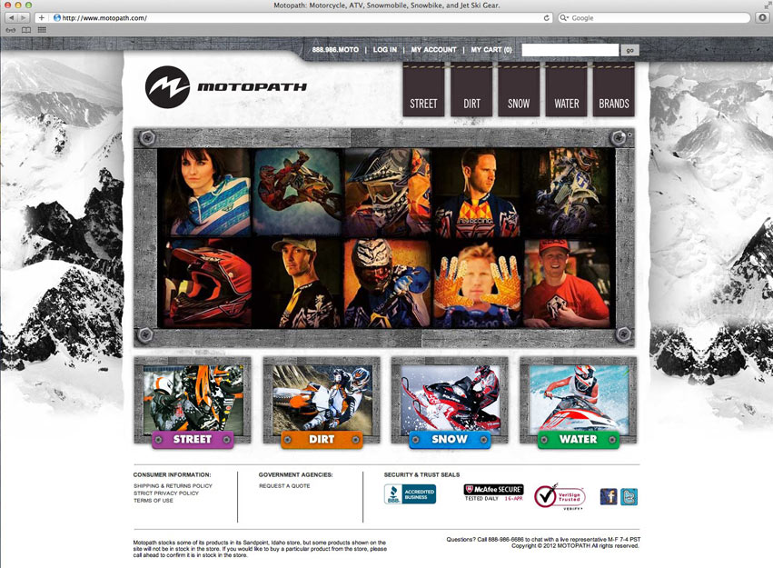
MOTOPATH is a high intensity motor sports hub, providing everything you need to know about motor sports. Our goal was to create an active and progressive visual, and to capture the feeling of the adrenaline within.
The final logo solution encompasses many ideas into one strong mark. The “m” shape represents water waves, mountain peaks, field of grass, rough edges, and the adrenaline heartbeat. With a specific color for each category within MOTOPATH, we have created a color code palette system. This helps identify the many categories in MOTOPATH: Snow, Dirt, Surf, etc.