Family Home Care

FHC_logo_design_brand_identity_tran_creative

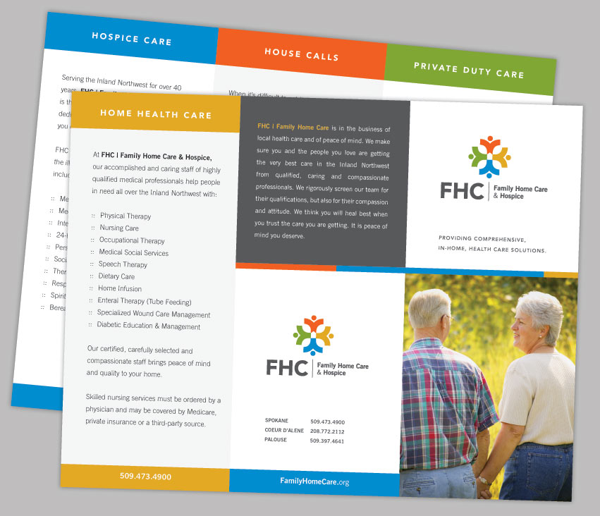
For over 40 years, people throughout the Inland Northwest have counted on Family Home Care & Hospice (FHC) to provide professional, compassionate medical and home health services. As the largest locally owned home health company in the area with over 400 employees and the only agency that provides private duty care, home health, hospice and mobile primary care services, FHC has a unique commitment to providing the finest care to clients and their families. FHC is growing, evolving, and moving forward as a company by expanding their services and their service areas. They felt the need to update their visual identity. FHC asked Tran Creative to provide them with a full branding package: corporate identity, brand audits, print collateral, brand standards guide, etc.

After nearly 4 months and hundreds of design explorations, Tran Creative & FHC are pleased and excited to introduce to you the new look.

FHC started inside a hospital setting. That is one reason their old logo carries a red cross with a home at center. For the new logo, we are able to keep the root of their origin, the cross with the home in the center. In addition, people sprouting out from the cross signifies that FHC is growing, serving and working with communities across the region. A vibrant color palette enhances the community aspect and add flavors to the brand. Overall, the new logo is friendly, communicates “Celebration of Life”, and is timeless.

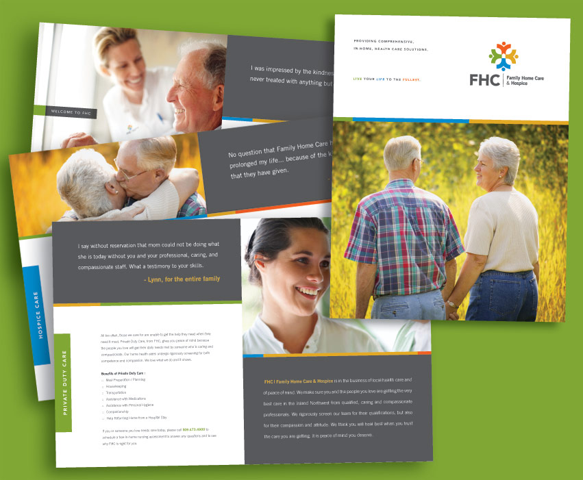
The design execution is easily identifiable and produced on corporate collateral, web site, and other promotional products.

To learn more about FHC, please visit: www.familyhomecare.org.

FHC_stationery_design_tran_creative FHC_trifold_brochure_design_tran_creative FHC_brochure_design_tran_creative

Steve Omi Memorial Open Water Swim

Steve_Omi_Memorial_open_water_swim_logo_design_tran_creative

Tran Creative is pleased to present the new Steve Omi brand identity. As a token of our love and appreciation for our local community, we have donated our service for this project.

Steve Omi was a celebrated member of the Coeur d’Alene community, who passed away from cancer in 1994. In honor of Masters swimmer Steve Omi’s life, the Steve Omi Open Water Memorial Swim was established. It’s an annual fund raiser to support High School swimming in Kootenai County.

The final chosen logo incorporates water and Steve Omi’s name. The clean and simple mark uses the S in a way that suggests water and waves, all pulled together in a circular O. The color Blue conveys intelligence and loyalty, which were strong characteristics of Steve. The Blue also represents the beautiful waters of Lake Coeur d’Alene, where the swim takes place annually.

To learn more about this great nonprofit organization, please visit
www.steveomi.org

Motopath

Motopath_logo_design_tran_creative

Tran Creative and MOTOPATH are thrilled to present the Brand Identity for MOTOPATH.

MOTOPATH is a high intensity motor sports hub, providing everything you need to know about motor sports. Our goal was to create an active and progressive visual, and to capture the feeling of the adrenaline within.

The final logo solution encompasses many ideas into one strong mark. The “m” shape represents water waves, mountain peaks, field of grass, rough edges, and the adrenaline heartbeat. With a specific color for each category within MOTOPATH, we have created a color code palette system. This helps identify the many categories in MOTOPATH: Snow, Dirt, Surf, etc.

Motopath_website_design_tran_creative Motopath_tshirt_graphic_design_tran_creative Motopath_tshirt_design_tran_creative

Cycle Metrix

Cycle_Metrix_web_design_brand_identity_tran_creative

Research showed that most bike shops carried expected symbols in their logos. We wanted to move away from the specific images of chain links, wheels and gears. Because CycleMetrix deals with many aspects of cycling, we wanted to create a non-specific mark that would provide CycleMetrix with the flexibility to encompass all areas of services:  sales, custom fitting and much more…

After many logo solutions, the final logo has been chosen. In only two simple shapes, the new logo communicates speed, precision, and innovation. These two shapes come together to form a person in an aerodynamic position, bicycle wheel, and letter C. The blue represents experience. The sporty orange embodies state-of-the-art innovation and passion for top-notch quality and service.

Visit the website: www.CycleMetrix.com

Cycle_Metrix_logo_design_brand_identity_tran_creative Cycle_Metrix_logo_old_new_design_brand_identity_tran_creative

Think Green Promos

ThinkGreenPromos_logo_design_tran_creative

Think Green Promos provides promotional products that reflect a conscious concern for the environment, using organic, recycled and earth friendly materials. They are constantly looking for new ways to provide eco friendly materials to the customer, at a reasonable price. Our goal is to incorporate this way of thinking into the new brand identity system.

The green arrows show the complete process that Think Green Promos goes through to find the best possible solutions for consumers (and the earth). Think Green Promos provides the possibilities of printing on varieties of promotional products. The white space inside the logo mark conveys this imprint area. After careful color considerations, we chose green to symbolize consciousness and love for nature. Blue represents trust and loyalty, to deliver the best products at the best prices.

View the website: www.thinkgreenpromos.com

ThinkGreenPromos_stationery_design_tran_creativeThinkGreenPromos_website_design_tran_creativeThinkGreenPromos_t-shirt_display_design_tran_creative

16th Ave Mini Storage

16th_Ave_Mini_Storage_logo_design_tran_creative

Research shows that most mini storage companies typically have locks as their symbols. To give 16th Ave Mini Storage a distinctive look and stand apart from the competition, we focus on a completely different direction – the artistic & modern approach.

Looking from bird’s eye view, Tran Creative stylized the space in 2 blocks. They represent the organization of objects within the storage units: boxes, furniture, etc. A thick black border boldly seals the objects within – protection & safety.

16th_Ave_Mini_Storage_stationery_design_tran_creative

Nancy For Mayor

Nancy_for_mayor_2011_logo_design_tran_creative

Tran Creative was asked to provide Branding services for Nancy Lowery, a Mayoral Candidate for City of Hayden, Idaho.

THE RESEARCH

Majority of Political campaigns lack “The Identity”. Most of them either have just the candidate’s name or minimal graphic: star & stripes, etc. We wanted to give this campaign its own identity to stand out from the mass crowd.

THE DESIGN EXECUTION

Letter “N” for “Nancy”, with forward movement – forward thinking & progression. It’s also number “11” in orange to signify this significant year of election for the city of Hayden. The “orange parallel // symbol” also communicates balance & equality.

Orange = energy, innovation, and passion. Blue = experience, stability.

Overall, the logo is bold, yet friendly, timeless, memorable, and appeal to all demographics.

Nancy_for_mayor_2011_website_design_tran_creative

Avenue 54

ave54_logo_visual_identity_graphic_design_tran_creative

Avenue 54 Advertising Agency Brand Identity

ave54_stationery_graphic_design_tran_creative

Atrium Professional Building

Atrium_Professional-Building_visual_identity_logo_design_tran_creative

ATRIUM is a 40,000+ SF Professional Office Building. The interior is designed with tropical lush plants & a river running through. Imagine working in a tropical paradise – all year round, yes, even in the snowy winters of North Idaho.

After research & consultation with the client, we wanted to create a logo mark that would capture the characteristics of the building: Professional, Relaxing, and Fresh. The challenge is to keep the graphic minimal to reflect the professionalism and would be simple to apply onto signage/landmark monument, but at the same time, bring out the tropical nature feel.

The result is the wordmark in a clean type treatment with a wavy shape as the crossbar of the “A”. This minimal design element conveys: plant, water, freshness, all in one.

To learn more about the building or if you’d like to work in tropical paradise all year round, please visit:
http://www.nwcre.org/jsp/listings/listing_overview.jsp?listingID=16300011

Atrium_Professional-Building_visual_identity_logo_design_tran_creative_office_building

Empire Eye Physicians

Empire_Eye_Physicians_logo_design_tran_creative

A FRESH NEW LOOK

With over 60 years devoted to the vision and eye health of patients throughout the Inland Northwest, Empire Eye Physicians is continuing to grow, evolve, and moving forward. They felt that their old visual identity system no longer fully represented their clinic. They have asked Tran Creative to freshen up their visual identity system.

Tran Creative and the team at Empire Eye Physicians would like to introduce to you the fresh new look – a timeless representation of growth and dedication to excellence in providing exceptional care to patients.

THE STORY BEHIND THE NEW LOOK

Research showed that there were thousands of eye-illustrated logos in the field of eye clinics. We wanted an identity that is fresh, friendly, approachable, memorable, and capture Empire Eye’s unique characteristics.

After hundreds of logo variations, the final result is a stylization of “the eye” without showing the actual eye. Letter “e” is for “Empire”. The mark has movement which conveys the idea that Empire Eye Physicians is moving ahead toward the future with forward thinking and commitment to ALWAYS strive to provide the best possible care for patients.

The sans serif typography is clean, friendly, and timeless.

The design execution is easily identifiable and produced on corporate collateral, web site and other promotional products.

We created a color code system for the brand since the group currently has 3 entities. Green for Empire Eye Physicians; Blue for Surgery Center; Orange for Laser Institute. This way, if/when they decide to add more entities, they would still have the flexibility to simply add more colors to the color system.


Empire_Eye_Physicians_surgery_center_logo_design_tran_creative Empire_Eye_Physicians_the_laser_institute_logo_design_tran_creative

Empire_Eye_Physicians_surgery_center_stationery_design_tran_creative Empire_Eye_Physicians_the_laser_institute_stationery_design_tran_creative Empire_Eye_Physicians_stationery_design_tran_creative Empire_Eye_Physicians_website_design_tran_creativeEmpire_Eye_Physicians_old_logo_design_tran_creative

Get In Touch

Interested in working with us?
We would love to help TELL YOUR STORY.

Logo

Create an identity to break the generic mold.

Web

Provide sleek and modern resources for your clients.

Marketing

Tell your story and increase your revenue.