For over 40 years, people throughout the Inland Northwest have counted on Family Home Care & Hospice (FHC) to provide professional, compassionate medical and home health services. As the largest locally owned home health company in the area with over 400 employees and the only agency that provides private duty care, home health, hospice and mobile primary care services, FHC has a unique commitment to providing the finest care to clients and their families. FHC is growing, evolving, and moving forward as a company by expanding their services and their service areas. They felt the need to update their visual identity. FHC asked Tran Creative to provide them with a full branding package: corporate identity, brand audits, print collateral, brand standards guide, etc.
After nearly 4 months and hundreds of design explorations, Tran Creative & FHC are pleased and excited to introduce to you the new look.
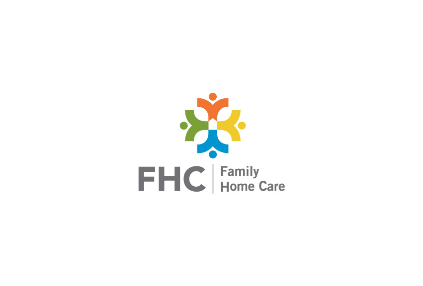
FHC started inside a hospital setting. That is one reason their old logo carries a red cross with a home at center. For the new logo, we are able to keep the root of their origin, the cross with the home in the center. In addition, people sprouting out from the cross signifies that FHC is growing, serving and working with communities across the region. A vibrant color palette enhances the community aspect and add flavors to the brand. Overall, the new logo is friendly, communicates “Celebration of Life”, and is timeless.
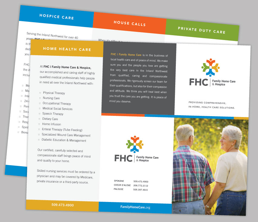
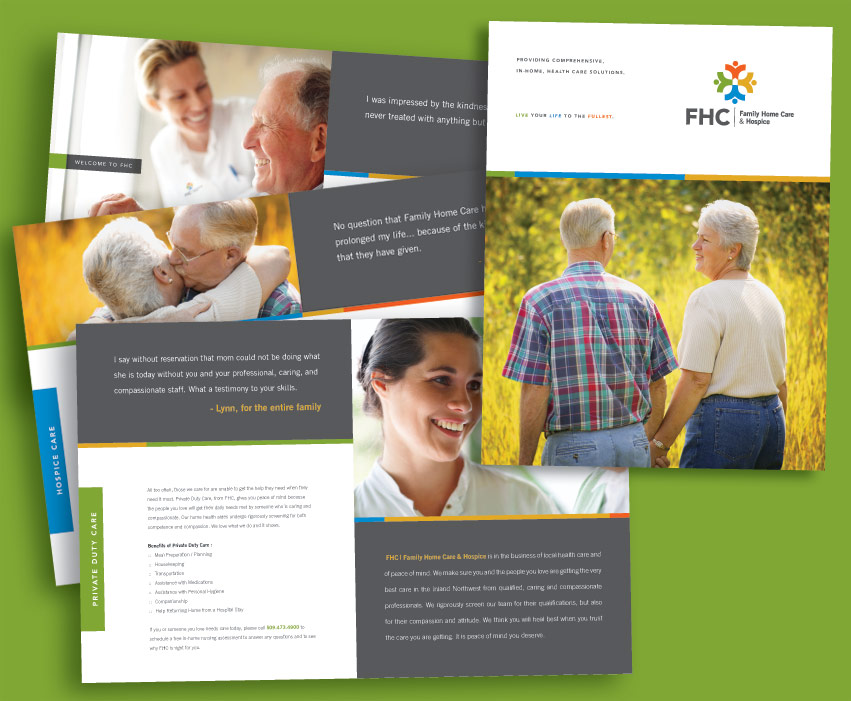
The design execution is easily identifiable and produced on corporate collateral, web site, and other promotional products.
To learn more about FHC, please visit: www.familyhomecare.org.


