![]()
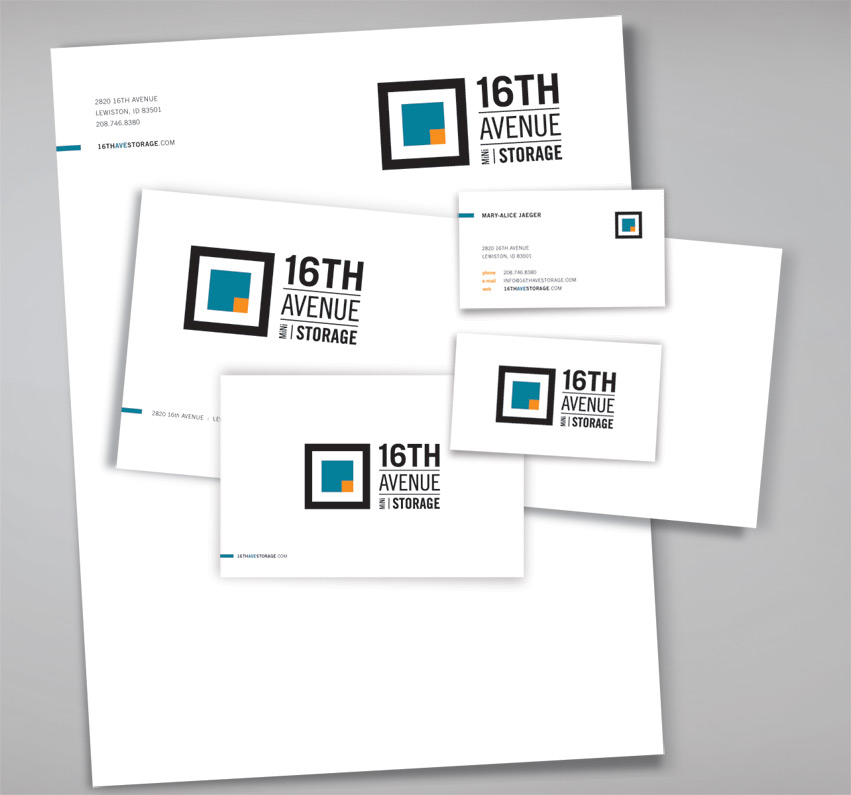
Research shows that most mini storage companies typically have locks as their symbols. To give 16th Ave Mini Storage a distinctive look and stand apart from the competition, we focus on a completely different direction – the artistic & modern approach.
Looking from bird’s eye view, Tran Creative stylized the space in 2 blocks. They represent the organization of objects within the storage units: boxes, furniture, etc. A thick black border boldly seals the objects within – protection & safety.