Jaeger Orthodontics

Jaeger_Orthodontics

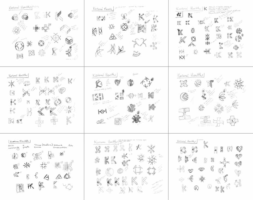
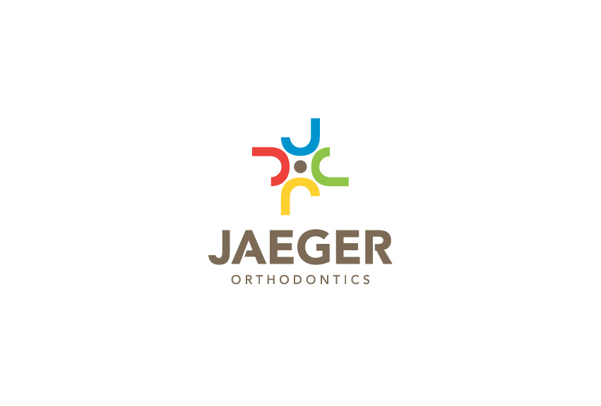
Research showed that most dental/orthodontics logos often carried symbols of teeth, toothbrushes, braces, etc. We wanted to break away from the expected and create a visual identity that would capture the personalities of Jaeger Orthodontics.

Jaeger Orthodontics has nearly 3 decades of experience in providing orthodontic treatments. They are well-known in the community, and have served generations of patients. Dr. Jaeger is also well-liked by the staff. Some of the team members have been with him for over 2 decades.

After a series of logo variations, the chosen final logo communicates the many aspects of Jaeger Orthodontics: Letters J for Jaeger, generations of patients, well-liked by staff and community, and has a joyful feel that radiates throughout the Jaeger office.


Jaeger_Orthodontics_Braces_2_School_logos_tran_creative


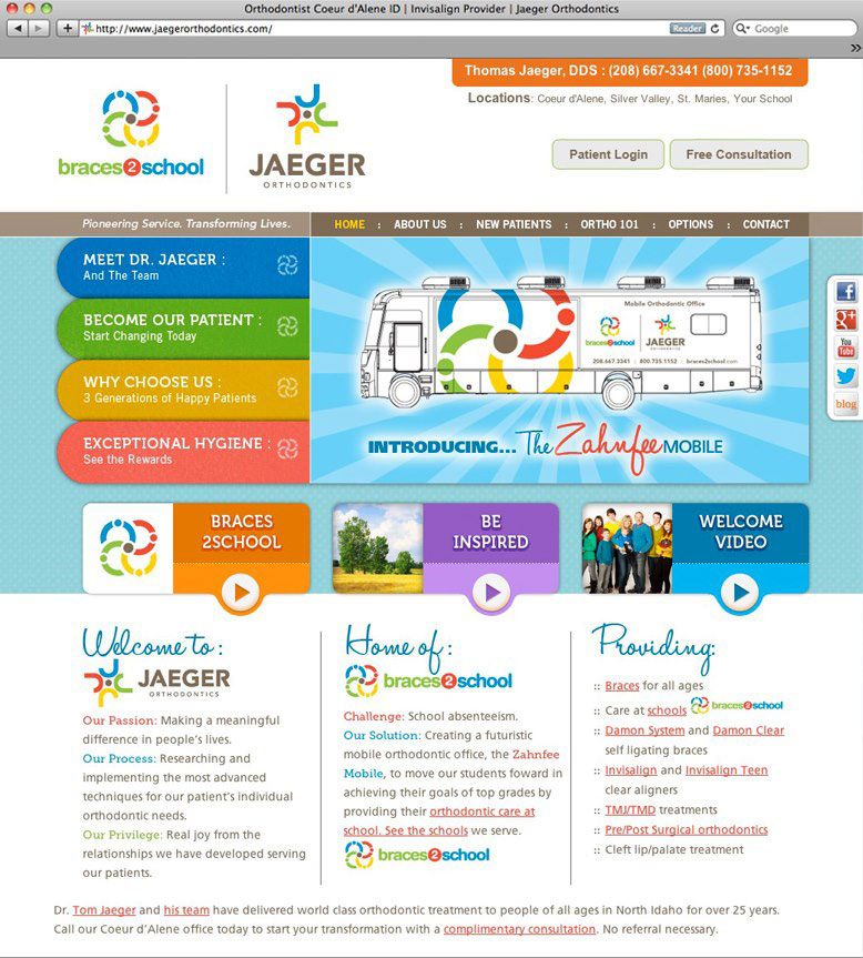
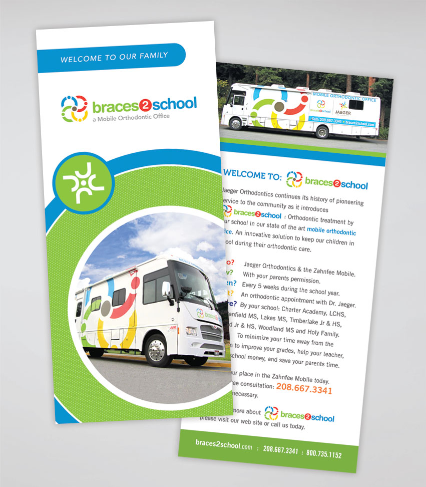
With the launch of Braces2School, a state of the art mobile orthodontics clinic, Jaeger Orthodontics has hired Tran Creative to design a fresh new logo and web site to reflect both entities.

The new Braces2School logo is an extension of Jaeger Orthodontics logo. The four “J” curl into circles (wheels of the bus). The circles are also stylized into people elements (students, teachers, parents, community). The brown circle remains in the center as a tribute to Jaeger Orthodontics, the root of the brand. The vibrant colors convey: community, friendly & upbeat staff and generations of patients. Together, they roll forward from schools to schools, continuing its history of pioneering service to the community for the past 20+ years as the leader in orthodontics.

Tran Creative will also be implementing the new logo across all communication pieces: stationery, rack card, brochure, signage, a brand new web site, and a state of the art mobile orthodontic office RV.

We’d like to introduce the new site: www.JaegerOrthodontics.com


Jaeger_Orthodontics_Braces_2_School_website_tran_creativejaeger_braces_2_school_rackcard_tran_creative

Pleasant View Surgery Center

Pleasant_View_Surgury_Center_logo_design_tran_creative

Tran Creative was hired to design a new Logo for Pleasant View Surgery Center located in Post Falls, Idaho. Research showed that there were many Pleasant View logos out there. Many of them used leaves, mountains and trees as design elements. We wanted to provide Pleasant View Surgery Center with a unique mark that didn’t blend in with the crowd.

The new logo represents a network of physicians working together. It also conveys nonspecific contour human anatomy. The stylization and colors reflect finesse, intricacy, gentleness and comfort.

The new logo is applied on all communication materials for Pleasant View Surgery Center.

Dave Erickson Media

Dave_Erickson_Media_website_logo_design_tran_creative

Tran Creative was tasked with developing a new visual identity and web site for Dave Erickson Media. The new logo we created for Dave was recently published in Logo Lounge 7: International Identities by Leading Designers. You could check out the book next time you’re at Barnes & Noble.

Dave is a man of many talents: Brand Ambassador Athlete, News Anchor, Videographer, Reporter, Triathlete, and much more… Visit Dave’s website: www.daveericksonmedia.com


Dave_Erickson_Media_logo_design_tran_creative

American Floors and Blinds

AFB_american_floors_and_blinds_website_design_by_tran_creative_coeur_dAlene_idaho

Founded in 1962, AFB is the flooring & window-covering supplier with deep expertise and the largest sales support staff in the industry. AFB has 3 locations in Washington.

AFB hired Tran Creative to develop a new & comprehensive web site. After working with the AFB marketing team since last summer, Tran Creative is please to introduce the new site for AFB, equipped with a robust CMS (Content Management System) that allows AFB staff to update site with ease.
www.American-Drapery.com

Cycle Central

Cycle_Central_logo_design_tran_creative

Cycle Central is a bike shop in Wenatchee, WA. They hired Tran Creative to develop a new brand identity & web site. After many logo variations, we’d like to introduce the new visual identity for Cycle Central. The new logo consists of 4 shapes forming letter “C” in the negative space. We did not want to incorporate any bike specific elements: handle bar, chain, frame, etc. to provide future flexibility for Cycle Central to carry more products than just bikes. However, we stylized the shapes to have elements of cycling: aerodynamic, speed, and movement. Color Orange represents passion for exceptional customer service, energy and love for the sports. Gray stands for progressiveness and stability.

The new logo is applied on variety of applications: race kits, cycle jerseys, sales tags, apparels, signage, and much more.

See the new website: cycle-central.com


Cycle_Central_website_design_tran_creative

1 Tri Coaching

1Tri_logo_design_tran_creative

1TRI Coaching hired Tran Creative to provide them with a new logo. We also helped with the naming. 1TRI has many meanings: one on one coaching, one vs. oneself (overcoming self-doubt), becoming #1 (the best you could possible be). Research shows that there are many triathlon related logos with 3 swim bike run figures. We want to give 1TRI a unique look that would make them unique, creative, and stand apart from the norm.

After many logo variations, designers at Tran Creative crafted 3 simple shapes to form #1. The stylization conveys: speed, movement, athlete body in motion, mountain peak of the Coeur d’Alene region, and the challenging yet rewarding road to success.

1Tri_stationery_design_tran_creative

Kootenai Electric Cooperative

Kootenai_Electric

Kootenai Electric Cooperative (KEC) is the largest electric cooperative in Idaho with 75 employees. KEC has more than 22,000 member accounts and nearly 2,000 miles of electric line in parts of Kootenai, Benewah, Bonner and Spokane counties.

It has been a year since we first came in contact with Kootenai Electric Cooperative. After an interview with KEC staff, Tran Creative was hired as the creative agency to work with KEC. Since then, we have produced Annual Report, Trade Show Display, E-mail Templates, Interior Lobby Design, and Program Logos. The team at KEC is friendly, energetic, innovative, and fun to work with. We thoroughly enjoy this ongoing partnership.

To learn more about Kootenai Electric Cooperative, please go to:
www.kec.com


Kootenai_Electric_75th_year_installation_timeline_tran_creative_graphic_design Kootenai_Electric_75th_year_installation_tran_creative_graphic_design Kootenai_Electric_75th_year_tran_creative_graphic_designKootenai_Electric_2011_annual_report_design_tran_creative_graphic_designKootenai_Electric_2010_annual_report_design_tran_creative_graphic_designKootenai_Electric_smart_choice_logos_tran_creative_graphic_designKootenai_Electric_members_choice_program_logos_tran_creative_graphic_design

Charles Regalado, DDS

Charles_Regalado_DDS_advanced_aethetics_and_restorative_dentistry_logo_design_tran_creative

Charles Regalado, DDS of Spokane Washington has spent more than 20 years researching and developing the best methods for transforming your smile into something beautiful. Through advanced aesthetics and restorative dentistry, Dr. Regalado provides his patients with the smile they have always wanted.

Research shows that most dentistry logos often convey images of the tooth or tooth brush. We wanted to move away from these overused icons and create a more personalized approach that would illustrate Dr. Regalado’s main objective of providing a beautiful, natural smile.

THE EXECUTION

After many logo variations, a new visual identity was born for Charles Regalado, DDS. The chosen logo has a representation of a smile (letter C) and a person lounging in comfort (letter R). Purple conveys the luxurious service patients receive. Refreshing and cleansing Teal is for the way your mouth will feel after a visit with Charles Regalado, DDS.


Charles_Regalado_stationery_design_business_card_graphic_design_tran_creative_coeur_dAlene_idaho

Annie Warner Pro Athlete

Annie_Warner_Pro_Athlete_logo_design_tran_creative

Annie Warner is a professional triathlete and swim coach with an impressive racing record, including multiple 1st place finishes. Annie tasked Tran Creative with developing a visual identity that would allow her to extend her brand into a wider stage.

After many logo variations, we narrowed down to 3 logos and asked the audience to help Annie select one. The chosen final logo carries initials A & W. The design stylization of letter “A” conveys movement (arm, leg). Letter “W” signifies water, an attribute to Annie’s background in collegiate swimming. Green and Blue represent the Pacific NW colors. Green is also for easy going, and friendly personality. Blue is for freshness and water.

With this fresh new look, Annie Warner is now armed with a solid visual representation to be recognized on an international level as an elite athlete.

Vann Companies

Vann_Companies_logo_design_tran_creative

Vann Companies is a national, government-contracted Engineering & Contracting firm with headquarters in Minneapolis. They are growing and evolving as a company and hired Tran Creative to provide branding services.

After several months and hundreds of logo variations, the chosen logo was launched in the spring of 2013 along with other print collaterals, new web site, and much more. The new logo is executed with simplicity and boldness. It has 2 shapes converging and forming letter V. The 2 shapes represent the 2 main areas of services in engineering and contracting. The rounded corners signify friendliness and approachability. Blue stands for experience and stability. Green conveys environmental friendliness and fresh ideas.

Get In Touch

Interested in working with us?
We would love to help TELL YOUR STORY.

Logo

Create an identity to break the generic mold.

Web

Provide sleek and modern resources for your clients.

Marketing

Tell your story and increase your revenue.