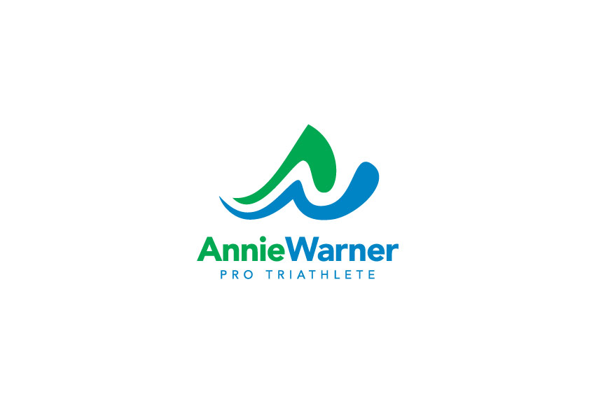
Annie Warner is a professional triathlete and swim coach with an impressive racing record, including multiple 1st place finishes. Annie tasked Tran Creative with developing a visual identity that would allow her to extend her brand into a wider stage.
After many logo variations, we narrowed down to 3 logos and asked the audience to help Annie select one. The chosen final logo carries initials A & W. The design stylization of letter “A” conveys movement (arm, leg). Letter “W” signifies water, an attribute to Annie’s background in collegiate swimming. Green and Blue represent the Pacific NW colors. Green is also for easy going, and friendly personality. Blue is for freshness and water.
With this fresh new look, Annie Warner is now armed with a solid visual representation to be recognized on an international level as an elite athlete.


