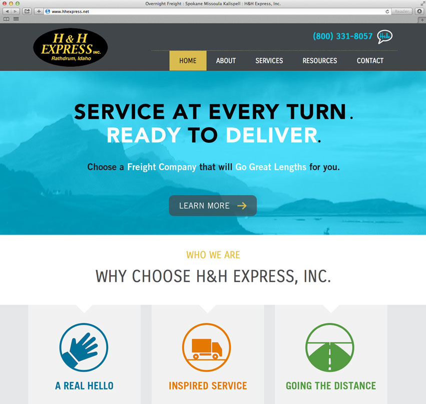
For nearly 20 years, H&H Express has been providing Freight Services for companies around the Pacific Northwest and across the United States. Headquartered in Rathdrum, Idaho, H&H Express is growing steadily. They asked Tran Creative to develop a new web site that will help tell their story and vision for the future.
Tran Creative crafted a brand strategy direction, design, code and launched the new site: www.HHExpress.net
Heart Song Massage Therapy is located in Hayden, Idaho. They provide therapeutic massage that integrates deep tissue work and offer hot & cold stone massage.
They asked Tran Creative to create a new visual identity. After research and many logo explorations, the chosen final logo captures the “H” and “S” working together in harmony and cohesion. The “Song” concept was also emphasized with 2 music notes, but minimal to avoid leaning toward the “music” industry. HeartSong means doing what you love and enjoy most while humming along to life’s favorite song, from the heart.
Color brick red represents love and passion from the Heart. Sage green is for new start, life and better health.
Pacific Coast Triathlon is part of the premiere OC Tri Series, with breathtaking ocean view. Taking place at Crystal Cove in Orange County, athletes and spectators will enjoy the finish overlooking the Pacific Ocean. Race organizers hired Tran Creative to design a new logo for the event.
During research phase, we’ve found many triathlon logos with Swim Bike Run icons. We wanted to give this race its own unique visual identity. After over 100 logo variations, the chosen logo captures the “P” & “C”, nature elements and ocean waves of Southern California. It also captures the Athlete, Movement and Performance aspect of triathlon.
Blue is for the ocean of Pacific Coast. Orange is for energy and fun under the sun. Green accentuates the beautiful landscape of Southern California.
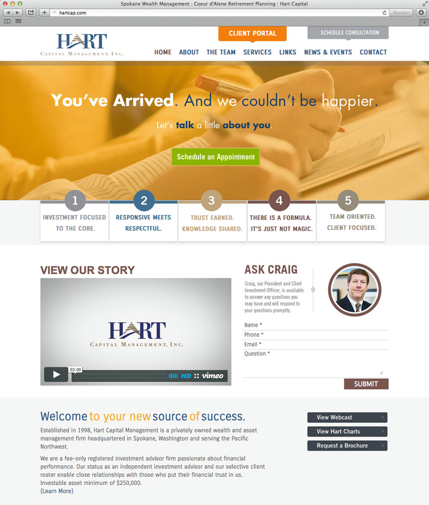
Established in 1998, Hart Capital Management is one of the most respected privately owned wealth and asset management firms in the Pacific Northwest. After an extensive and comprehensive interview process, they hired Tran Creative to provide brand strategy, develop corporate collaterals and create desktop & mobile site.
After working closely with Hart Capital for the past year, we’ve developed a great relationship with Hart’s team. We’d feel confident and trust Hart enough to let them manage our retirement. Yes, even at a minimum of $250,000.
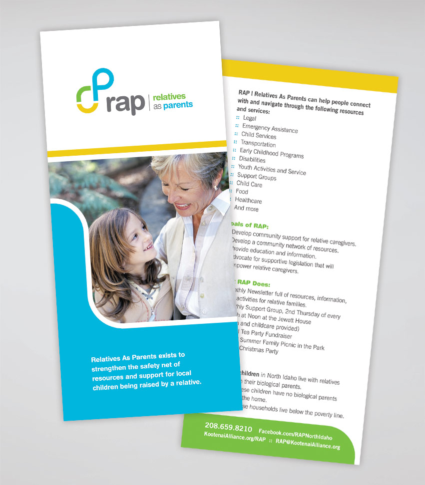
Relatives As Parents exists to strengthen the safety net of resources and support for local children being raised by a relative. They hired Tran Creative to provide branding services.
After many logo variations and much research, the final chosen logo captures the “r” & “p” with a link connecting the two together. The link conveys that RAP can help people connect and navigate through helpful resources and services: legal, emergency assistance, child services, disabilities, child care, support groups, and more…
Color Green represents growth and fostering of new relationships. Blue conveys stability and peace of mind. Yellow provides hope and bright future.
The new logo is applied on all corporate communication materials.
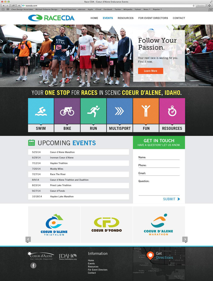
Race CDA will be promoting Endurance Races in and around Coeur d’Alene ranging from 5K Fun Runs, Marathons, to Triathlons, and more. Race CDA has the support from CdA Chamber, CdA Convention & Visitors Bureau, with the vision to put Coeur d’Alene on the map as the destination town to visit and participate in endurance events.
Tran Creative was hired to provide branding services, including the design of a new logo. After much research and many logo variations, the final chosen logo captures the “C” for Coeur d’Alene. The “Racing C” is crafted to resemble the “Wave” – water & lake elements of town.
Colors Blue & Green capture the spirit of the Pacific Northwest: water & greenery.
Movita Health is a synergy between health care and fitness. Together, they combine to provide medically supervised therapeutic lifestyle modification programs. Learn healthy habits to improve vitality and quality of life with Movita Health.
Tran Creative was hired to create a new visual identity. “Movita” means “More Life” and also “Movement of Life”. After much research and many logo variations, the chosen final logo captures the “M”, full of movement with a splash of life. Movita is not corporate and is flexible, with the ability to provide one-on-one services to clients. Tran Creative’s designers crafted the logo mark to resemble human form, moving smoothly with fluidity.
The color Blue represents experience, stability and comfort. Orange conveys passion, energy, and innovation to changing lives and making a difference in society.
Emily Dishman, Realtor, has recently joined our friends at Fortus Realty, Inc. Emily is an amazing client and friend to work with through this whole process. Tran Creative was hired to provide Emily with a new Logo.
Research showed many real estate logos often carried obvious symbols: house, key, tree, mountain, fence, etc. We wanted to give Emily her own visual identity without associating with the obvious, but still captured all the essence of Emily Dishman.
After many logo variations and through organizing and planning shapes carefully and strategically, the chosen logo captures the “E” and “d”. The inspiration came from looking at floor plans and plat maps.
Emily Dishman is more than just selling/buying real estate. She is about planning for the future, service in community, helping people in full circle. The multi-color palette helps capture these points.
The Chamber office is a business resource and visitor information center located in the heart of the city of Hayden. They hired Tran Creative to provide a new Visual Identity. During the brand visual audit and research, we’ve found many local logos with obvious mountains, trees, leaves, and water, including the old Hayden Chamber logo. We wanted the new logo to captures these elements of Hayden, but not so obvious. After about 100 logo variations, a new logo has been chosen by the Board of Directors.
The new Hayden Chamber of Commerce logo captures the “Gateway to Recreation”. It conveys nature, outdoors, mountain peaks, water, splash of life, and recreation. Tran Creative’s designers also stylized the mark into a letter “h” using the yellow and green shapes. People in Hayden work hard and have fun after work: outdoors, trails, boating, lake, fishing, etc. The 4 color palette is symbolic of community. Blue is for majestic lake of Hayden. Yellow is for fun activities and recreation. Green captures the nature aspect and fresh ideas. Orange means innovation and passion for making this community one of the best towns to live, work, and play.
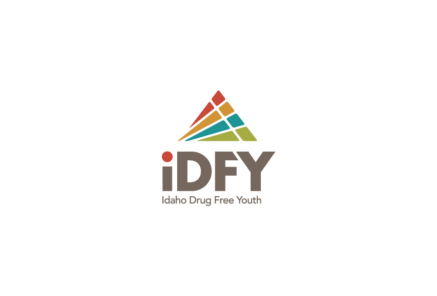
IDAHO DRUG FREE YOUTH or iDFY (pronounced “i defy”) is Idaho’s statewide drug and alcohol prevention program for Idaho teens. Since 1991, iDFY has been a community based drug, alcohol, and tobacco prevention program that educates and supports Idaho students. iDFY’s mission is empower youth to lead happy and healthy lives. The organization is growing and evolving. Tran Creative designed their fresh new look.
THE STORY BEHIND THE NEW LOOK
After looking at many logo variations, iDFY and our team have chosen a new symbol that represented iDFY in a complete spectrum going forward to the future. The new logo consists of four letters “i”. Each “i” is unique and different in its own way. Yet, together, they all shoot forward and upward. The four “i” with different colors communicate differences, uniqueness, individuality, teamwork, acceptance, community, and inspiration to achieve success. It does not matter who you are or where you come from, when you belong to iDFY, you become part of a family network. Together, we will move forward and upward into success. The overall rectangular shape is symbolic of being organized and having a structured foundation for progress and positive achievement. The typography is clean, modern, yet timeless.
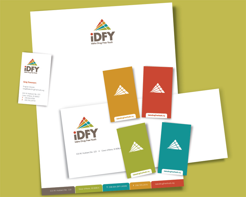
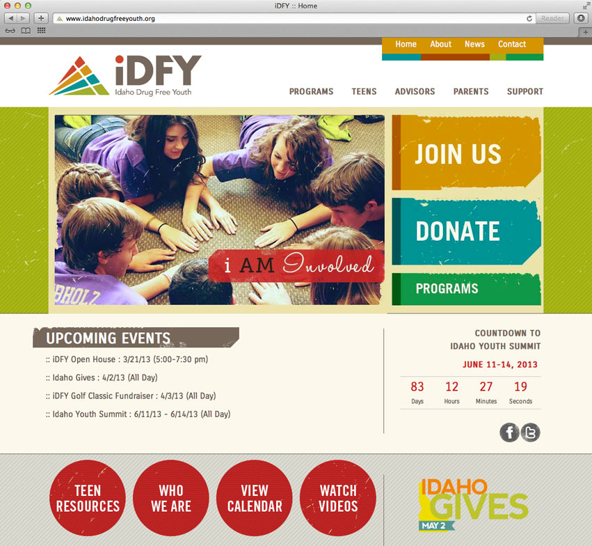
The design execution is to be easily identifiable and produced on corporate collateral, web site, and other promotional products. See the new website: idahodrugfreeyouth.org