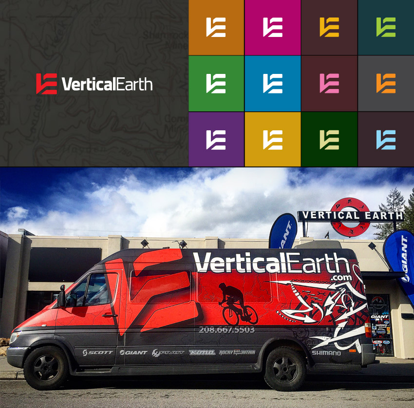
John Pulsipher, DDS

John_Pulsipher_Logo_Design_Tran_Creative

John Pulsipher, DDS provides surgical services to dental clinics across the country. From sedation, wisdom teeth removal to extractions, implant surgery to bone grafting… Dr. Pulsipher can come to dental clinics and perform these procedures.

Tran Creative was hired to to develop a new logo & web site. The site is built with a CMS so Dr. Pulsipher’s staff could update with ease. We also built a private platform to allow dentists to login and view confidential information. View site: www.JohnPulsipherDDS.com


John_Pulsipher_website_design_tran_creative

Sole Solutions

sole_solutions_logo_design_tran_creative_coeur_d_alene_idaho

Since 1998, Sole Solutions located by Spokane Valley Mall in Washington, has been offering wide selections of shoes, expertise and knowledge in foot conditions, diabetic shoes, etc. Sole Solutions hired Tran Creative to refresh their Visual Branding: logo, print materials and web site.

After much research and nearly 100 different logo ideas, the NEW LOGO captures the S, legs, feet, movement, flexibility and shoe traction. Gray = experienced shoe experts. Green = fresh ideas, creative thinking, innovation.

The new logo is used on all marketing pieces and a new web site: Sole-Solutions.com


sole_solutions_website_design_tran_creativesole_solutions_Stationery_design_business_card_tran_creative

Resort City Inn

Resort_City_Inn_website_design_tran_creative

Resort City Inn (Hotel) in downtown Coeur d’Alene hired Tran Creative to create a new web site. The new web site helps tell the story of Resort City Inn. It is responsive to mobile devices and has a user-friendly CMS for easy update. See it LIVE at: www.ResortCityInn.com

Hern Recycling Foundry

Hern_Recycling_Foundry_logo_design_tran_creative

HERN Recycling Foundry has been in business since 1971. With facilities located on 32 Acres of land in Coeur d’Alene, HERN is well-known as experts in iron foundry, metal recycling, cannon design & production, and all things metal… HERN hired Tran Creative to help tell their story through Visual Branding, from logo design to responsive e-commerce web development and marketing.

After much research and over 100 logo concepts, the final logo captures the legacy of 2 generations in 2 simple shapes to form letter H within a family crest. The new logo mark also conveys heavy duty tools, equipments, materials without being too specific. We want the brand to have flexibility and not get boxed in so it can grow, evolve, and encompass other lines of service in the future.

Orange/Yellow is for heat to mold metal, innovation, ideas, and passion. Gray is for metal, stability and experience.

The new logo is applied on all marketing materials including a comprehensive, responsive e-commerce web site.


Hern_Recycling_Foundry_photography_3_design_tran_creativeHern_Recycling_Foundry_photography_2_design_tran_creativeHern_Recycling_Foundry_photography_1_design_tran_creative

ShedIt

ShedIt_Logo_Design_Tran_Creative

Shedit hired Tran Creative to provide branding services. Research showed there were many generic looking shed logos. In creating a brand, we wanted the shed to be more conceptual and not so obvious and generic.

After many logo explorations, the chosen logo has 3 shapes lining up perfectly to form an “S” in a shed-like shape. It has depth through arrangement of negative space. Typography is customized to match the mark with slanted edges. Colors blue and gray convey stability, strength, durability and trust.

See the new site: www.shedit.com

McEuen Park

McEuen_Park

In 2010, Tran Creative was hired to work with Team McEuen, Steering Committee and City of Coeur d’Alene for over a year on McEuen Park Renovation. Park upgrades feature a natural amphitheater, a new covered pavilion for group picnics and events, a donor wall, a grand plaza and waterfront promenade, scenic paved trails, new public art, a re-designed Veteran’s Memorial, an amazing interactive playground for kids of all ages, a new dog park, more user-friendly and efficient public parking, a new Front Avenue promenade with community gathering areas and an interactive splash pad with more than a dozen colorful water features.

The Ideas behind the Logo:

People + Letter “M” for McEuen. The CIRCLE in the middle represents the LAND where this project will be built upon. The color BROWN represents the color of the SOIL. The MULTI-COLOR palette represents the different parts of the COMMUNITY coming together to assist with this project. Each letter is individually customized to give McEuen its own distinctive personality.

On May 2, 2014, the community joined in for a soft Grand Opening. We know we are privileged to be a part of a special legacy project when we see our own children laughing, smiling, running around and playing at the park.


McEuen_Park_SoftOpening_tran_creativeMcEuen_Park_hat_tshirt_Coeur-dAlene_Web_Design_Tran_CreativeMcEuen_Park_photos_2_tran_creativeMcEuen_Park_photos_3_tran_creative
McEuen_Park_photos_tran_creative

H&H Express

hh_express_website_design_tran_creative

For nearly 20 years, H&H Express has been providing Freight Services for companies around the Pacific Northwest and across the United States. Headquartered in Rathdrum, Idaho, H&H Express is growing steadily. They asked Tran Creative to develop a new web site that will help tell their story and vision for the future.

Tran Creative crafted a brand strategy direction, design, code and launched the new site: www.HHExpress.net

Heart Song Massage Therapy

Heart_Song_Massage_Therapy_Logo_Design_Tran_Creative

Heart Song Massage Therapy is located in Hayden, Idaho. They provide therapeutic massage that integrates deep tissue work and offer hot & cold stone massage.

They asked Tran Creative to create a new visual identity. After research and many logo explorations, the chosen final logo captures the “H” and “S” working together in harmony and cohesion. The “Song” concept was also emphasized with 2 music notes, but minimal to avoid leaning toward the “music” industry. HeartSong means doing what you love and enjoy most while humming along to life’s favorite song, from the heart.

Color brick red represents love and passion from the Heart. Sage green is for new start, life and better health.

Pacific Coast Triathlon

Pacific_Coast_Triathlon_Logo_Design_Tran_Creative

Pacific Coast Triathlon is part of the premiere OC Tri Series, with breathtaking ocean view. Taking place at Crystal Cove in Orange County, athletes and spectators will enjoy the finish overlooking the Pacific Ocean. Race organizers hired Tran Creative to design a new logo for the event.

During research phase, we’ve found many triathlon logos with Swim Bike Run icons. We wanted to give this race its own unique visual identity. After over 100 logo variations, the chosen logo captures the “P” & “C”, nature elements and ocean waves of Southern California. It also captures the Athlete, Movement and Performance aspect of triathlon.

Blue is for the ocean of Pacific Coast. Orange is for energy and fun under the sun. Green accentuates the beautiful landscape of Southern California.

Visit www.octriseries.com to learn more.

Get In Touch

Interested in working with us?
We would love to help TELL YOUR STORY.

Logo

Create an identity to break the generic mold.

Web

Provide sleek and modern resources for your clients.

Marketing

Tell your story and increase your revenue.