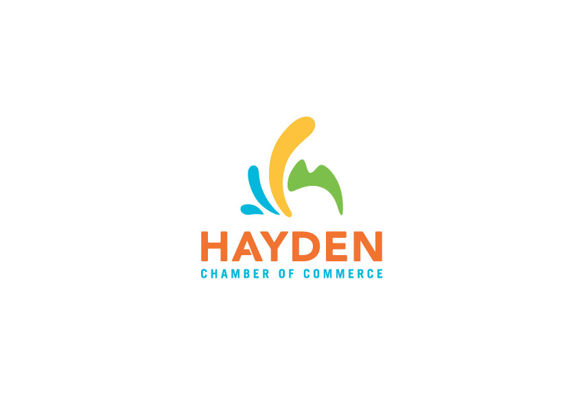
The Chamber office is a business resource and visitor information center located in the heart of the city of Hayden. They hired Tran Creative to provide a new Visual Identity. During the brand visual audit and research, we’ve found many local logos with obvious mountains, trees, leaves, and water, including the old Hayden Chamber logo. We wanted the new logo to captures these elements of Hayden, but not so obvious. After about 100 logo variations, a new logo has been chosen by the Board of Directors.
The new Hayden Chamber of Commerce logo captures the “Gateway to Recreation”. It conveys nature, outdoors, mountain peaks, water, splash of life, and recreation. Tran Creative’s designers also stylized the mark into a letter “h” using the yellow and green shapes. People in Hayden work hard and have fun after work: outdoors, trails, boating, lake, fishing, etc. The 4 color palette is symbolic of community. Blue is for majestic lake of Hayden. Yellow is for fun activities and recreation. Green captures the nature aspect and fresh ideas. Orange means innovation and passion for making this community one of the best towns to live, work, and play.


