![]()
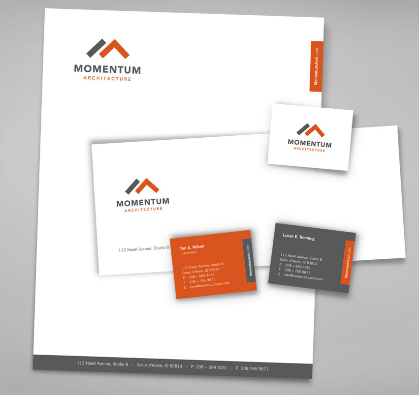
The Ideas: Using a ruler and a T-square, we created letter “M” for Momentum and “A” for Architecture. The T-square = exactness. The subtle and orange “A” is also an arrow with upward momentum. The logo mark has a subtle reference to roof top of houses/buildings.
The typography is clean, strong, and timeless. Gray = experience. Orange = innovative, progressive, and passion for new ideas in architecture and design.
Momentum Architecture logo was recognized with an award from the American Advertising Awards under logo category.