![]()
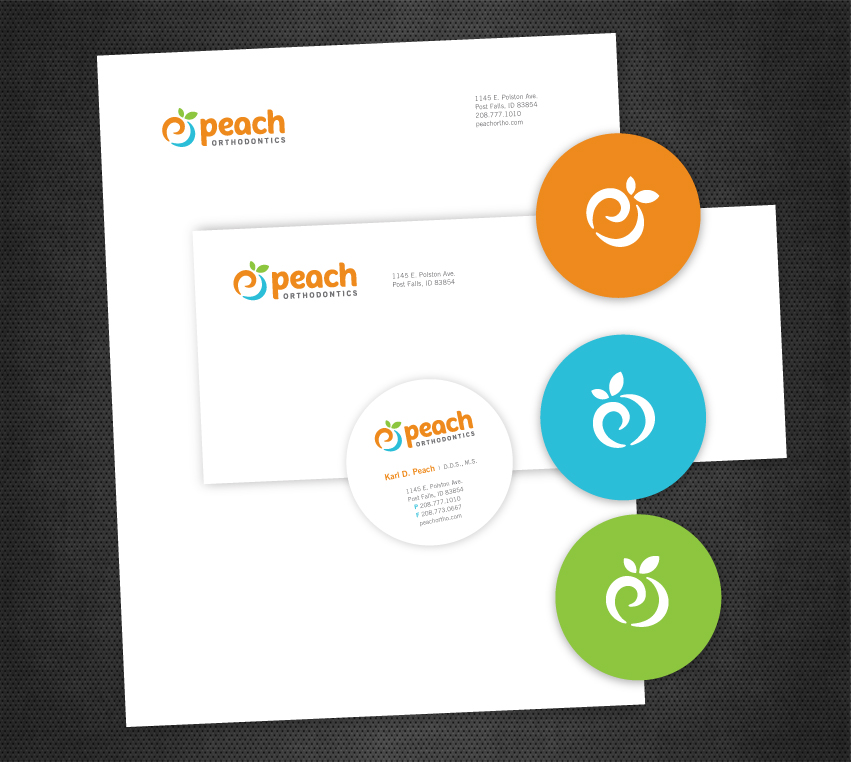
Peach Orthodontics hired Tran Creative to develop a new logo. After about 100 logo concepts, the final chosen logo captures more than just a peach – letter P, refreshing smile and a swirl of enthusiasm, passion and energy of an orthodontics group who truly cares about patients and loves what they do for over 20 years. Peach orange, refreshing aqua blue and nature green solidify and add flavors to the visual identity system.
The new logo will be applied onto all new marketing and communication materials, signage and a new web site.