Congratulations to Snap Fitness International Personal Trainer of the Year, Matt Grogan, gets a new brand identity designed by Tran Creative. The new logo captures “the Power” in your hand, the classic & deeply rooted kettlebell. Together they form letter M & G. The success of each person’s journey to healthy living, fitness, competition lies within themselves. How badly do you want it?
Work
Coeur OBGYN
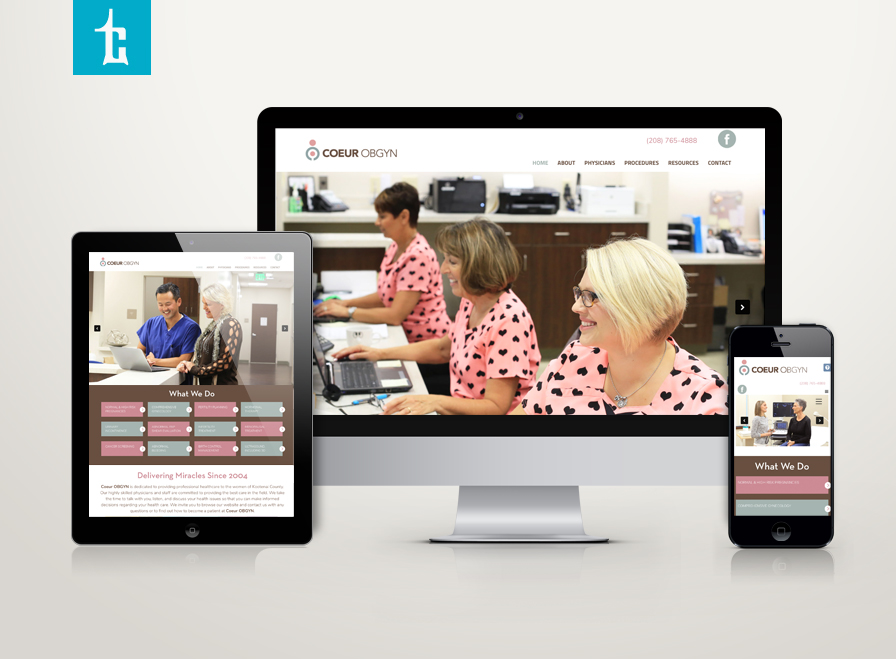
Henneberg & Kim OBGYN is expanding (no pun intended). We’d like to introduce COEUR OBGYN – a new name that encompasses a growing team of 6, soon to be 7 providers with exceptional nurses and staff. The name “COEUR” was chosen because it means “heart” – a reflection of love and heart that the COEUR team have for this specialty and all of their wonderful patients.
The logo represents a woman embracing her anatomy and a mother holding her child in her womb.
Thank you for checking it out: www.coeurobgyn.com
Coeur d’Alene Marathon Web Site
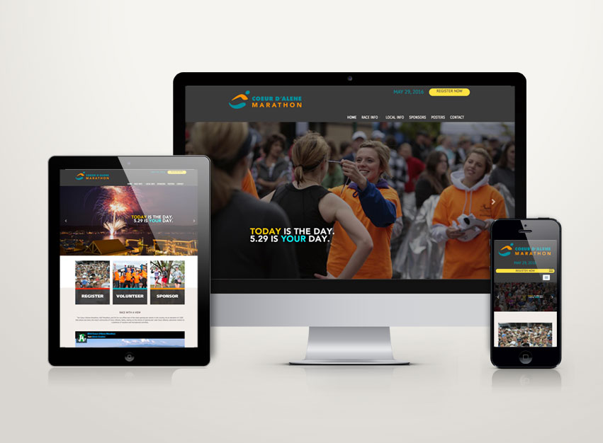
Tran Creative is happy to launch a new & responsive web site for Coeur d’Alene Marathon. 2015 & 2016 Posters we designed for CDA Marathon won back to back American Advertising Awards. With attendance at record high in 2015, we’re excited for May 29, 2016. Who’s excited to RUN? www.cdamarathon.com
HMS Healthcare Monitoring Systems
Tunstall America, headquarters in New York, has hired Tran Creative to provide branding services for one of their companies. HMS | Healthcare Monitoring Services specializes in personal emergency response systems and home medical equipments. After an extensive process in visual audits, over a hundred logo concepts, brand positioning… the final chosen logo captures 4 alert signals, network, connectivity, data. Together, they form a healthcare cross in the negative space. The symmetrical alignment reinforces stability and experience in healthcare. Red is for alert signals. Blue is for healthcare. The new logo will be applied on all corporate print materials and a new and responsive web site launching soon.
Triathlon Arts
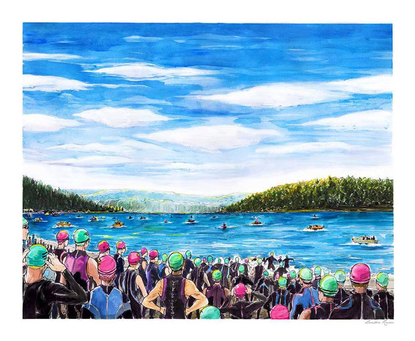
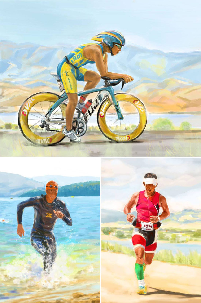
Triathlon Art is for people who love sport arts, especially triathlon. We create varieties of work based on unique art styles. Landon Ruan, BFA in illustration, painted these swim bike run pieces for Ben, Owner and Creative Director of Tran Creative.
Art by Triathlon Arts. Get your posters at: www.TriathlonArts.com
VisiPipe
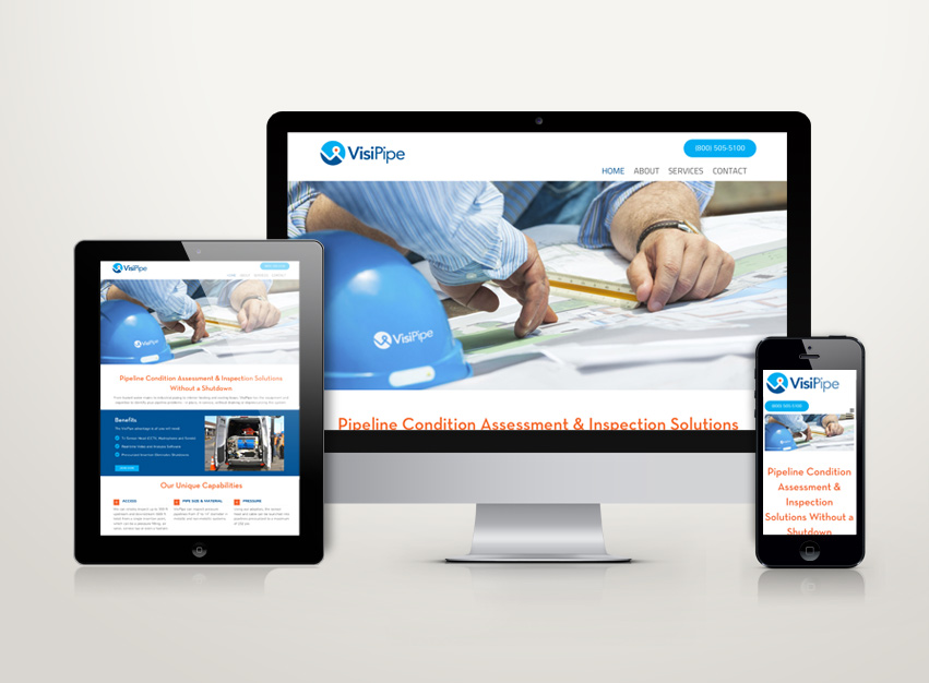
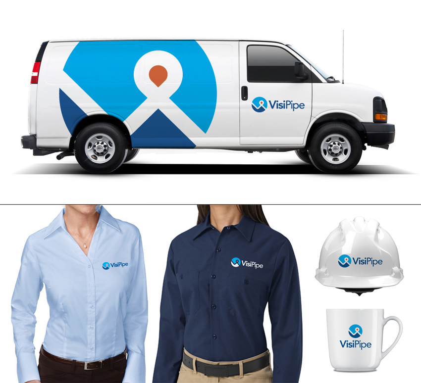
VisiPipe has hired Tran Creative to provide branding services including a new logo. VisiPipe works with cities, engineering firms in the Pacific Northwest to provide asset management for pipes and infrastructure using state-of-the-art technology involving sound, camera and recorder under pressurized systems.
After extensive research and about 100 logo concepts, the final chosen logo captures letters V, P, pipe, city grid, floor plan, identify marker. Blue is for experience, water. Orange is for innovation, problem solving and finding solutions.
See the new site: www.visipipe.com
Peach Orthodontics
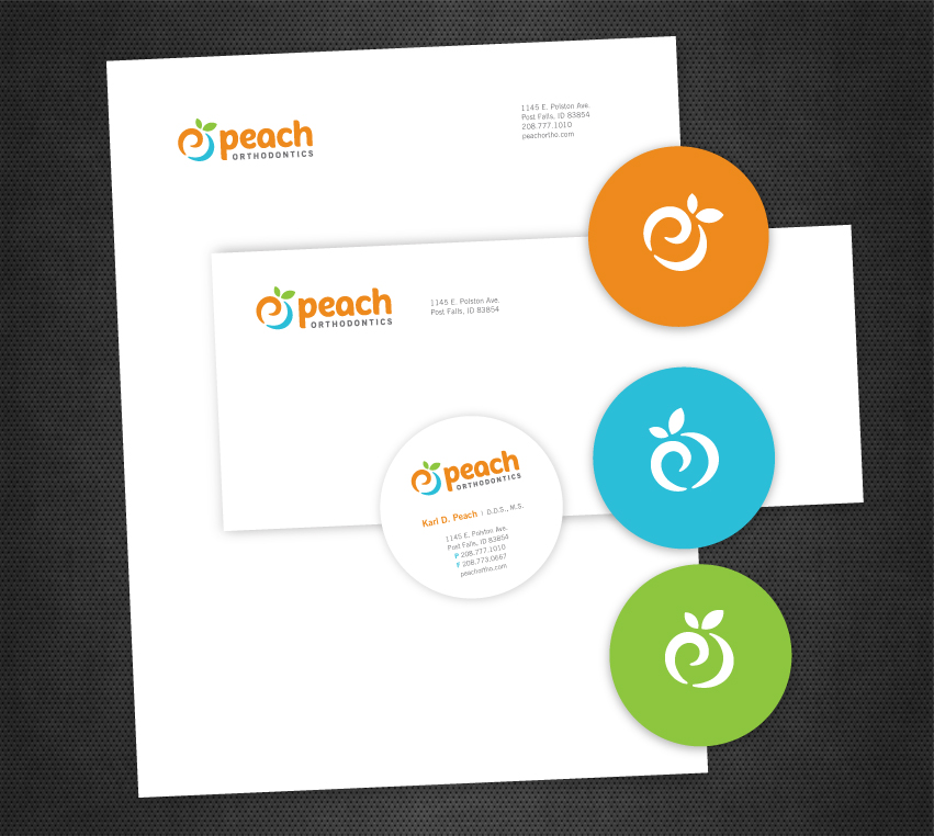
Peach Orthodontics hired Tran Creative to develop a new logo. After about 100 logo concepts, the final chosen logo captures more than just a peach – letter P, refreshing smile and a swirl of enthusiasm, passion and energy of an orthodontics group who truly cares about patients and loves what they do for over 20 years. Peach orange, refreshing aqua blue and nature green solidify and add flavors to the visual identity system.
The new logo will be applied onto all new marketing and communication materials, signage and a new web site.
Rock City Grill
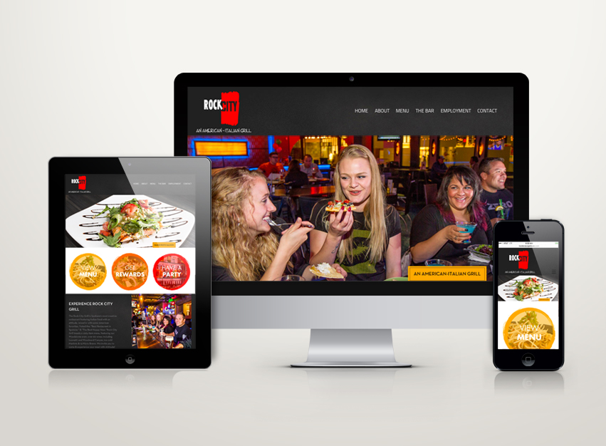
Rock City Grill, an iconic restaurant located at River Park Square in Spokane, has hired Tran Creative to create a new and responsive website to show and tell their story. Thank you for checking it out: www.rockcitygrill.com
Spokane Club
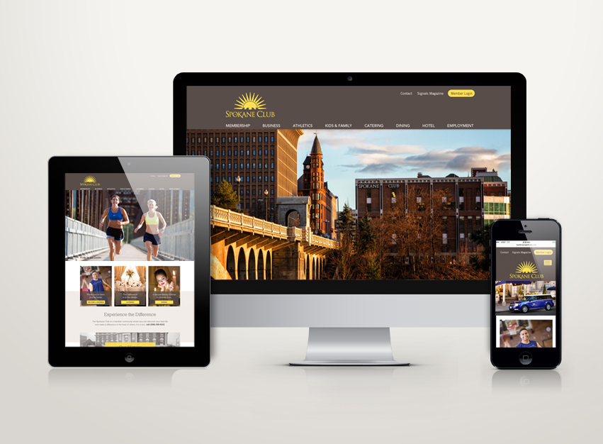
Spokane Club has hired Tran Creative to create a new and responsive website to show and tell their story. Thank you for checking it out: www.spokaneclub.org
Marksman Armory
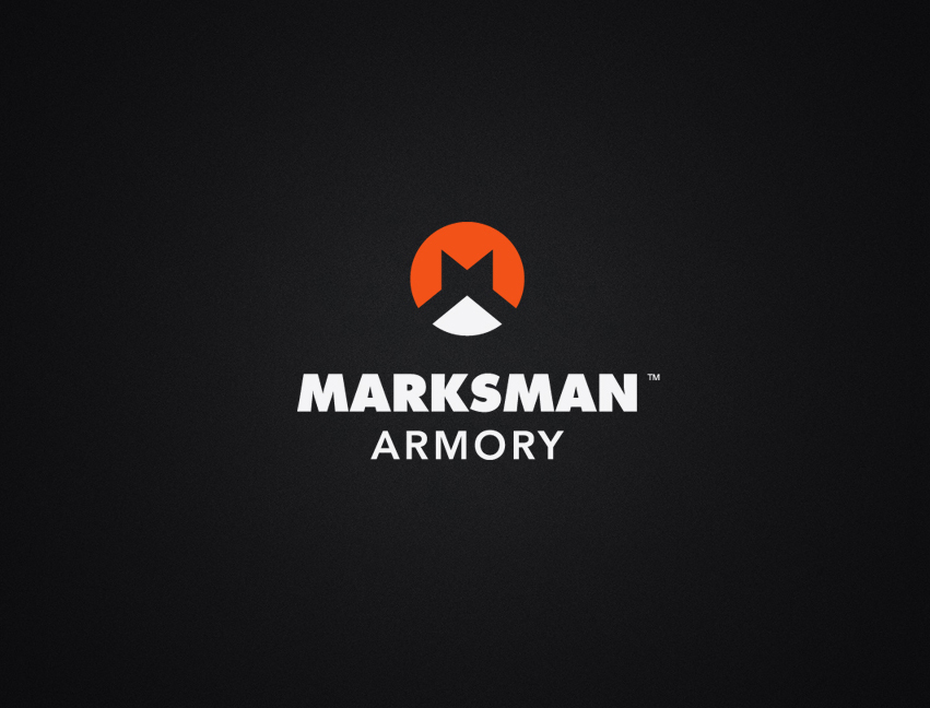
Marksman Armory, a firearms & gears company, has hired Tran Creative to provide branding services including a new logo development. After research and about 100 logo concepts, the new chosen logo, in 2 simple shapes, captures letter “M” in the center as “the Mark”. The round shape of the logo inspired by barrel, back side of a bullet, target. The bottom white shape signifies scanning and range of target. The pointy edges imply outdoors, hunting mountain range.
The new logo will be applied onto all marketing collateral including a new and responsive web site.
