![]()
12K’s of Christmas RUN is coming to Coeur d’Alene this winter. Announcement will be made soon… Who’s excited to RUN with Santa, his elves and reindeer?

![]()
12K’s of Christmas RUN is coming to Coeur d’Alene this winter. Announcement will be made soon… Who’s excited to RUN with Santa, his elves and reindeer?
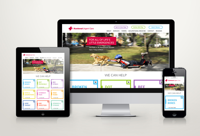

Kootenai Urgent Care has 3 clinics in CDA, Hayden and Post Falls. KUC has hired Tran Creative to create a fresh new site. We want to focus more on lifestyle rather than the clinical side of urgent care. People can live life, do what they love. When they get hurt with minor injuries, come see KUC. The new site is responsive to mobile devices. www.kootenaiurgentcare.com
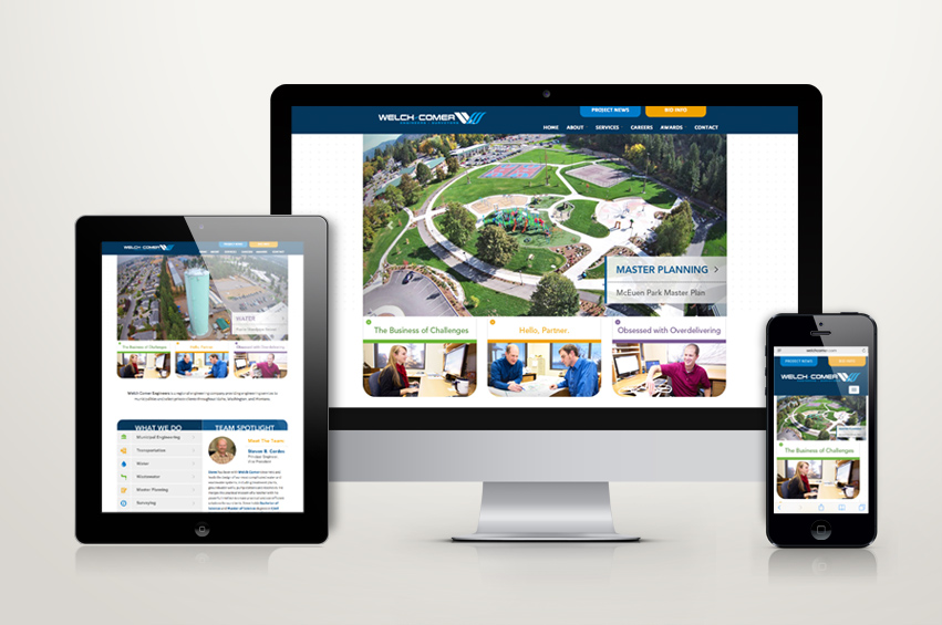

Founded in 1979, Welch Comer Engineers has grown from a 2-person office to nearly 30 employees. WC has hired Tran Creative to create a fresh new web site for their firm. The new site is responsive to mobile devices. Thank you for checking it out: www.WelchComer.com
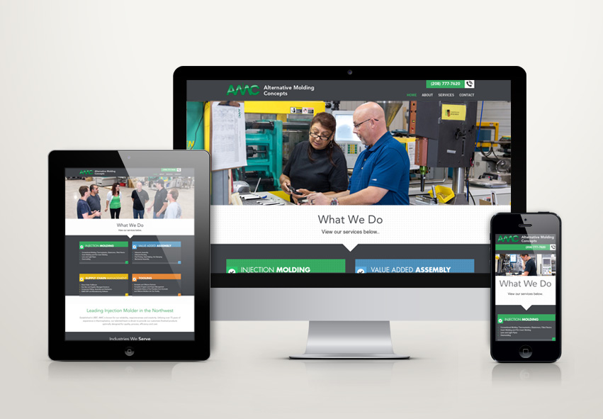

Established in 2007, Alternative Molding Concepts (AMC) is the leading injection molder in the Northwest. AMC has hired Tran Creative to create a new web site to help tell their story. The new site is responsive to mobile devices and gives AMC staff the ability to make updates easily.
SEE the NEW SITE: www.amconcepts-inc.com
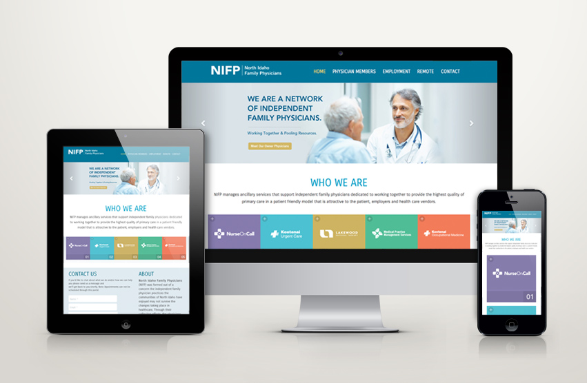

We just launched a new and responsive web site for NIFP (North Idaho Family Physicians), a network of physicians and clinics. NIFP is also HIRING, especially in medical billing/coding. Pass it on if you know of someone looking for work: www.nifp.com

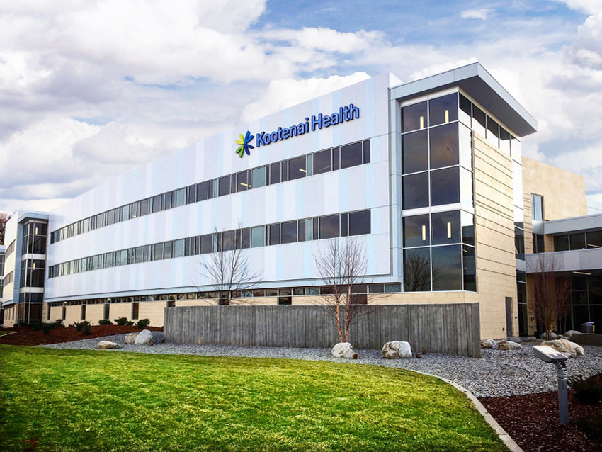
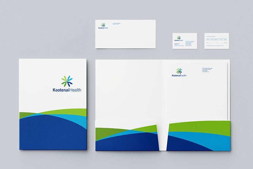
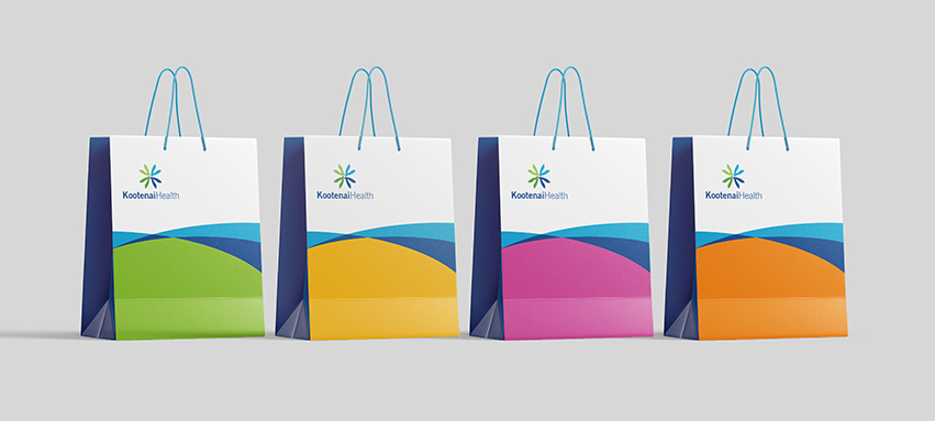
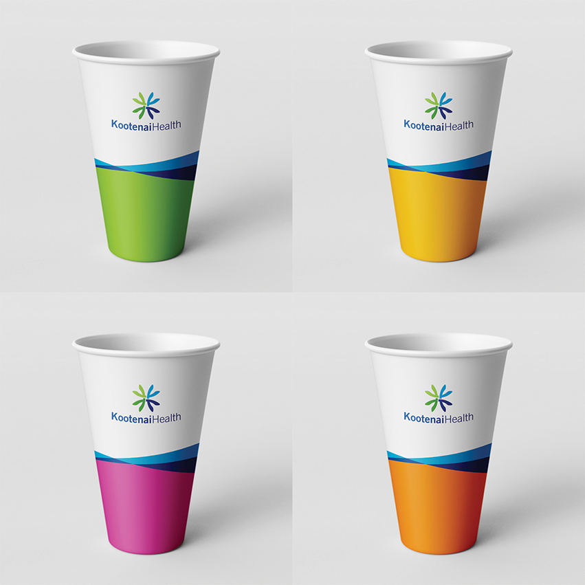
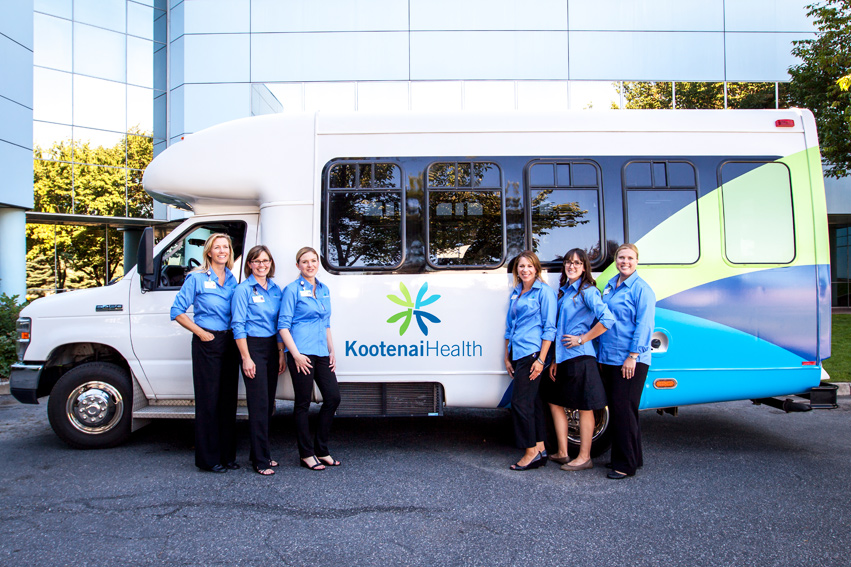
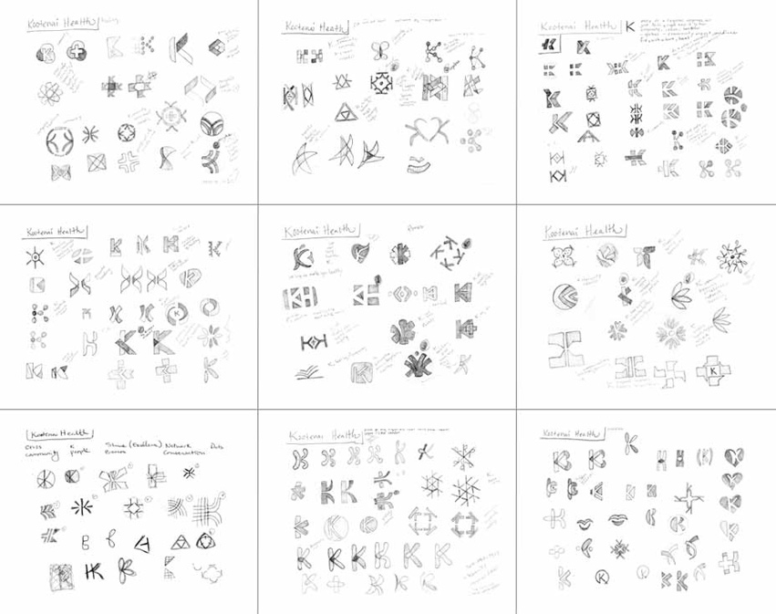
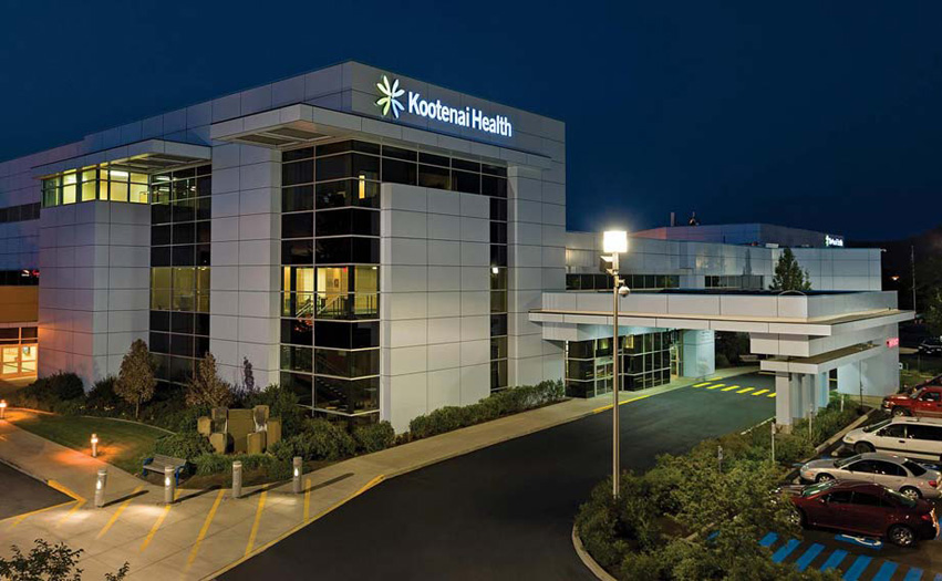
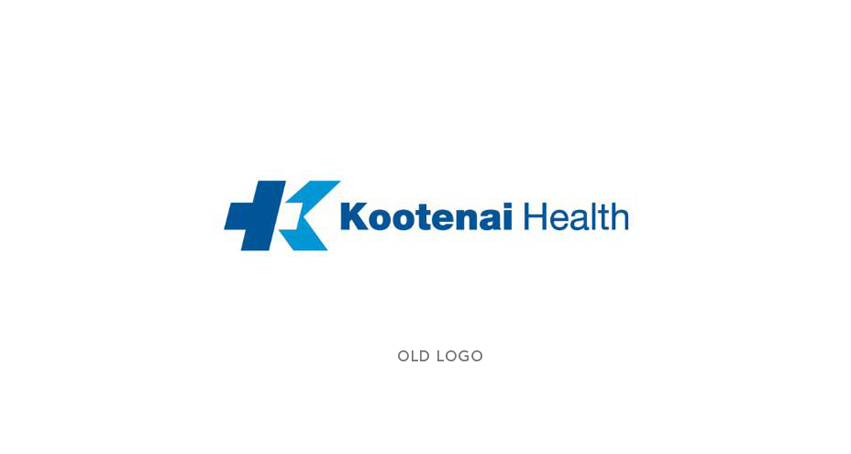
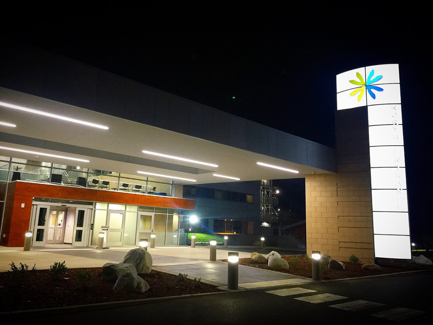
With nearly 3,000 employees and continuous growth, Kootenai Health is one of the largest organizations in the Pacific Northwest region. Tran Creative was hired to rebrand the company. After about 1 year of comprehensive planning, research, focus groups, and hundreds of logo design explorations and revisions… together with Kootenai Health, we would like to introduce to you the fresh new look for Kootenai Health.
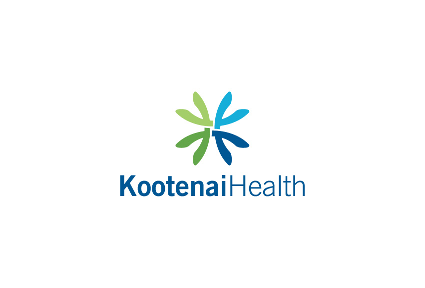
To update a brand like Kootenai Health’s requires comprehensive work and respect for the equity of the brand. We wanted to value Kootenai’s history (since 1960’s) but also visually represent who they are today. Visual audits of other health care organizations’ logos showed similar themes and colors. We wanted to develop a logo that represented Kootenai Health as: friendly, compassionate, reaching out and growing.
The new logo, “the Spark”, features the “K” and captures the spirit of service, health and compassionate care. It reaches up to set high standards and reaches down to lift and provide compassionate care. The new logo also conveys teamwork – weaving together. The balance symmetry of the logo conveys stability, experience, consistency, and growth for the future.
The Kootenai Blue is kept to preserve history. The fresh new Green provides hope and healing.
Kootenai Health’s vision is to be a comprehensive regional medical center by 2020. Visually, this new mark will take them there.
To learn more, visit: www.kootenaihealth.org
For about 1 year, Tran Creative worked with Kootenai Health communications and leadership team on research, focus groups, interviews. Only after we’ve gathered these important data, we’ve moved forward on the design process. We’ve explored hundreds of logo concepts in many different directions. Once the “Spark” direction was chosen, the Kootenai Health mark began to take shape.
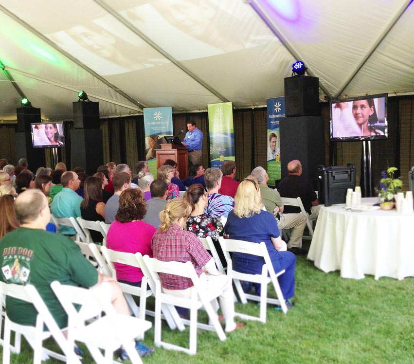
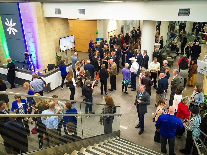
Tran Creative was hired to rebrand Kootenai Health. We got to work with this amazing marketing & communications team, went through an extensive process of about one year from start to launch of the new brand: research, focus groups, interviews, concept, design, presentations… Last week, at the Grand Opening of the $57 million expansion, we had a chance to catch up, a reunion to reflect and marvel… A good friend at this event reminded us, “Years from now, we tell our kids and their kids that we got to work on this legacy project.” Wow!


![]()
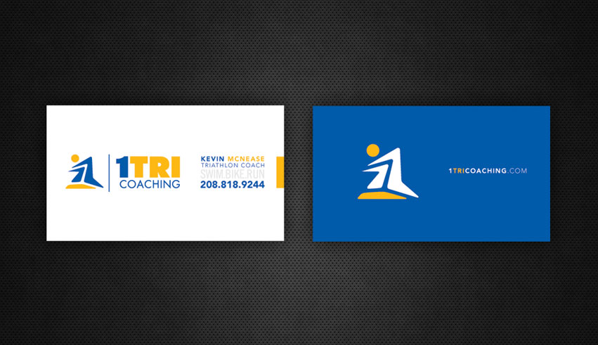
1TRI Coaching hired Tran Creative to provide them with a new logo. We also helped with the naming. 1TRI has many meanings: one on one coaching, one vs. oneself (overcoming self-doubt), becoming #1 (the best you could possible be). Research shows that there are many triathlon related logos with 3 swim bike run figures. We want to give 1TRI a unique look that would make them unique, creative, and stand apart from the norm.
After many logo variations, designers at Tran Creative crafted 3 simple shapes to form #1. The stylization conveys: speed, movement, athlete body in motion, mountain peak of the Coeur d’Alene region, and the challenging yet rewarding road to success.
![]()
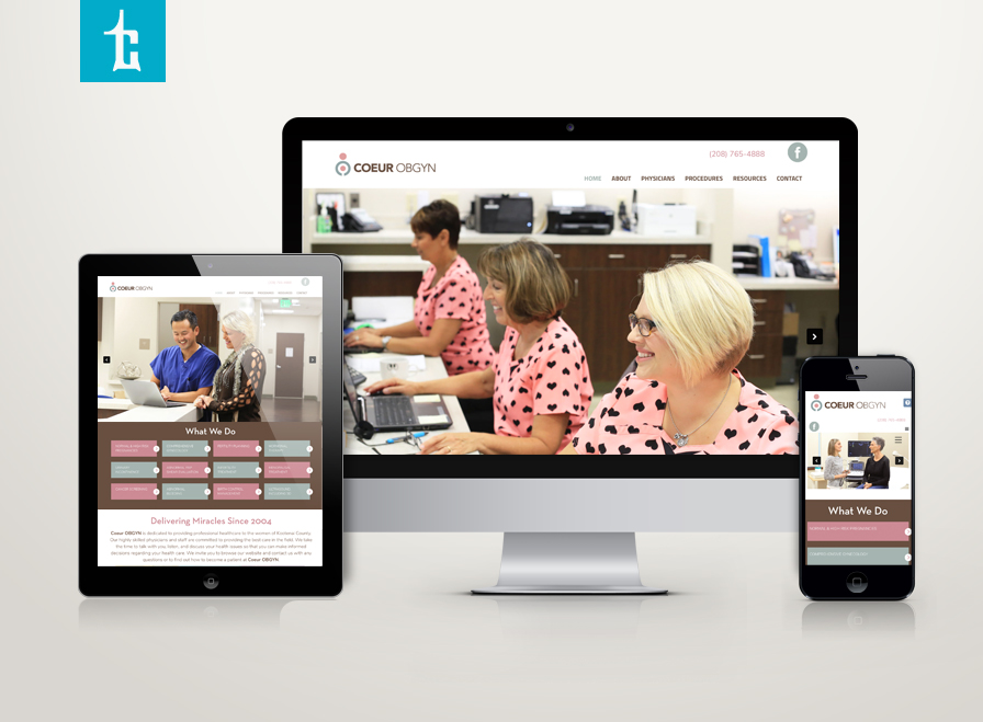
Henneberg & Kim OBGYN is expanding (no pun intended). We’d like to introduce COEUR OBGYN – a new name that encompasses a growing team of 6, soon to be 7 providers with exceptional nurses and staff. The name “COEUR” was chosen because it means “heart” – a reflection of love and heart that the COEUR team have for this specialty and all of their wonderful patients.
The logo represents a woman embracing her anatomy and a mother holding her child in her womb.
View the web site. www.CoeurOBGYN.com
![]()
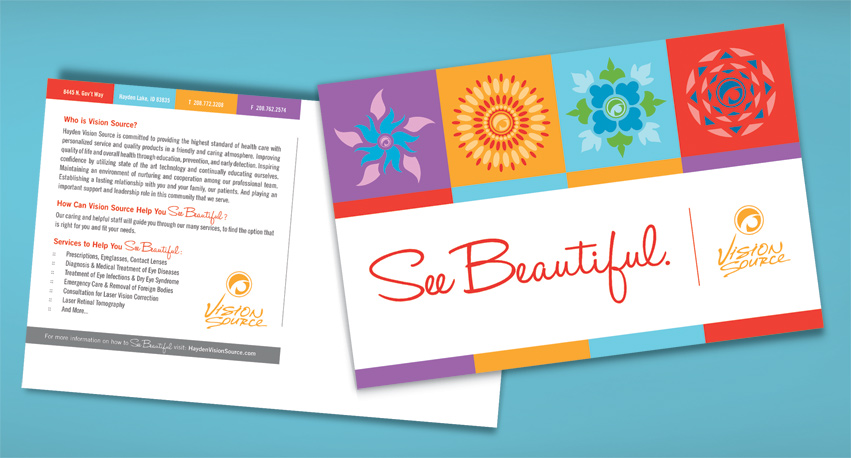
Tran Creative was hired to create a fresh marketing campaign for Hayden Vision Source, a group of eye physicians in Hayden, Idaho.
We came up with “SEE BEAUTIFUL” and incorporated Hayden Vision Source existing logo into the designs. This campaign was launched throughout social media, web, and local events.
What does it mean to SEE BEAUTIFUL? It is the ability to have clear vision to enjoy every aspect of life: “watching my daughter perform her 1st piano concert”, “painting a portrait of my wife for our 50th wedding anniversary”, …
To learn more about how you could SEE BEAUTIFUL, please visit: www.facebook.com/HaydenVisionSource