Twin Towers Commemorative 5K

Twin_Towers_commemorative_5K_run_logo_design_tran_creative_graphic_design_coeur_dAlene_Idaho

Tran Creative was tasked with creating a new Logo for this great charity 5K event. Run in Memory. Live with Honor. This event’s mission is to bring awareness, thanks, and help to FIREFIGHTERS, VETERANS and other first responders. Honoring the memory of the fallen heroes of 9/11 and celebrating the hero in each of us is at the heart of the Twin Towers Commemorative 5K run/walk. To learn more, visit: www.facebook.com/TwinTowersCommemorative5k

WITH Performance

WITH_Performance_wellness_incentive_to_health_logo_design_tran_creative

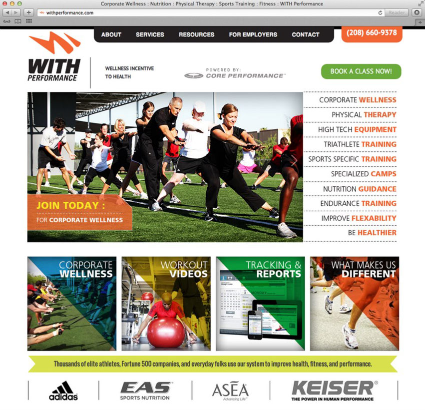
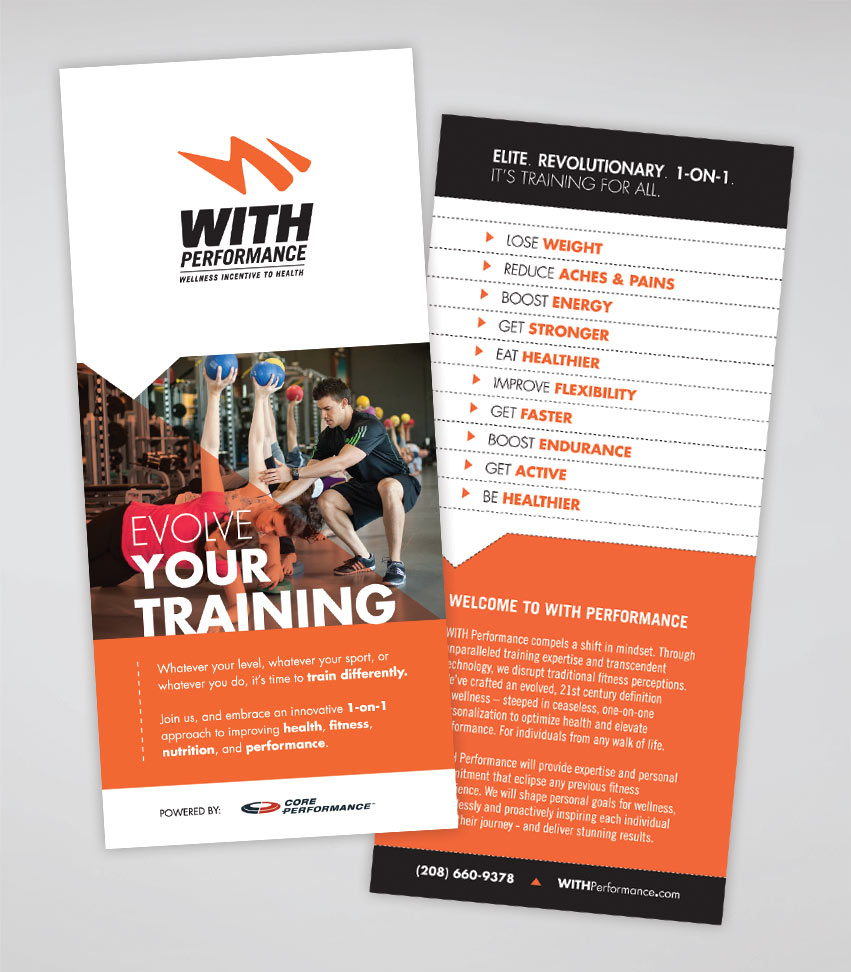
WITH Performance is a state of the art wellness and fitness facility in Coeur d’Alene, Idaho (in Riverstone). The facility is equipped with high tech equipments and technology never before seen in the area. WITH (Wellness Incentive To Health) will provide a proven system that focuses on 4 key areas: Mindset, Nutrition, Movement, and Recovery. Thousands of elite athletes, Fortune 500 companies, and every day folks have used WITH’s system to improve health, fitness and performance. WITH Performance hired Tran Creative to provide them with full branding: Logo, Stationery, Web Site, Marketing, and all Communication Materials.

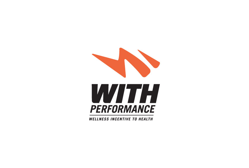
The new logo for WITH carries the letter “W” in the form of a person with forward movement and burst of speed. The new WITH logo conveys speed, performance, wellness, and activeness. The rounded corners of the mark help soften up and make the logo friendly, yet still maintains the aggressive and progressive edge.

See the website: www.withperformance.com


WITH_Performance_wellness_incentive_to_health_website_design_tran_creativewith_performace_rackcard_brochure_design_tran_creative

Pleasant View Surgery Center

Pleasant_View_Surgury_Center_logo_design_tran_creative

Tran Creative was hired to design a new Logo for Pleasant View Surgery Center located in Post Falls, Idaho. Research showed that there were many Pleasant View logos out there. Many of them used leaves, mountains and trees as design elements. We wanted to provide Pleasant View Surgery Center with a unique mark that didn’t blend in with the crowd.

The new logo represents a network of physicians working together. It also conveys nonspecific contour human anatomy. The stylization and colors reflect finesse, intricacy, gentleness and comfort.

The new logo is applied on all communication materials for Pleasant View Surgery Center.

Dave Erickson Media

Dave_Erickson_Media_website_logo_design_tran_creative

Tran Creative was tasked with developing a new visual identity and web site for Dave Erickson Media. The new logo we created for Dave was recently published in Logo Lounge 7: International Identities by Leading Designers. You could check out the book next time you’re at Barnes & Noble.

Dave is a man of many talents: Brand Ambassador Athlete, News Anchor, Videographer, Reporter, Triathlete, and much more… Visit Dave’s website: www.daveericksonmedia.com


Dave_Erickson_Media_logo_design_tran_creative

American Floors and Blinds

AFB_american_floors_and_blinds_website_design_by_tran_creative_coeur_dAlene_idaho

Founded in 1962, AFB is the flooring & window-covering supplier with deep expertise and the largest sales support staff in the industry. AFB has 3 locations in Washington.

AFB hired Tran Creative to develop a new & comprehensive web site. After working with the AFB marketing team since last summer, Tran Creative is please to introduce the new site for AFB, equipped with a robust CMS (Content Management System) that allows AFB staff to update site with ease.
www.American-Drapery.com

Cycle Central

Cycle_Central_logo_design_tran_creative

Cycle Central is a bike shop in Wenatchee, WA. They hired Tran Creative to develop a new brand identity & web site. After many logo variations, we’d like to introduce the new visual identity for Cycle Central. The new logo consists of 4 shapes forming letter “C” in the negative space. We did not want to incorporate any bike specific elements: handle bar, chain, frame, etc. to provide future flexibility for Cycle Central to carry more products than just bikes. However, we stylized the shapes to have elements of cycling: aerodynamic, speed, and movement. Color Orange represents passion for exceptional customer service, energy and love for the sports. Gray stands for progressiveness and stability.

The new logo is applied on variety of applications: race kits, cycle jerseys, sales tags, apparels, signage, and much more.

See the new website: cycle-central.com


Cycle_Central_website_design_tran_creative

Charles Regalado, DDS

Charles_Regalado_DDS_advanced_aethetics_and_restorative_dentistry_logo_design_tran_creative

Charles Regalado, DDS of Spokane Washington has spent more than 20 years researching and developing the best methods for transforming your smile into something beautiful. Through advanced aesthetics and restorative dentistry, Dr. Regalado provides his patients with the smile they have always wanted.

Research shows that most dentistry logos often convey images of the tooth or tooth brush. We wanted to move away from these overused icons and create a more personalized approach that would illustrate Dr. Regalado’s main objective of providing a beautiful, natural smile.

THE EXECUTION

After many logo variations, a new visual identity was born for Charles Regalado, DDS. The chosen logo has a representation of a smile (letter C) and a person lounging in comfort (letter R). Purple conveys the luxurious service patients receive. Refreshing and cleansing Teal is for the way your mouth will feel after a visit with Charles Regalado, DDS.


Charles_Regalado_stationery_design_business_card_graphic_design_tran_creative_coeur_dAlene_idaho

Annie Warner Pro Athlete

Annie_Warner_Pro_Athlete_logo_design_tran_creative

Annie Warner is a professional triathlete and swim coach with an impressive racing record, including multiple 1st place finishes. Annie tasked Tran Creative with developing a visual identity that would allow her to extend her brand into a wider stage.

After many logo variations, we narrowed down to 3 logos and asked the audience to help Annie select one. The chosen final logo carries initials A & W. The design stylization of letter “A” conveys movement (arm, leg). Letter “W” signifies water, an attribute to Annie’s background in collegiate swimming. Green and Blue represent the Pacific NW colors. Green is also for easy going, and friendly personality. Blue is for freshness and water.

With this fresh new look, Annie Warner is now armed with a solid visual representation to be recognized on an international level as an elite athlete.

Vann Companies

Vann_Companies_logo_design_tran_creative

Vann Companies is a national, government-contracted Engineering & Contracting firm with headquarters in Minneapolis. They are growing and evolving as a company and hired Tran Creative to provide branding services.

After several months and hundreds of logo variations, the chosen logo was launched in the spring of 2013 along with other print collaterals, new web site, and much more. The new logo is executed with simplicity and boldness. It has 2 shapes converging and forming letter V. The 2 shapes represent the 2 main areas of services in engineering and contracting. The rounded corners signify friendliness and approachability. Blue stands for experience and stability. Green conveys environmental friendliness and fresh ideas.

EXcel

EXcel_labels_package_design_label_graphic_design_tran_creative

EXcel Vitamin Packaging Design

EXcel_labels_orange_pink_package_design_label_graphic_design_tran_creative EXcel_labels_purple_yellow_package_design_label_graphic_design_tran_creative

Get In Touch

Interested in working with us?
We would love to help TELL YOUR STORY.

Logo

Create an identity to break the generic mold.

Web

Provide sleek and modern resources for your clients.

Marketing

Tell your story and increase your revenue.