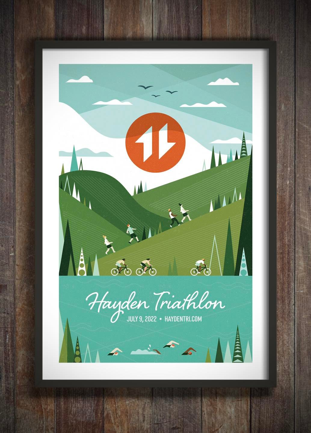
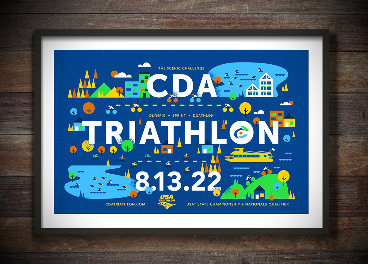
Tran Creative creates the new design for the 2022 CDA Triathlon. This year, CDA will be the destination for State Championship and National Qualifier. Custom medals designs will be featured soon.
REGISTER: cdatriathlon.com
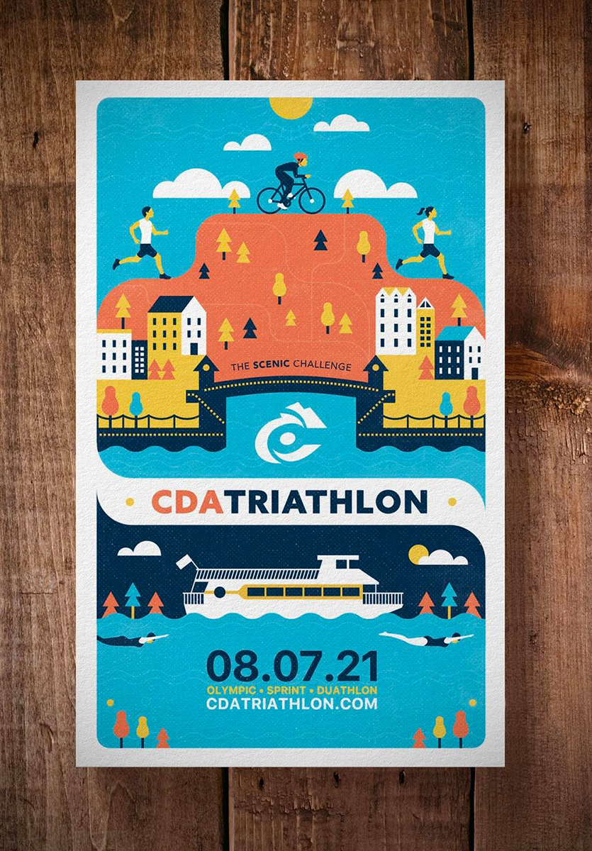
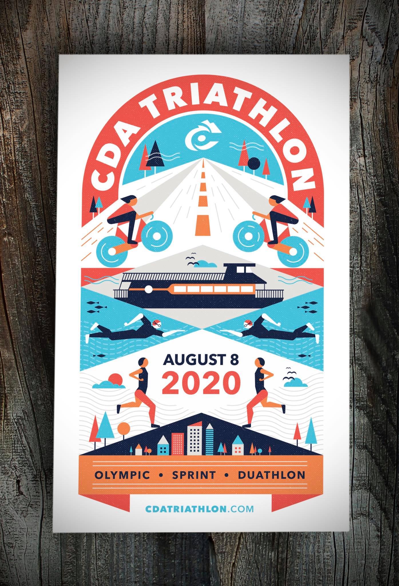
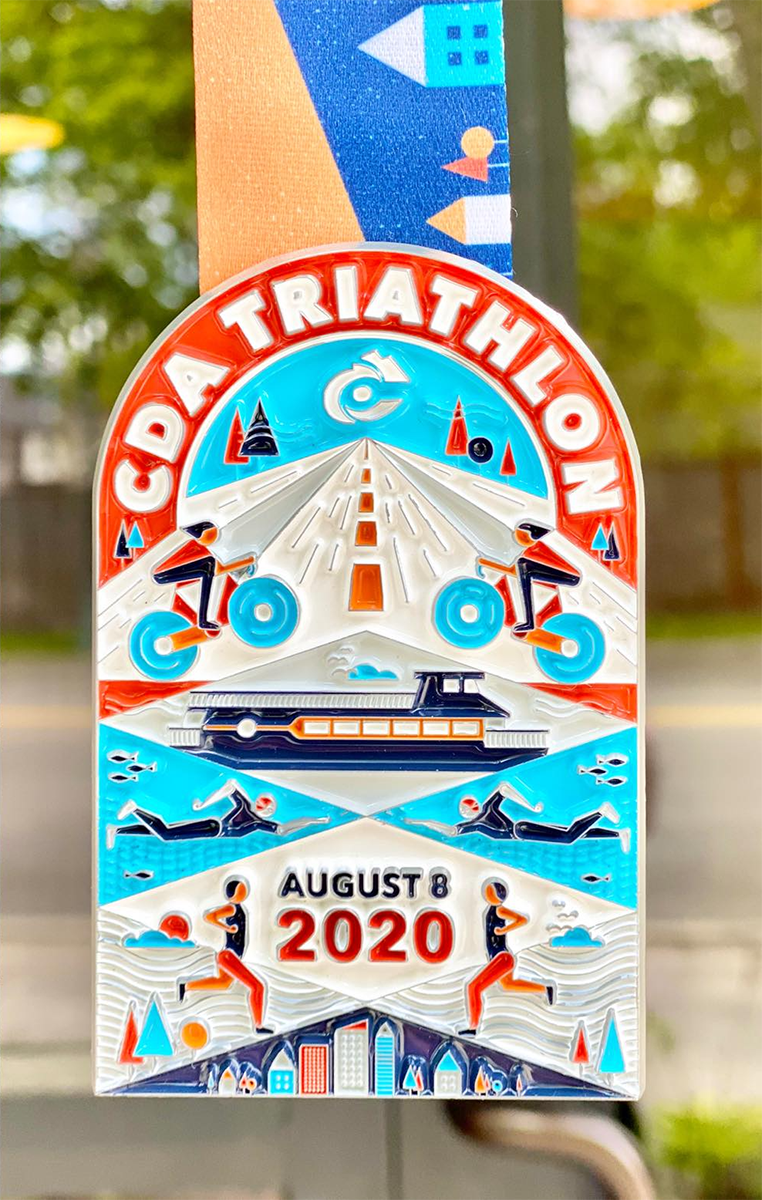
Tran Creative is excited to team up with the 2020 Coeur d’Alene Triathlon for epic swim bike run. For the 2nd year, CDA Triathlon will have a “deep water start” for its Olympic swim. Swimmers will board the cruise ship, which will take them out 1.5 km to transfer to the staging barge. From the barge, swimmers will enter the water to wait their turn at starting buoys for a 1500 meter swim to city beach. Who’s in?
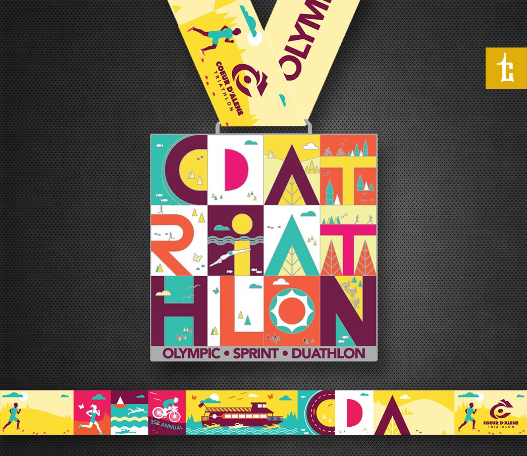
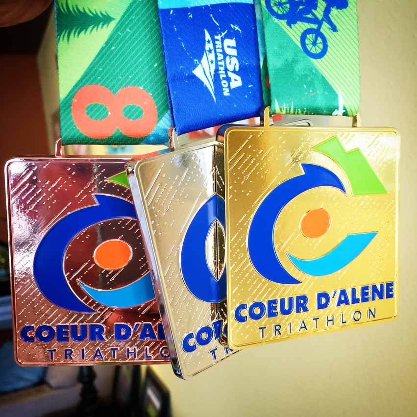
NEW DESIGN – 1st look at the all-new 2019 Coeur d’Alene Triathlon & Duathlon custom medal design. Each letter color is uniquely crafted with durable stained glass to magnify your finish. WHO wants one? Which distance will you do? WHO’s excited for the boat?

NEW DESIGN – Tran Creative is excited to team up with Coeur d’Alene Triathlon & Duathlon (under new ownership) for epic SWIM BIKE RUN racing. See you at the start line.
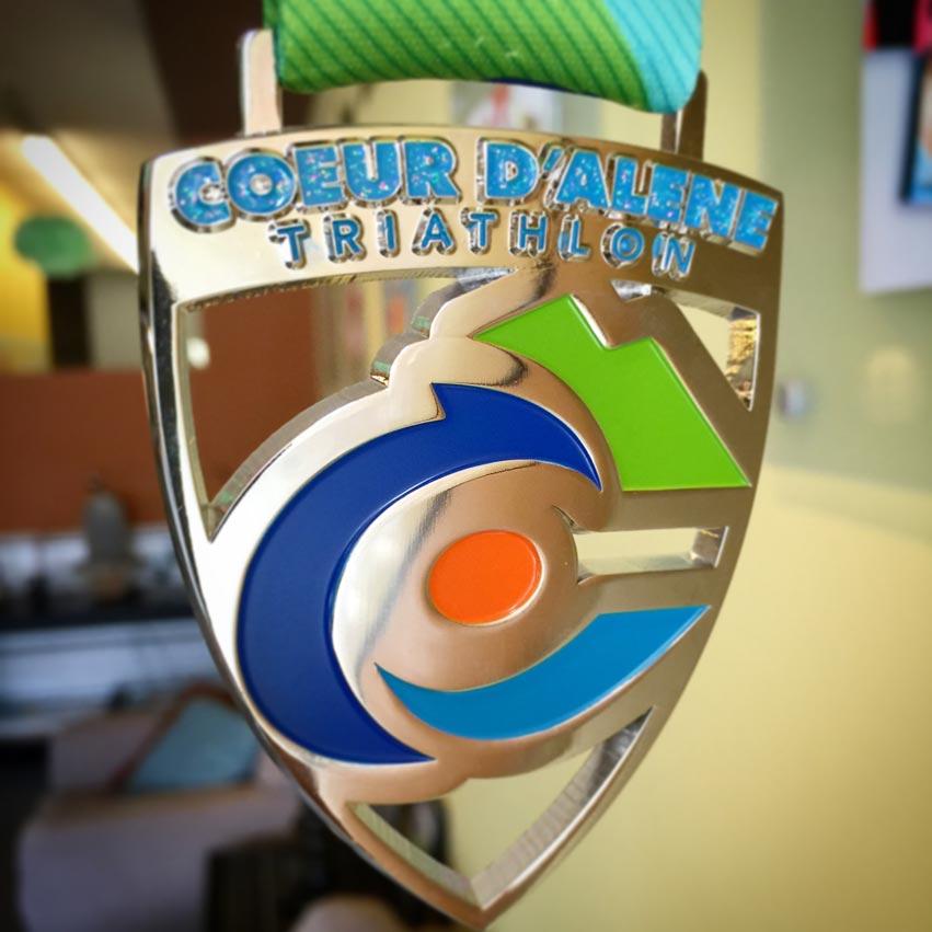
NEW DESIGN – #TranCreative is teaming up with Coeur d’Alene Triathlon for an epic day of SWIM BIKE RUN in downtown Coeur d’Alene. Here is the 1st look at the all new custom medal design with die cut, stained glass. Who wants one?

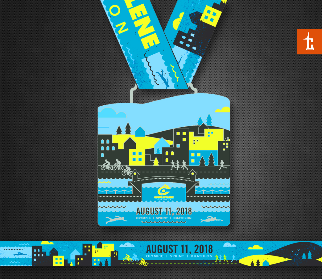
NEW DESIGN – #TranCreative is teaming up with Coeur d’Alene Triathlon for an epic day of SWIM BIKE RUN in downtown Coeur d’Alene.
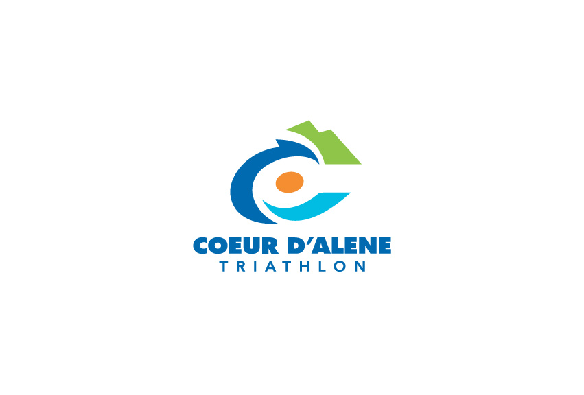
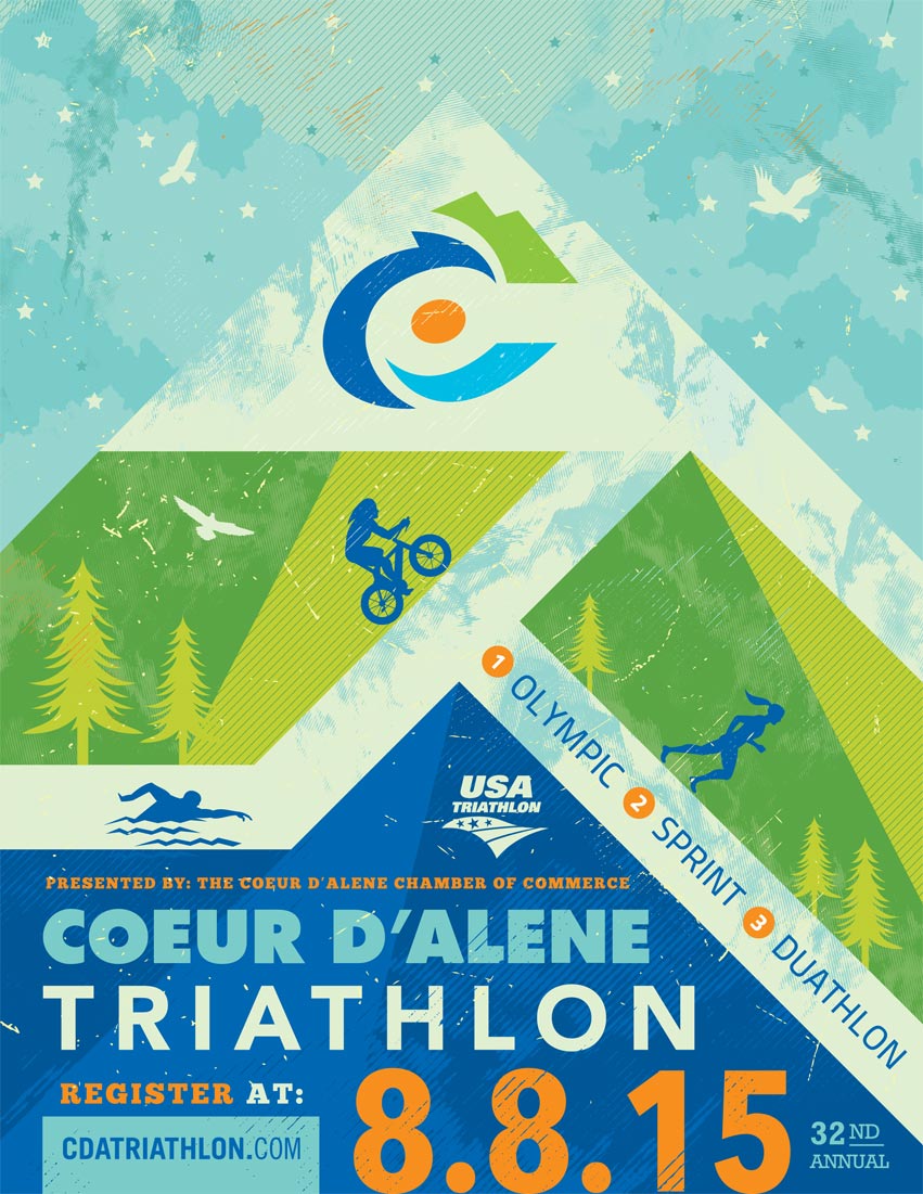
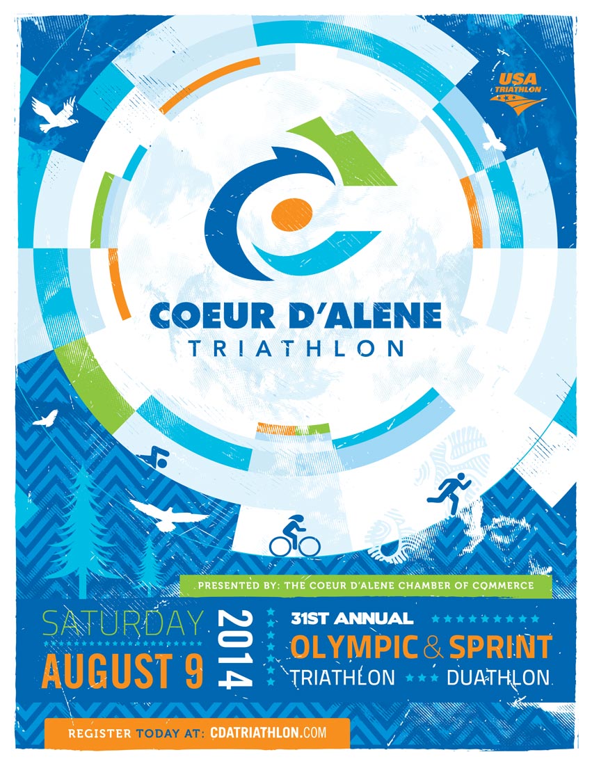
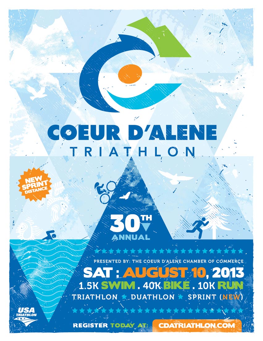
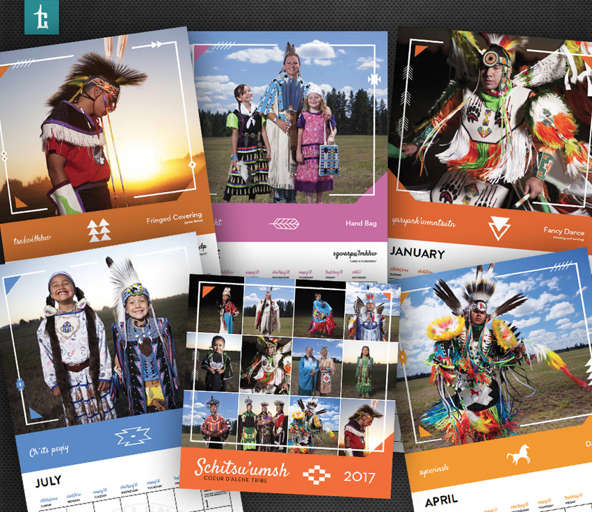
2015 marks the 32th anniversary for one of the premiere triathlons in the Inland Northwest – Coeur d’Alene Triathlon & Duathlon. Event organizers hired Tran Creative to create a fresh new look that communicates: scenic, progressiveness, and quality in such a historic annual sporting event.
After much research and many logo variations, the chosen final logo conveys speed, movement, scenic and simple enough to recognize and withstand the test of time for years to come. Research showed that there were many triathlon logos with typical SWIM BIKE RUN figures. We wanted CdA Tri logo to be unique in its own ways. Our designers crafted a “dynamic” letter “C”. The new logo also conveys speed, movement, active, bike wheel, athlete, water, wave, and mountain top. In doing so, we captured both aspects of the race: athlete & magnificient landscape of Lake Coeur d’Alene. Color Blue = water, lake. Green = nature, fresh. Orange is symbolic of Energy, Speed, and Passionate Commitment from organizers to bring the best possible race each year to participants. To learn more about the race, visit: www.CdATriathlon.com