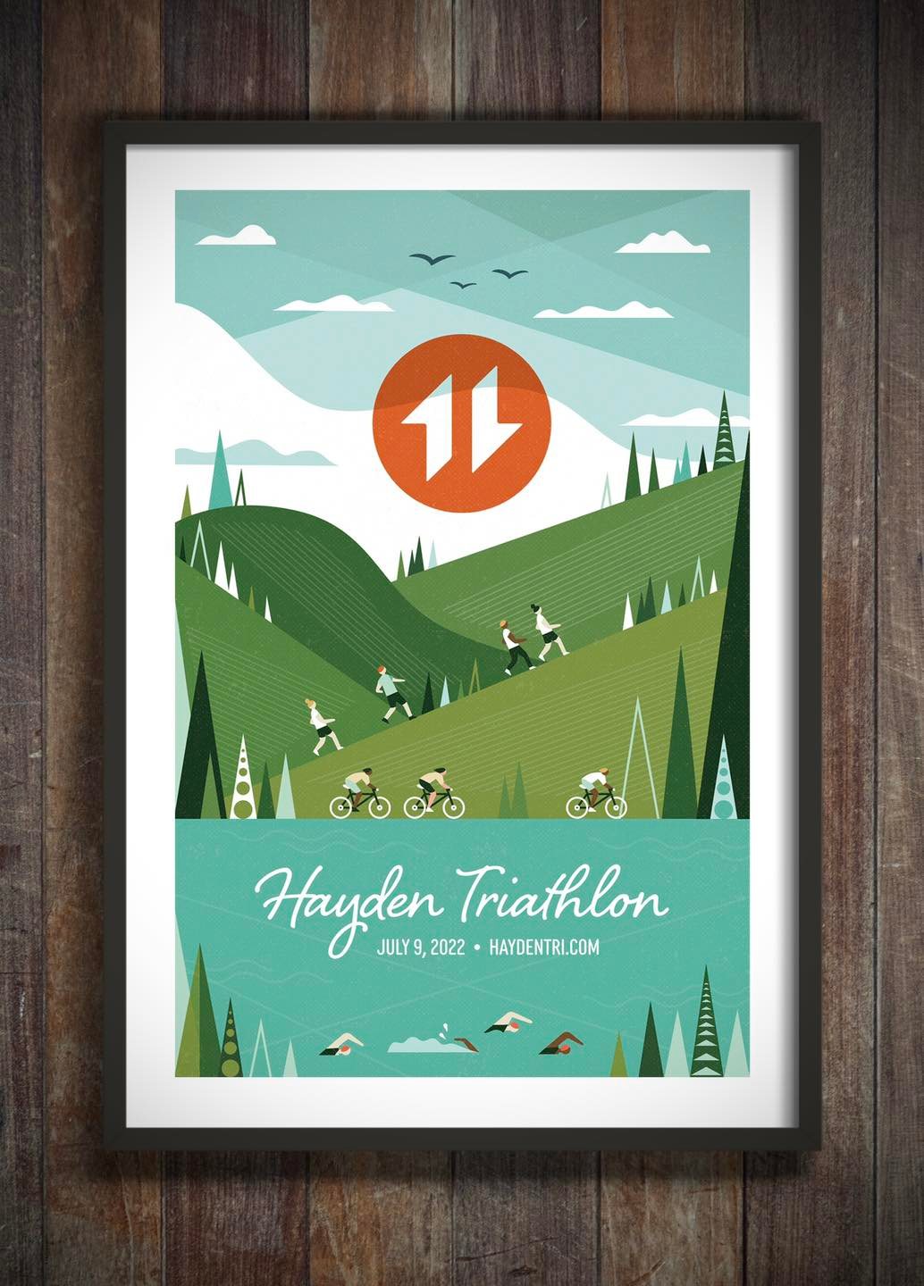
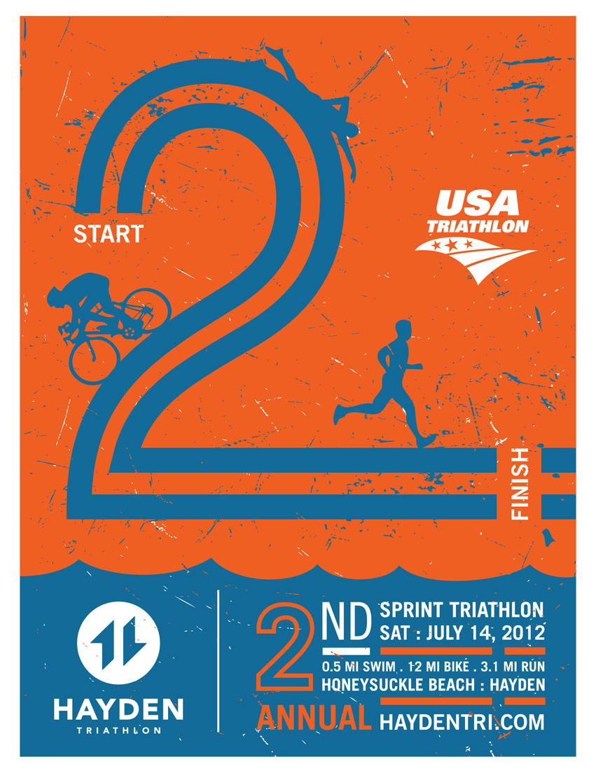
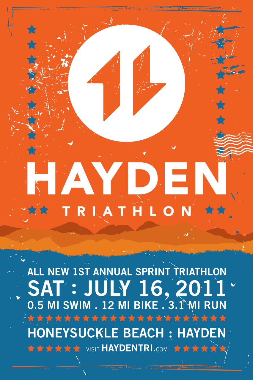
Hayden View Triathlon started in the summer of 2008. After 3 years of establishment, its brand has taken a toll. Series of events in 2010 have led to a substantial drop in brand equity. Many people enjoyed the beautiful race venue, but wondered about the uncertainty of the brand. Will it still go on…?
Tran Creative has revitalized the brand.
The Strategy:
A new group of motivated & community minded individuals have joined together to reorganize the event. We decided to give the event a new name, a shorter but more direct version from the original name. Since race organizers will be working closely with the City of Hayden, we view it best to call it the All-New Hayden Triathlon.
We wanted to start building brand equity for Hayden. Therefore, the word “View” was dropped because it now signifies a whole new beginning. Obviously, the venue is known for its majestic lake and scenic backdrop of Hayden Lake. “View” is no longer necessary.
The Ideas + Execution:
Research shows that most triathlon logos often have the 3 swim/bike/run figures. We wanted to be professional but unique and different than the rest.
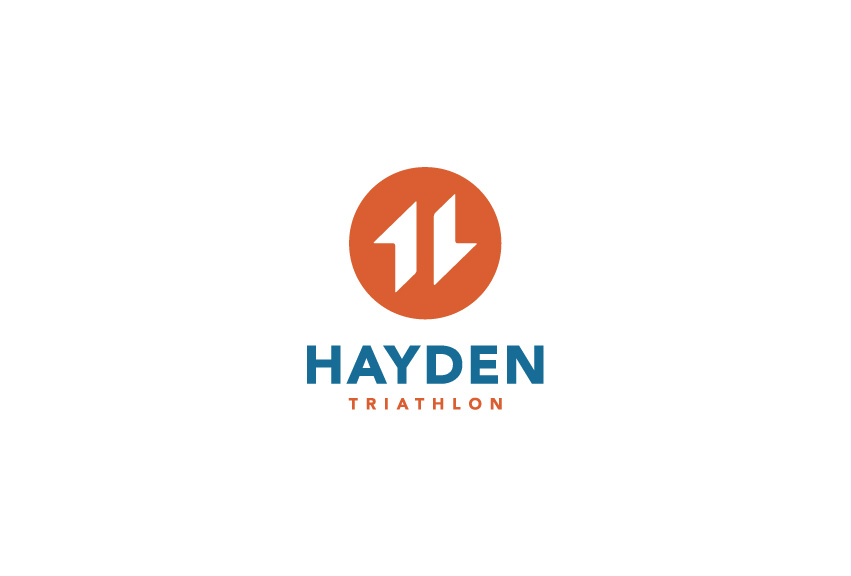
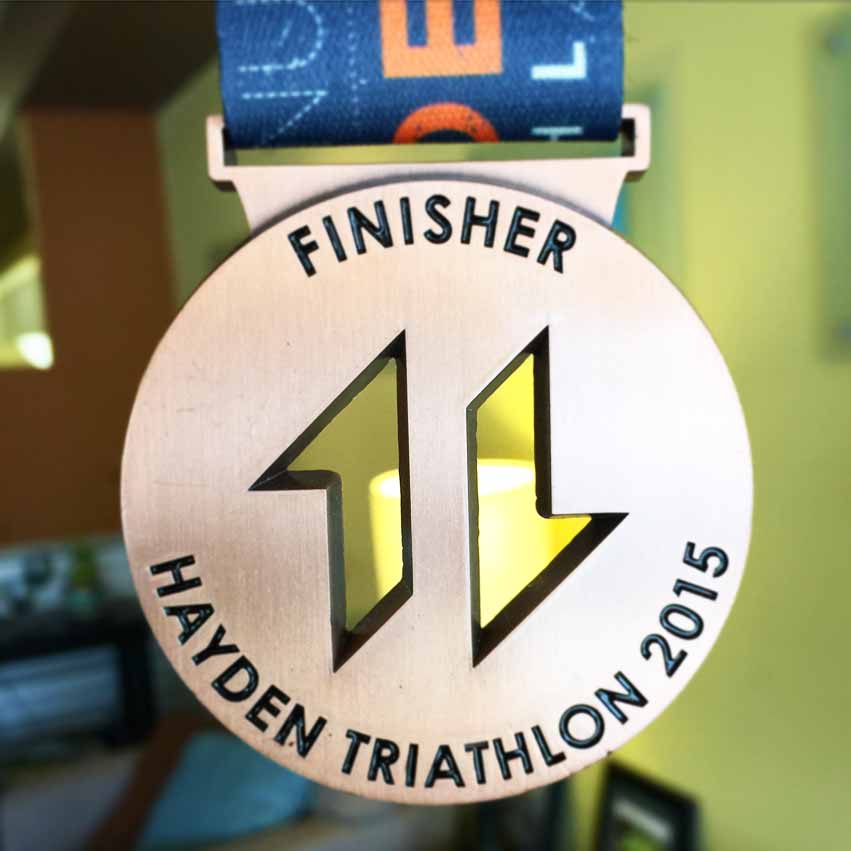
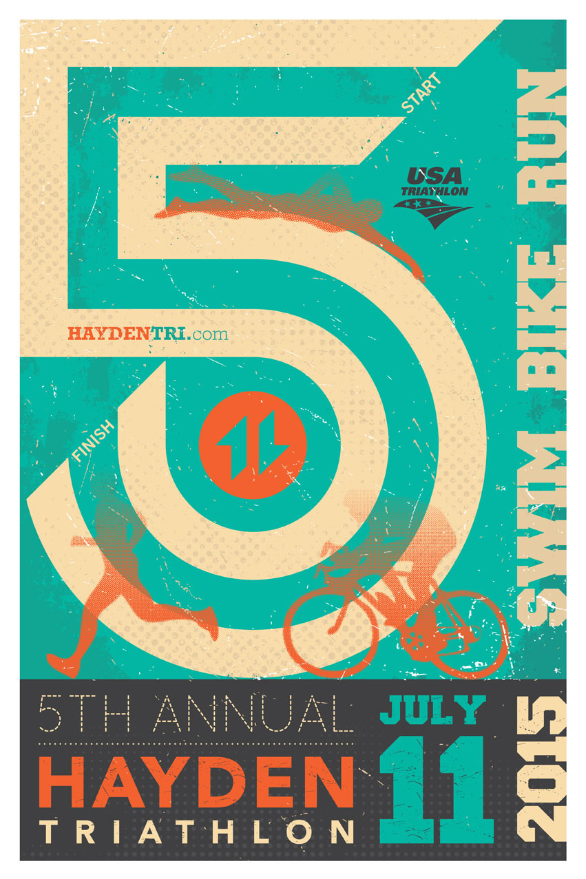
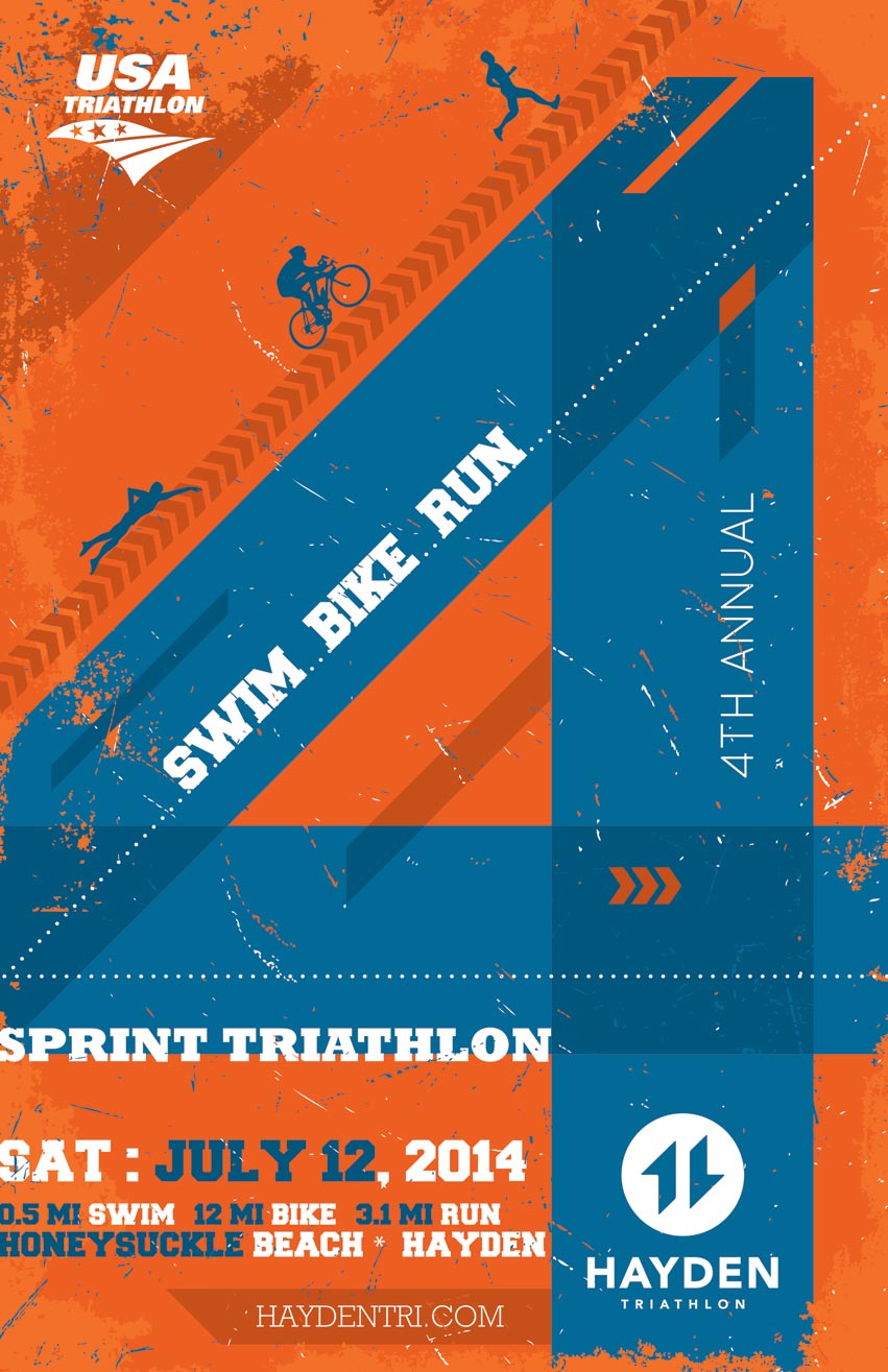
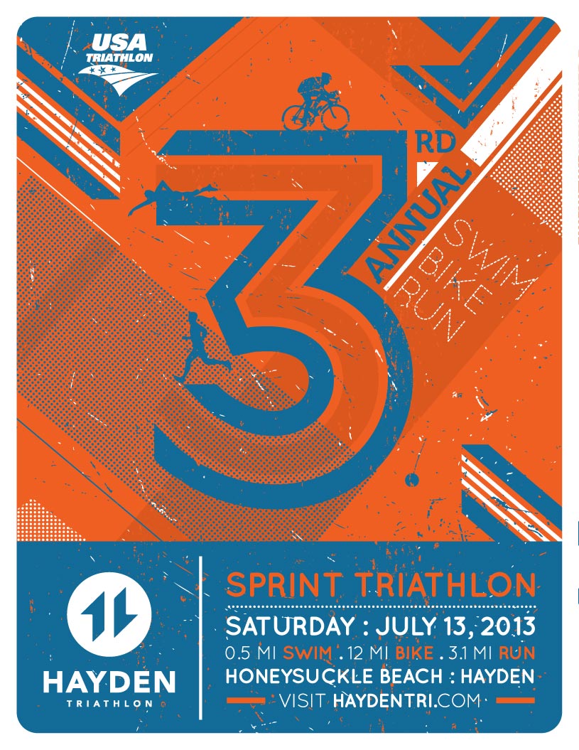
2 active shapes form letter “H” for Hayden. The 2 shapes also read “11”. It signifies the year the event entering into a new era. Orange = Sun + Energy + Passion. Blue = Water + Lake. The typography is clean and timeless so it could exist another 10-20 years.
Many of the local logos often feature pine trees, mountains, and elements that people are expected to see with first thoughts. In this design, we pushed the concept much further and took parts of these elements and applied them in a subtle style. Ex.: the left shape has character of the peak of a mountain. We added the diagonal lines to also communicate the mountain range that we have here in the area. The right shape is part of a person’s leg striking in running form.
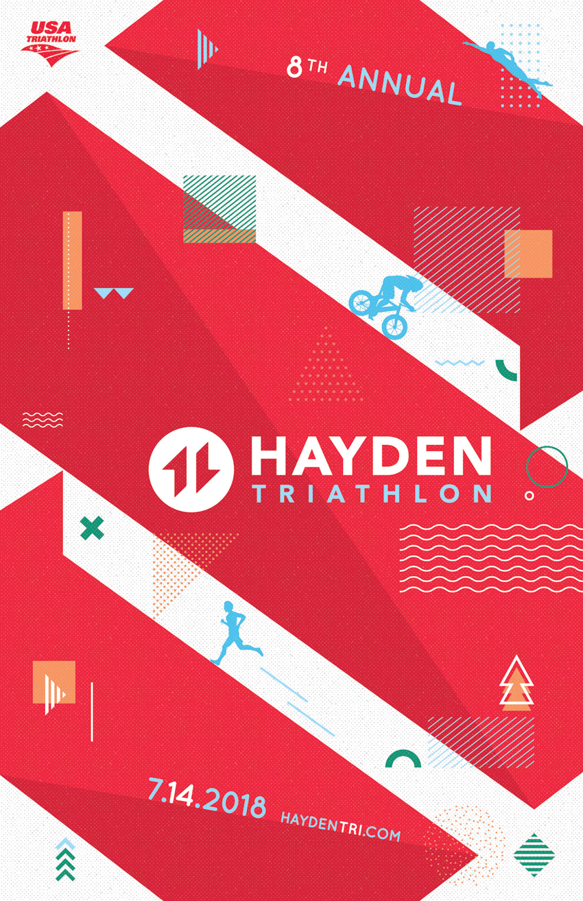
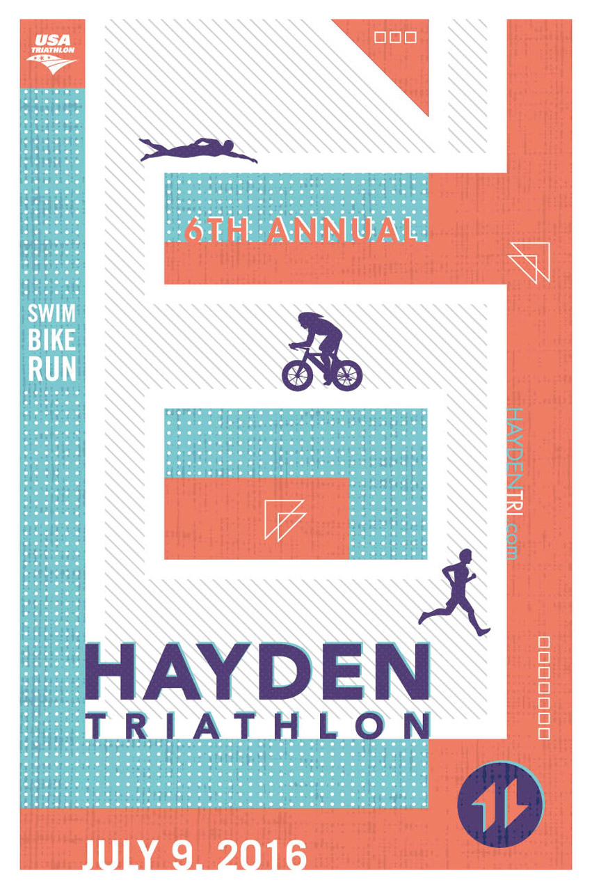
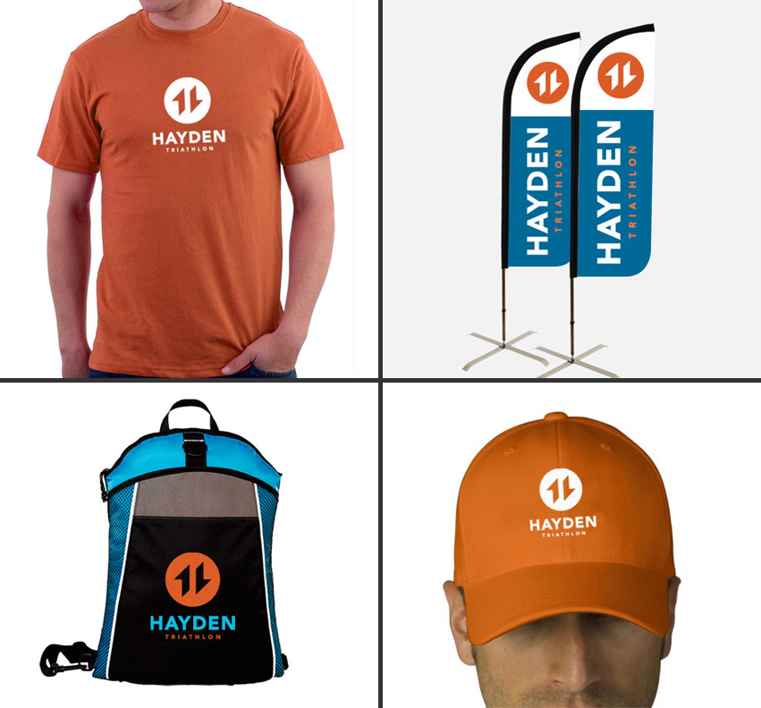
Overall, Tran Creative made the logo easy to apply onto different applications + promotional items.
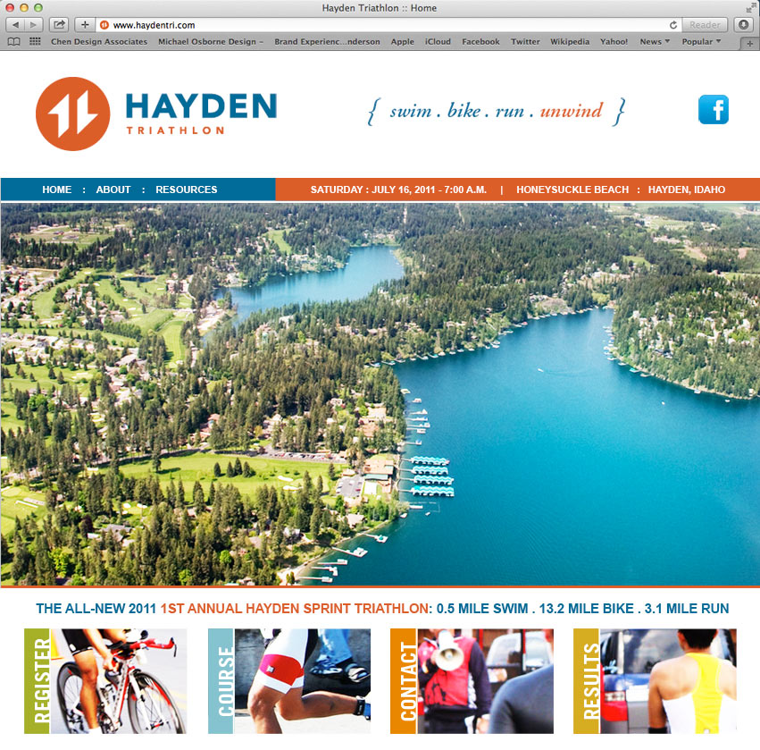
Visit the web site to learn more: www.HaydenTri.com
