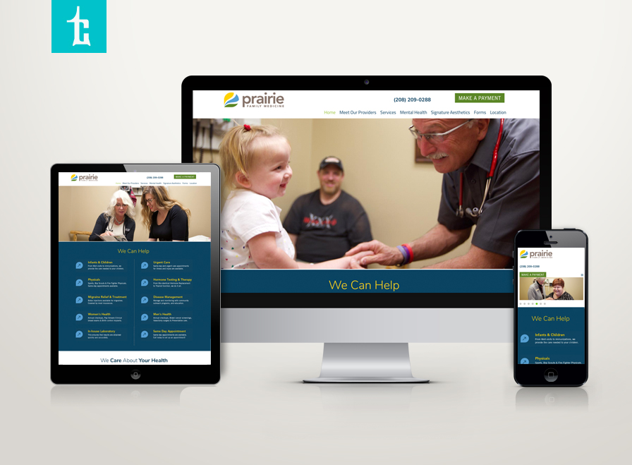
NR Consulting specializes in business implementation and processes: accounting, marketing strategy, HR fundamentals. Tran Creative was hired to help with branding. The new logo consists of moving parts, all organized to form letters N, R. Managing a business has many moving parts, NR Consulting helps organize, save money and increase revenues for companies.
Admin
NorCal Medical Alert
Tran Creative is excited to launch a new brand for Norcal Medical Alert (acquired by www.americas.tunstall.com). NorCal is a healthcare company with solutions for medical alert and medication management tools. The new logo captures: helping hands, Northern California coastal landscape, alert waves. Together, they form letter “N” for NorCal. Red highlights alert and Northern Cali. Blue is for calming, safety and Cali ocean. New website launching soon…
LC Engineers
LC Engineers provides electrical engineering to commercial clients including: planning, design, construction management, commissioning, documentation, project management, quality control, thermal imaging and more. Tran Creative was hired to develop a new logo. After research and explorations, the final chosen logo captures letters L, C, with emphasis on the L as Lamb is the founder’s last name. T-square is for exactness and precision in planning and measurement. Blue is for engineering and experience. Yellow is for spark of innovation and energy.
Inland Empire Allergy
Inland Empire Allergy specializes in environmental allergies: tree, grass, pollen… These are key factors for “Hay Fever” that causes problems for ear, nose and throat: nasal congestion, sinus, itchy eyes, runny nose. Tran Creative was hired to create a new logo. The new logo consists of a bunch of letter “i” forming a dandelion, sunshine of clarity, and a burst/reaction of allergy well-contained within a circle. Orange is for burst, sun, reaction. Blue soothes, relieves and clears up allergy, from the core.
Tunstall Americas
Tunstall Americas, a healthcare company with headquarters in New York, has hired Tran Creative as their creative agency. We are tasked with managing all of Tunstall’s digital, marketing & communications projects including Tunstall’s websites for all the branches. It’s an enjoyable experience working with this great company (with over 3,000 employees globally) for the past few years. Here is a new website we just launched for Tunstall. Thanks for checking it out: www.americas.tunstall.com
ICEHP
North Idaho College, Lewis-Clark State College and Idaho State University hired Tran Creative to create a new website to provide resources for healthcare students entering Idaho’s healthcare workforce and secure Idaho as the leader in healthcare training and education.
Thanks for checking it out: www.icehp.org
Killer Pest Control
We just created for Killer Pest Control. This new logo has been chosen to publish in Logo Lounge 10: International Identities by Leading Designers. This is one of the logos chosen from among 40,000 logo submitted and reviewed by international judges. Check out the book next time you’re at Barnes & Noble.
Spokane Dental
Spokane Dental is growing. Dr. Jon Smith and team hired Tran Creative to provide branding services including a new logo development. Research shows many dental logos with overdone tooth, molar, tooth brush, tree, leaf, etc. The final chosen logo captures letter S for Spokane, 4 smiles (family), cleansing swirl. New website: www.spokanedental.com
LaRiviere CNI
LaRiviere has joined forces with CNI (Contractors Northwest, Inc.) to form LaRiviere CNI with about 200 employees strong. Tran Creative was hired to help brand this new powerhouse, a company that connects the Northwest community with projects: McEuen Park, CDA Chamber of Commerce Building, Greensferry Bridge, Kootenai Health Cancer Center and many more. The new logo is constructed of letters L & C stacking up to form a 3D structure. LaRiviere’s strong background in excavation combined with CNI’s expertise in building provide clients with a complete source, a one-stop shop, as a general contractor and construction manager.
Coeur OBGYN
Henneberg & Kim OBGYN is expanding (no pun intended). We’d like to introduce COEUR OBGYN – a new name that encompasses a growing team of 6, soon to be 7 providers with exceptional nurses and staff. The name “COEUR” was chosen because it means “heart” – a reflection of love and heart that the COEUR team have for this specialty and all of their wonderful patients.
The logo represents a woman embracing her anatomy and a mother holding her child in her womb.
Thank you for checking it out: www.coeurobgyn.com


