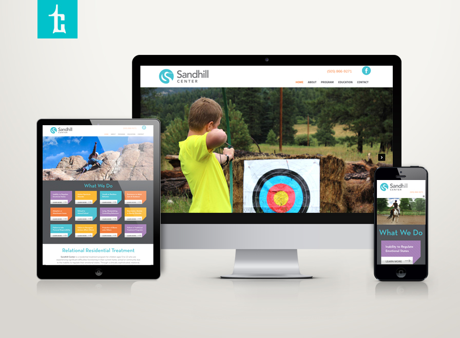
Sandhill Center, a clinically therapeutic institution serving children experiencing difficulties functioning in their home, school, community in New Mexico has hired Tran Creative to rebrand the organization. The new logo captures the iconic Sandhill crane in the form of letter S to reinforce the name. The yin-yang symmetry communicates getting clients back to balance in life. Thank you for checking out the new website: sandhillcenter.org
 Admin
Admin
Overbay Farms
Overbay Farms, family owned in Sandpoint, ID, is continuing a long family history of farming and ranching. All animals are humanely raised with non GMO, without hormones or antibiotics. Overbay hired Tran Creative to design their logo.
The new logo captures farm land, nature, their iconic Piggy, in the shape of Letter “O”.
Bretta Provost
Bretta Provost is an Entrepreneur, former executive of corporate America, hotel owner, engineer, triathlete, beauty pageant contestant… Most importantly, Bretta is a wife and mom. As a proven leader and motivator leading her teams of thousands of people across the world, we are fortunate to have Bretta hire Tran Creative to develop her visual branding. Thank you for the opportunity to work with you and to continual success, Bretta Provost.
The new logo features letters b & p, with open and connective access across the globe. The lower case b & p capture Bretta’s down to earth and friendly personality.
OSSM
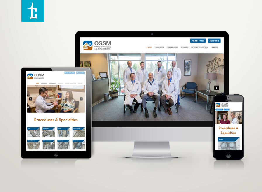
Tran Creative is excited to announce that a group of Orthopedic Surgeons has teamed up to form the most dynamic orthopedic group in the region: Dr. Roger Dunteman, Dr. William Sims, Dr. Doug McInnis, Dr. Jon King, Dr. Scott Brown, Dr. Greg Keese and Dr. Lucas Anderson. With this merger of 7 orthopedic specialists (all fellowship trained), the new OSSM will serve as a one-stop and go-to place for all things orthopedic.
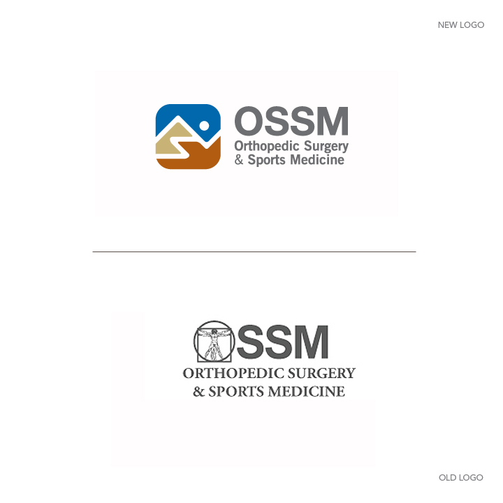
OSSM hired Tran Creative to provide branding services including a new logo and website. After extensive research, visual audit and over 100 logo concepts, the NEW LOGO captures letters O.S.S.M, pieces of bones aligning precisely to form the human element with movement and landscape terrain of the Pacific Northwest.
The new logo will be applied on all marketing materials, videos and a new website: ossmidaho.com
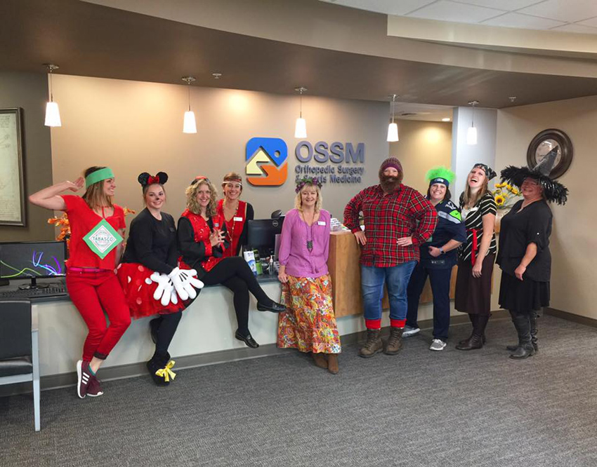
The new logo we created for OSSM Orthopedic Surgery & Sports Medicine is now prominently displayed on the main wall in the lobby.
CDA5K Summer Series
After two years of planning. Introducing the 1st Annual 2017 CDA 5K Summer Series on July 13, 20, 27 @ 6 pm. Race starts at North Idaho College. Run/walk along the North Idaho Centennial Trail. ONLY $5 entry. Chip timed. Awards for overall and age group winners. Awesome race swags. We encourage ALL runners: families, kids to get out and run/walk.
REGISTER for single race: http://bit.ly/2rAcKDd
REGISTER for all 3 races: http://bit.ly/2rU7VBo
The logo features a blazing C runner.
Branding Sponsor by Tran Creative: www.tran-creative.com
NR Consulting Business Services
NR Consulting specializes in business implementation and processes: accounting, marketing strategy, HR fundamentals. Tran Creative was hired to help with branding. The new logo consists of moving parts, all organized to form letters N, R. Managing a business has many moving parts, NR Consulting helps organize, save money and increase revenues for companies.
NorCal Medical Alert
Tran Creative is excited to launch a new brand for Norcal Medical Alert (acquired by www.americas.tunstall.com). NorCal is a healthcare company with solutions for medical alert and medication management tools. The new logo captures: helping hands, Northern California coastal landscape, alert waves. Together, they form letter “N” for NorCal. Red highlights alert and Northern Cali. Blue is for calming, safety and Cali ocean. New website launching soon…
LC Engineers
LC Engineers provides electrical engineering to commercial clients including: planning, design, construction management, commissioning, documentation, project management, quality control, thermal imaging and more. Tran Creative was hired to develop a new logo. After research and explorations, the final chosen logo captures letters L, C, with emphasis on the L as Lamb is the founder’s last name. T-square is for exactness and precision in planning and measurement. Blue is for engineering and experience. Yellow is for spark of innovation and energy.
Inland Empire Allergy
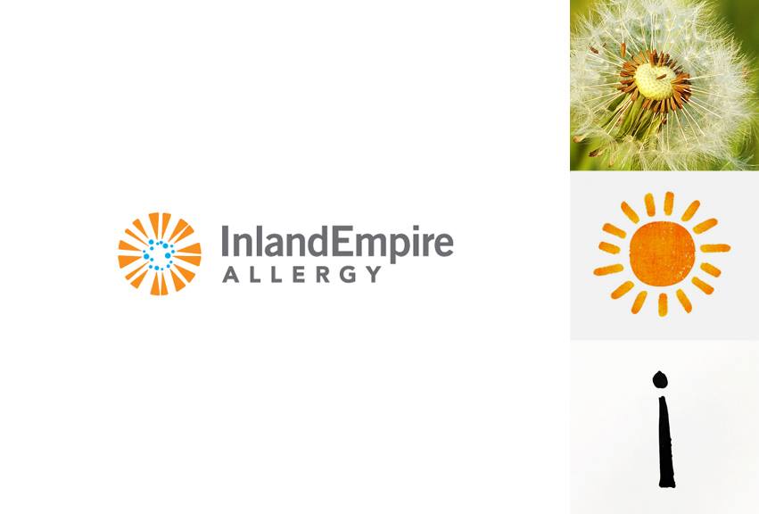
Inland Empire Allergy specializes in environmental allergies: tree, grass, pollen… These are key factors for “Hay Fever” that causes problems for ear, nose and throat: nasal congestion, sinus, itchy eyes, runny nose. Tran Creative was hired to create a new logo. The new logo consists of a bunch of letter “i” forming a dandelion, sunshine of clarity, and a burst/reaction of allergy well-contained within a circle. Orange is for burst, sun, reaction. Blue soothes, relieves and clears up allergy, from the core.
Tunstall Americas
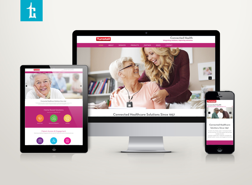
Tunstall Americas, a healthcare company with headquarters in New York, has hired Tran Creative as their creative agency. We are tasked with managing all of Tunstall’s digital, marketing & communications projects including Tunstall’s websites for all the branches. It’s an enjoyable experience working with this great company (with over 3,000 employees globally) for the past few years. Here is a new website we just launched for Tunstall. Thanks for checking it out: www.americas.tunstall.com
