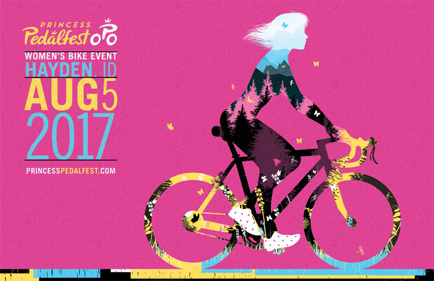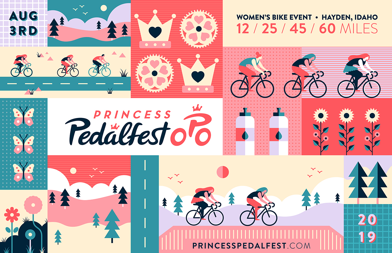

Tran Creative is excited to team up with Princess Pedalfest for the 4th consecutive year to bring this fabulous Women’s Bike Ride to the Inland NW. This event gives back to our community: Union Gospel Mission, Josie’s Warriors (Cystic Fibrosis) and more.

Tran Creative is teaming up with Princess Pedalfest for the 3rd year for an epic women’s bike ride, with 4 distances to choose from. Join over 500 cyclists to fundraise and give back to our local community. We are happy to support this great cause.
![]()
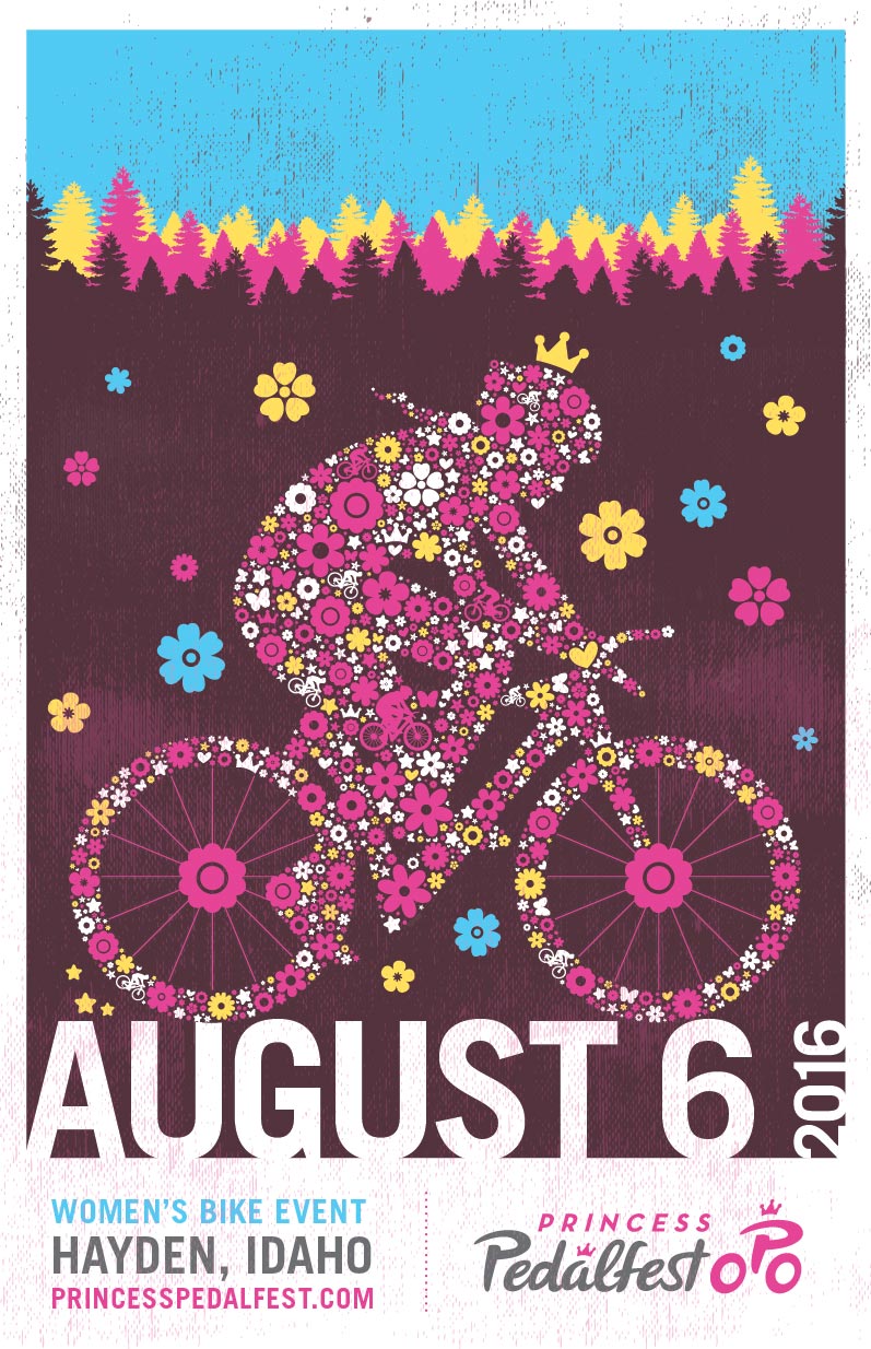
Tran Creative is excited to team up with Princess Pedalfest to bring you an epic and scenic bike ride on August 6, 2016. Proceeds to support Josie’s Warriors and help raise awareness about Cystic Fibrosis.
WHO’S IN? www.princesspedalfest.com