Tran Creative creates new identity for Victory Golfworks, a golf development hub in Logan, Utah. The NEW LOGO is constructed of letters V, G, golf swing, victory fist pump. We also created marketing assets with a new website: victorygolfworks.com



Tran Creative creates new identity for Victory Golfworks, a golf development hub in Logan, Utah. The NEW LOGO is constructed of letters V, G, golf swing, victory fist pump. We also created marketing assets with a new website: victorygolfworks.com


Tran Creative creates the new identity for Shannon Dye Massage Therapy in Boise, ID. The new logo is constructed with: letter s, d, body contour, movement, balance.


Tran Creative creates the new logo, website, print collateral for Premier Body & Laser in Spokane Valley, WA: body sculpting, fat transfer, tattoo removal, pico genesis… The logo is crafted with letter P, body shape, sculpting. Website: premierbodyandlaser.com


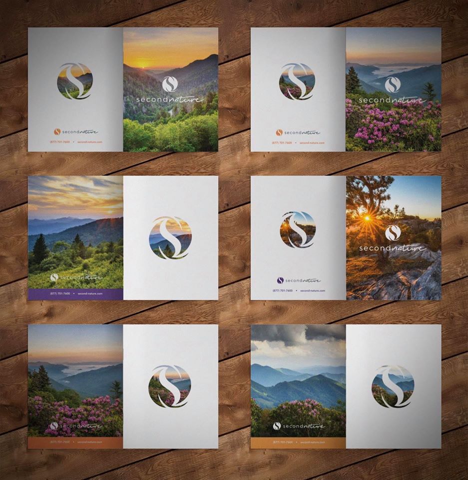
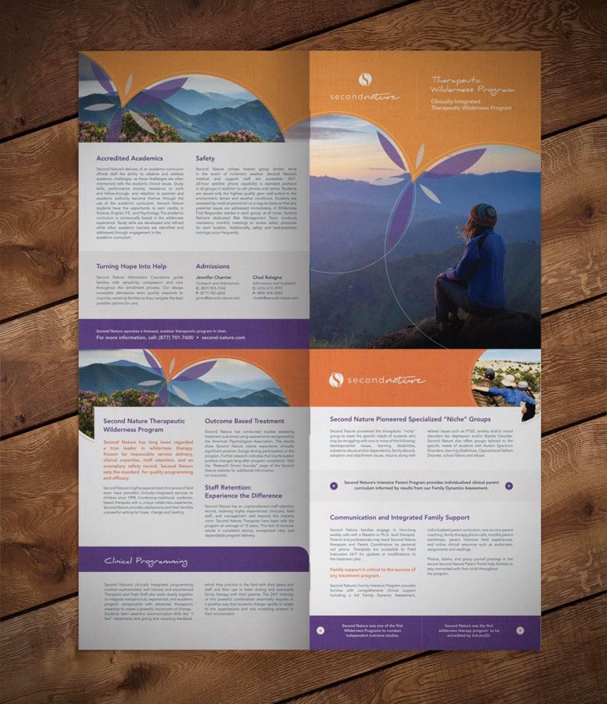
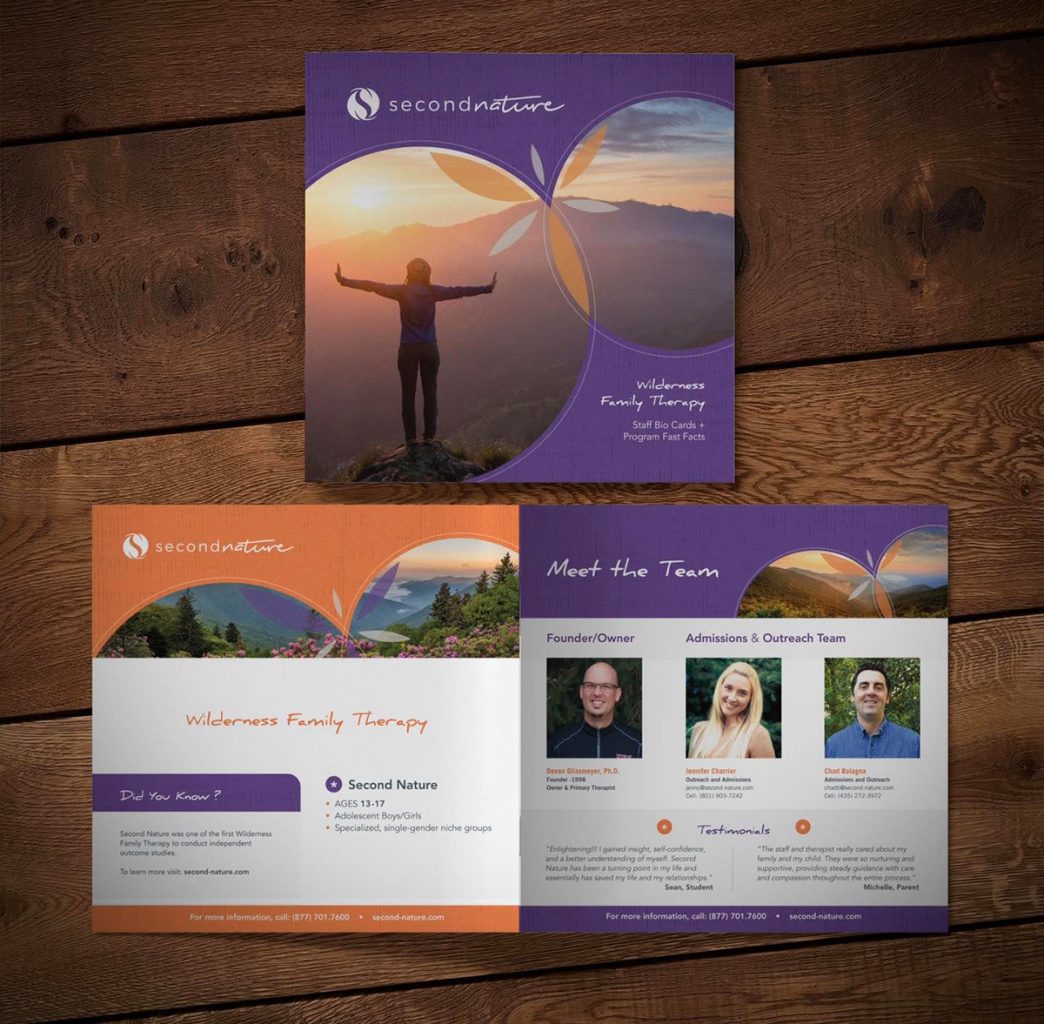
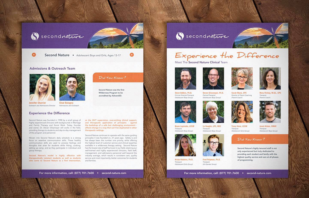
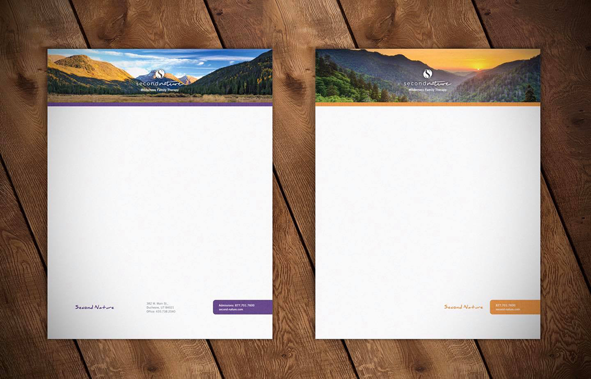
Tran Creative designs new corporate print pieces for one of the largest Wilderness Therapy programs in Utah – Second Nature: brochures, bio cards, menu cards, greeting cards, flyers, stationery, business cards.


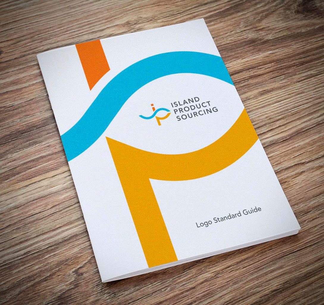
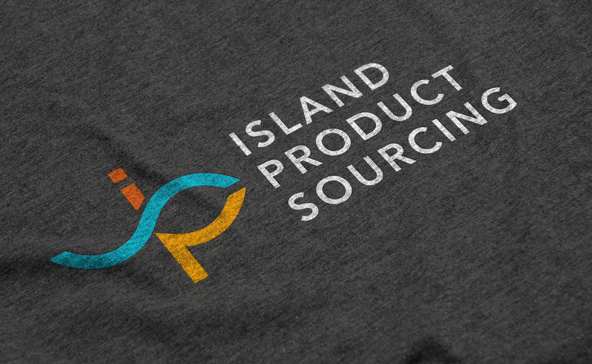
Tran Creative creates the new identity for Island Product Sourcing in Hawaii, a company that finds unique products from off island sources for the locals. The new logo is constructed with letters IPS, wave, oval magnifying glass to search, a human figure crossing the ocean to find the goods. Vibrant color palette is for the Aloha of the islands.


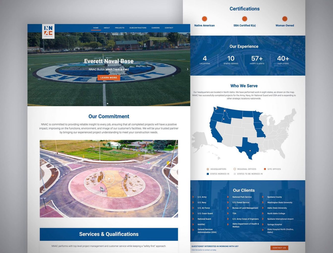
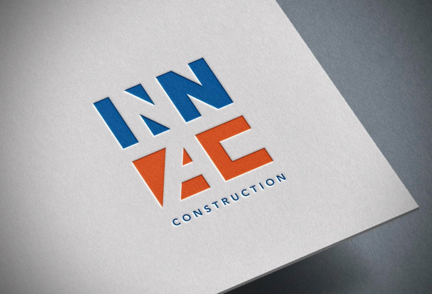
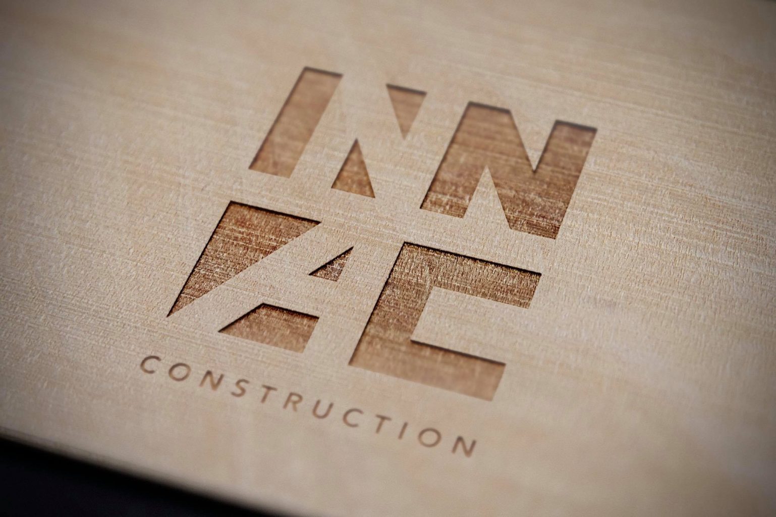
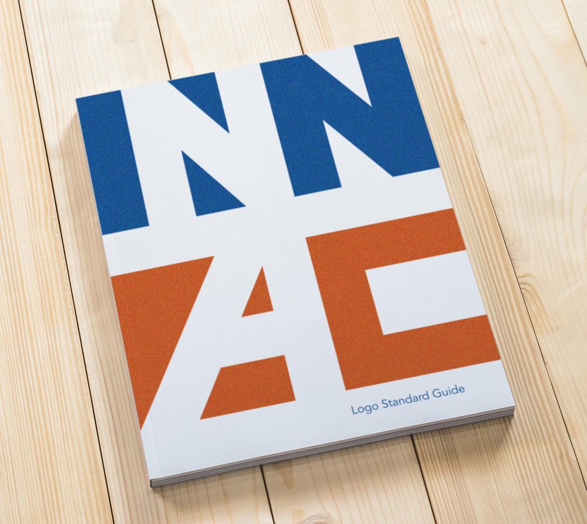
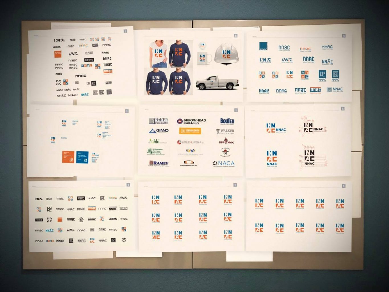
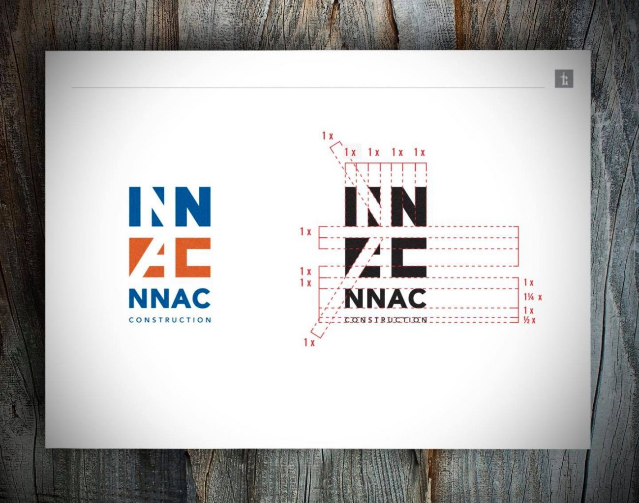
Tran Creative creates the new identity for NNAC Construction – offices in Idaho: Coeur d’Alene, Boise and Texas, provides general construction, civil… for military, federal, government, schools… across the country. After research and creating over 100 logo concepts, the NEW LOGO is constructed with negative and positive shapes to build letters NNAC – bold, sturdy, precise and timeless. Blue is for experience, trust. Orange is for innovation, safety and energy. The new logo is implemented onto trucks, signage, videos, marketing assets and a new website: nnacinc.com
There are several video shoots when we can see raw emotions from people as they describe what truly means to them and the environment they get to be a part of. That’s what makes these companies so great to work with and making our job enjoyable and rewarding.
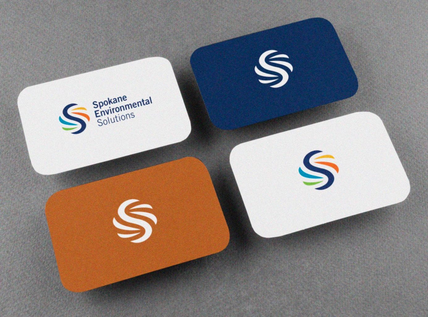
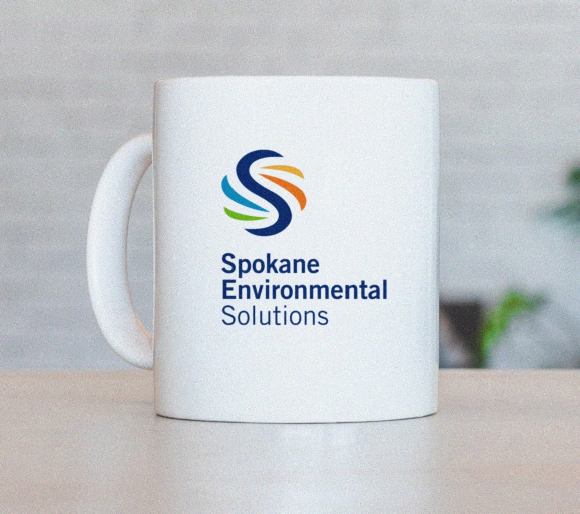
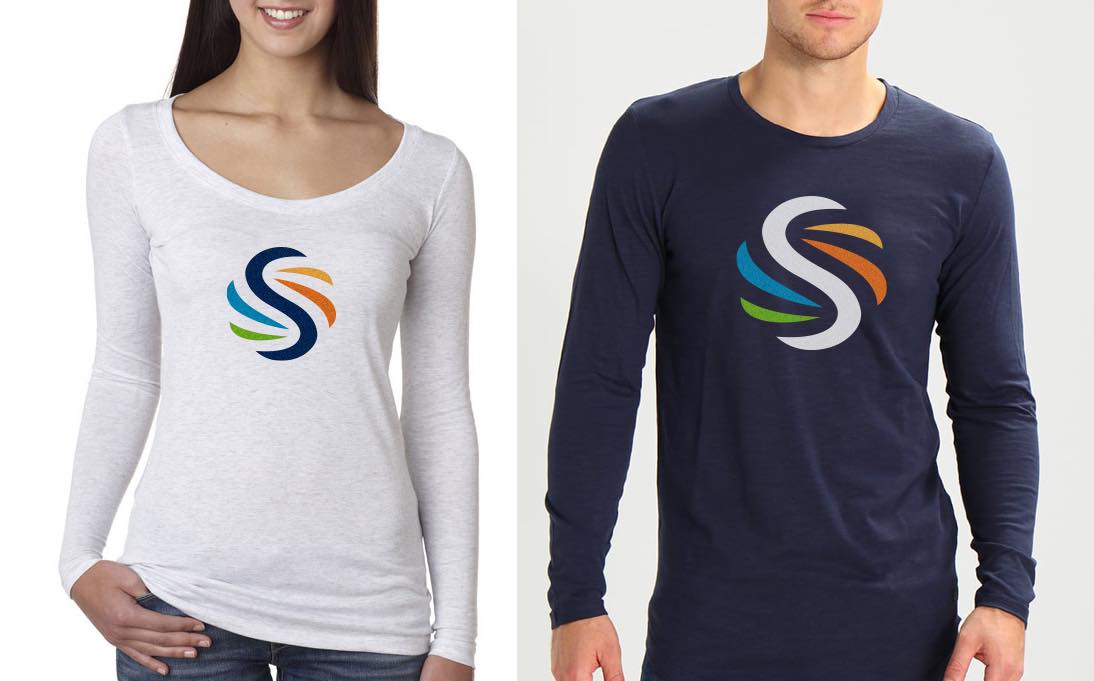
Tran Creative creates the new identity for Spokane Environmental, who solves complex environmental problems: site characterization, sampling and inspection, erosion and storm water. The new logo is constructed with a dynamic network of earth elements: earth, water, air and fire with movement and harmoniously forming the company’s first initial “S”.

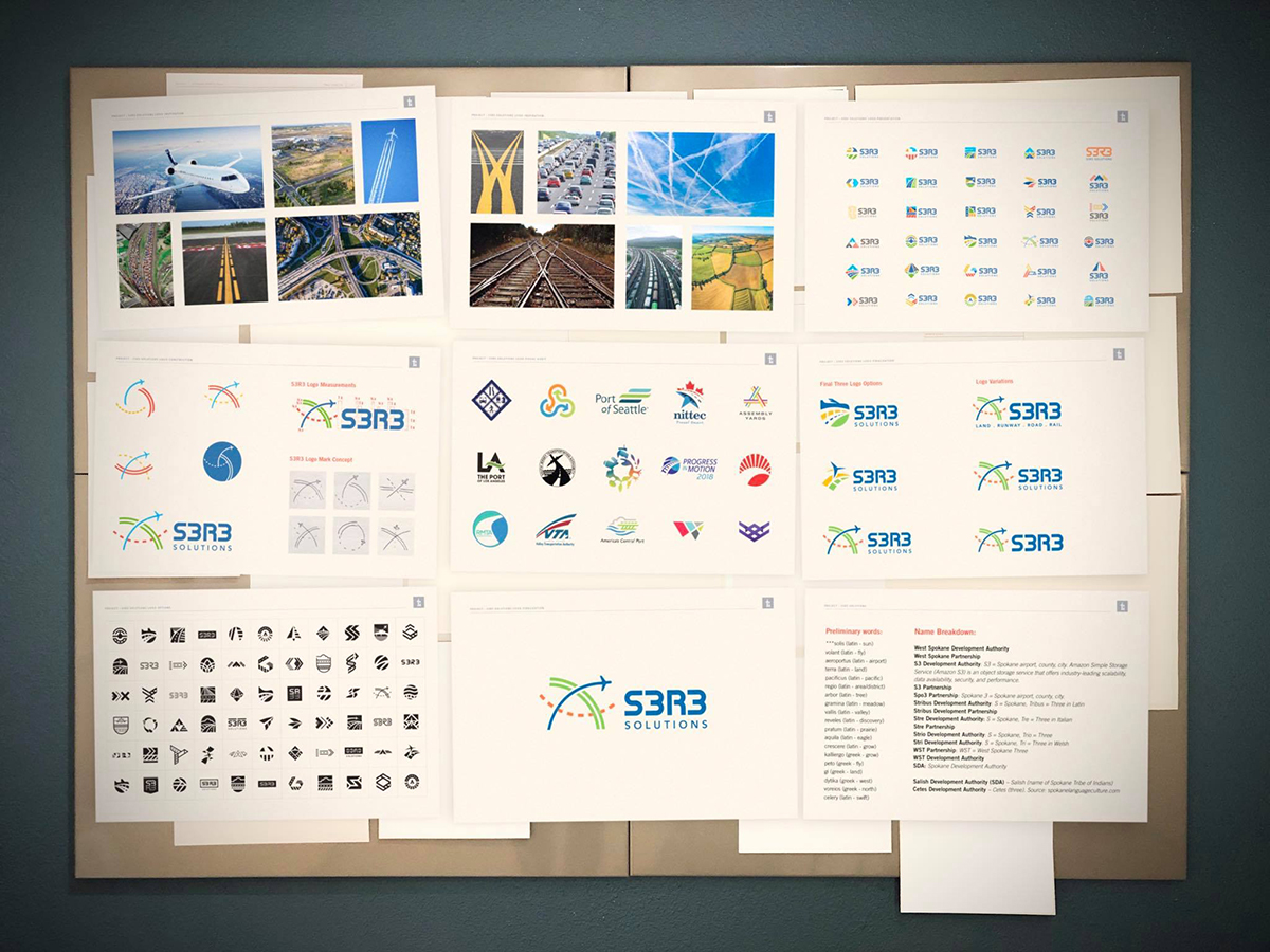
As you may know, Amazon and other prominent companies are developing in Spokane. Tran Creative was hired by Spokane county, Spokane city and Spokane International Airport to provide branding services including naming and logo development for over 9,000 acres of land by the airport.
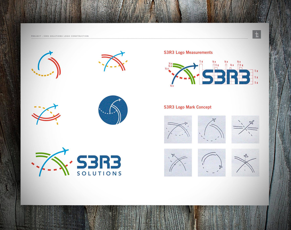
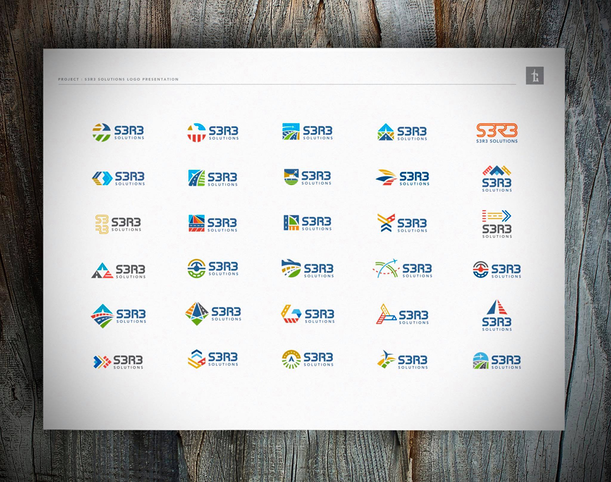
After initial research and strategy, we recommended to the board to move away from the original name of West Plains-Airport Area Public Development Authority as it was too long and among other reasons. Through extensive research and a vigorous process of exploring names, a new name was recommended and approved. “S3” represents Spokane County, City and Airport. “R3” communicates Roadway, Railway and Runway: three of the significant key points Spokane can offer companies.
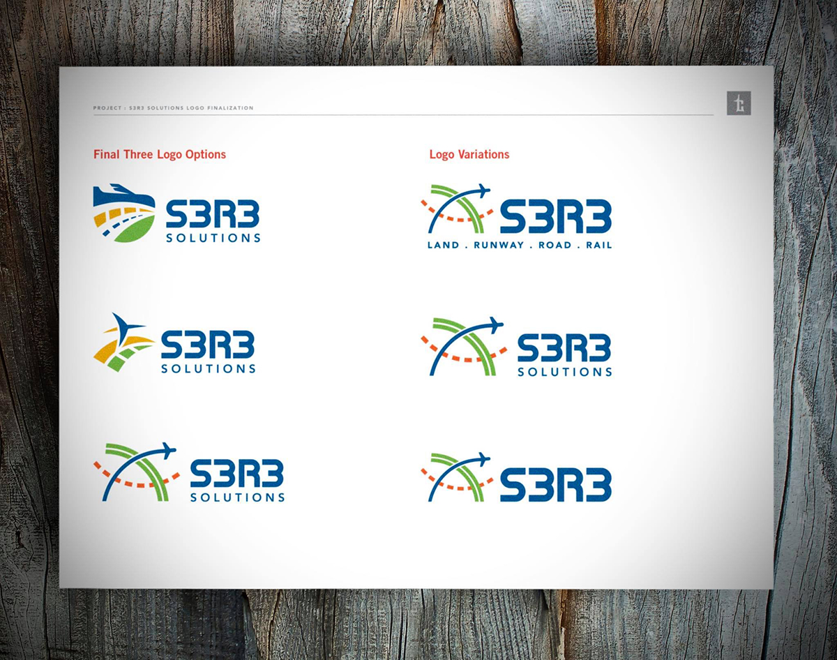
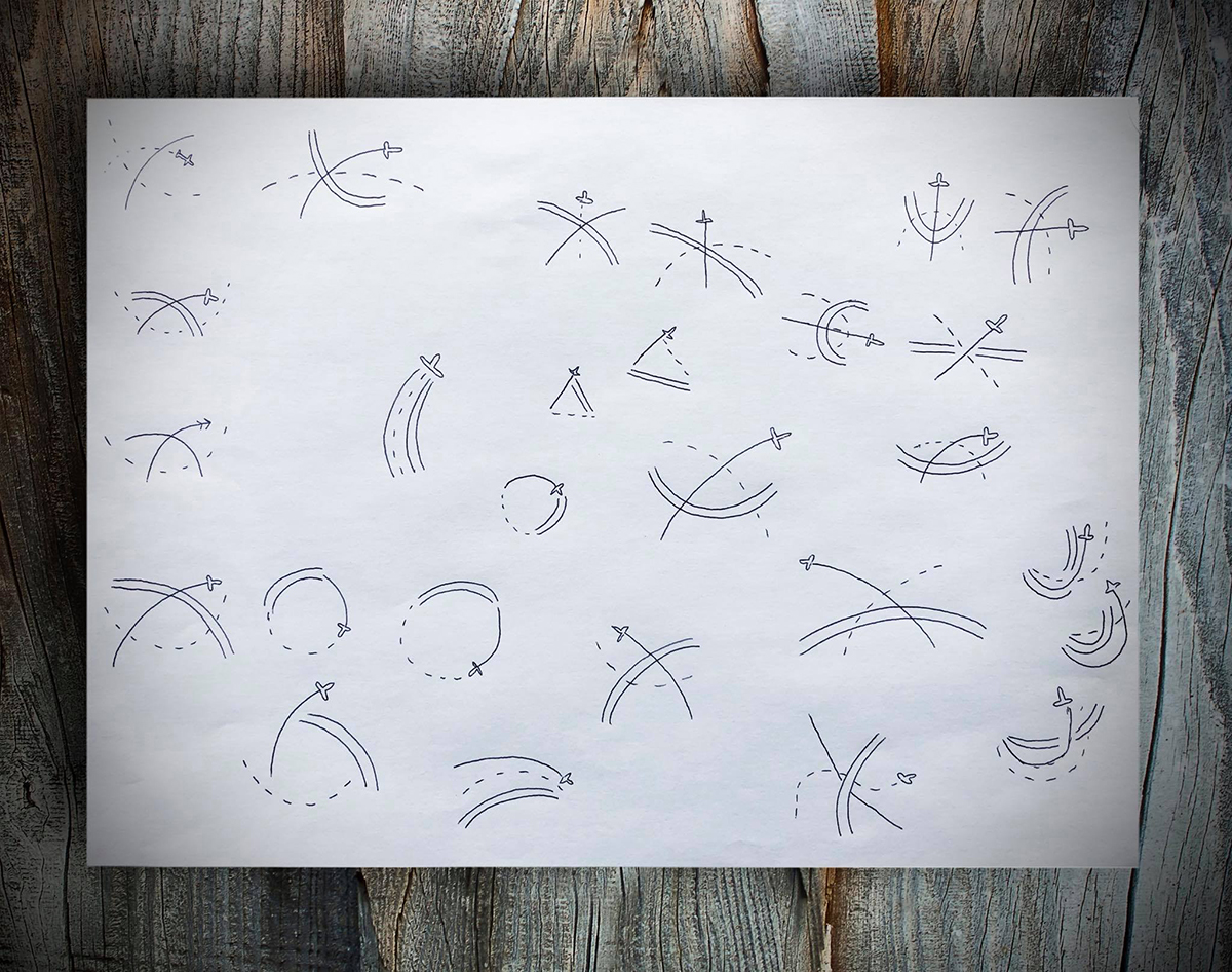
Once the new name was approved, Tran Creative’s team crafted over 200 logo concepts exploring A to Z possibilities. After almost a year of research, refinements and changes, meetings, delicious breakfasts with eggs, sausage, bacon… the final chosen logo is constructed of 3 intersecting elements: Road, Rail and Runway working together to drive business growth. With 3 partners (county, city, airport) authorized to get things done, companies can make swift advancements right here in Spokane.
We are grateful to be a part of this project and we look forward to seeing success and prosperity in Spokane.
