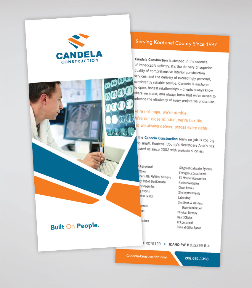
Candela Construction specializes in Healthcare interior construction and maintenance. The company has been growing steadily since 1997. Candela Construction hired Tran Creative to provide branding services as they’re planning on expanding the company.
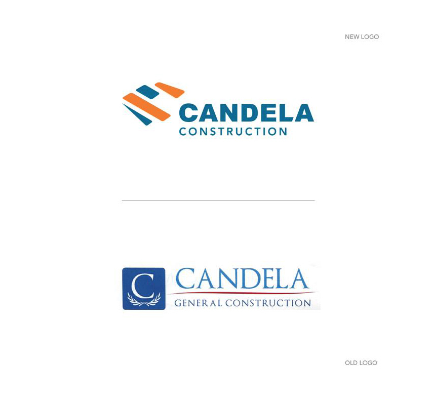
After much research and over 100 logo variations, the chosen new logo consists of 4 shapes aligning together to form shape of a “C”. The new mark resembles equipments and materials needed to swiftly complete quality projects, whether it be tools, panels, rails or accessories.
The chosen colors capture the spirit of quality construction. Blue represents stability, experience and hard working culture. Orange is for innovation and passion for new ideas.
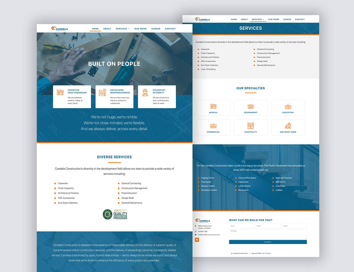
The design execution is to be easily identifiable and produced on all corporate collateral, web site, and other promotional products.
See the new site: www.candela-construction.com
