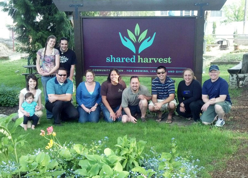
Shared Harvest is the 1st local community garden in Coeur d’Alene, Idaho. Tran Creative donated our design service for the logo. To learn more about this amazing community project, visit: facebook.com/SharedHarvest
 Admin
Admin
INDVSA | Inland Northwest Disabled Veterans Sports Association
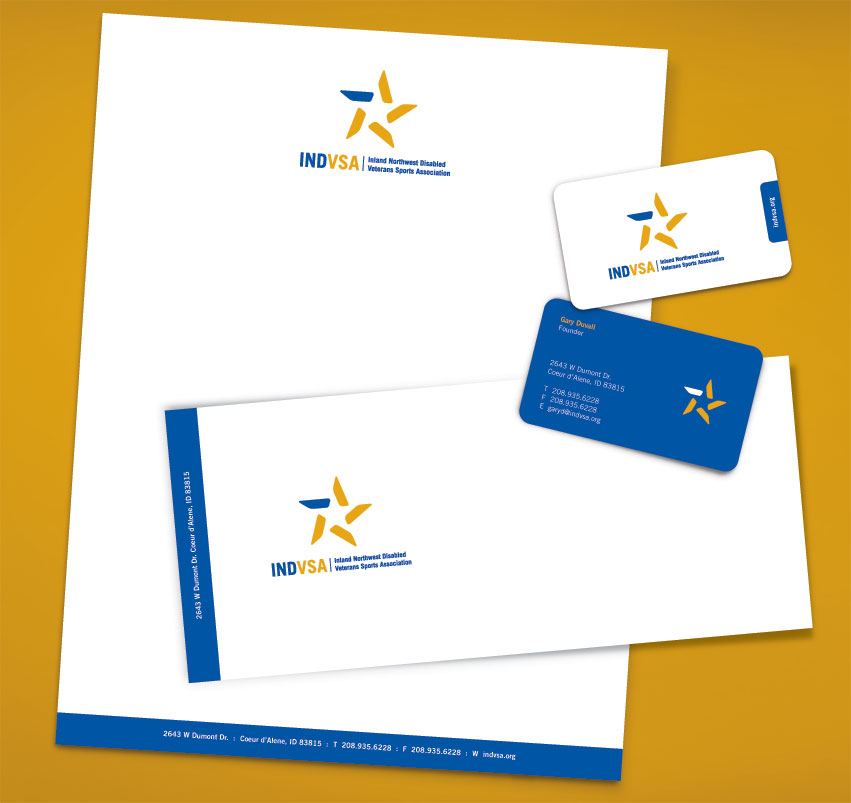
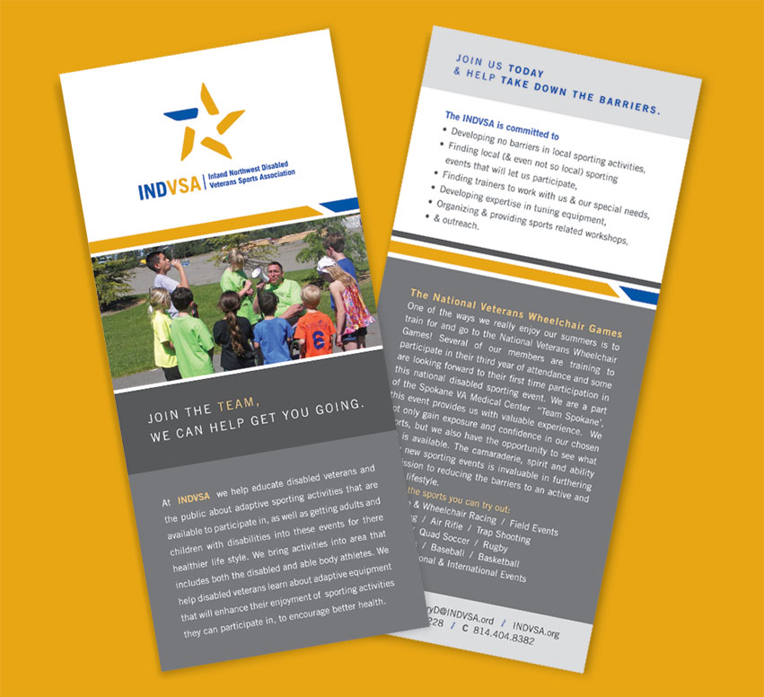
INDVSA | Inland Northwest Disabled Veterans Sports Association is a team of active disabled veterans dedicated to an active lifestyle. This non profit organization has become an important part of the community, by taking down barriers, educating the public and encouraging members to join & participate in sporting events. After lots of research, it was clear that we needed to create a unique mark that shows how important these heroes really are.
The final logo choice consists of five rotating shapes coming together to form a star in the center. The star represents veteran honor. The five shapes symbolize the community coming together to form this special coalition. We wanted the star to mimic movement, to show that although these folks are disabled because of circumstances, they are proudly moving forward and making great things happen in our community. The stand alone blue in the star represents the subtle “Disabled”. To make the acronym easier to read & remember, INDVSA was separated into two colors. Gold for honor, and blue for determination. For more information about this great non profit organization, please visit: www.INDVSA.org
Cliq Marketing
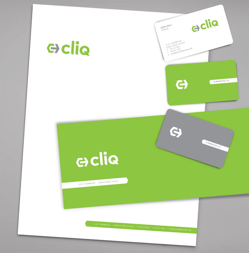
What is Cliq? Cliq is the action that makes an impact, the sound of perfect fit. Cliq is a company focusing on marketing solutions in SEO, Social Media, Video, and Apps.
The logo consists of letter C and an arrow. The arrow represents clicking: the click of the mouse or the click of a perfect fit. The arrow fits in perfectly with the C. This represents fitting well with the client while providing effective marketing solutions. Green is for progressiveness, innovation & fresh ideas. Gray symbolizes dependability and experience.
Visit the website to learn more: www.cliqmarketing.com
Lake Tye Triathlon
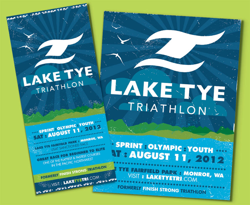
The race takes place at Lake Tye Park in Monroe, Washington. Some say it is the flattest and fastest course in the Pacific Northwest. It will be the same great race, with a new and exciting look. Research showed that most triathlons often displayed the “swim bike run” symbol. Tran Creative was hired to providing branding services for the race. We wanted to create a unique mark without being too apparent.
The final chosen logo portrays an active and aggressive mark. It forms a “T” for Tye, with a wave underneath. The blue wave also helps complete letter “L” for Lake. It also can be described as a body of an athlete in the race. Blue represent the beautiful waters of Lake Tye, and the Green represents endurance, full of life, and nature.
To learn more about the race, please visit: http://
WGA | Women’s Gift Alliance
Established in 2004, WGA is a group of skilled female philanthropists in Kootenai County. Their mission is to pool together talents and resources, in order to provide meaningful financial support to the community. They also strive to increase women’s awareness, involvement and leadership abilities. WGA has donated nearly $300,000 to other non-profit organizations.
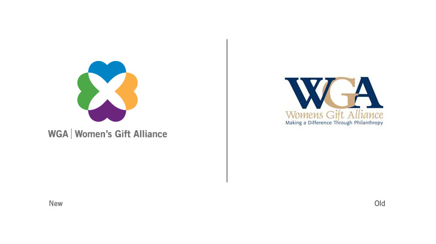
Our goal was to show the kind hearts of these amazing women, forming an alliance to help out in the community. The result was a vibrant and colorful combination of hearts coming together to form something truly beautiful. Blue for intelligence. Green for resources. Purple for femininity. And gold for generosity. All of the hearts come together to create a gift for the community.
To learn more visit: www.wgakc.org
Family Home Care
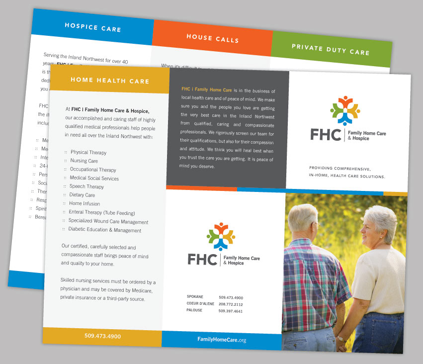
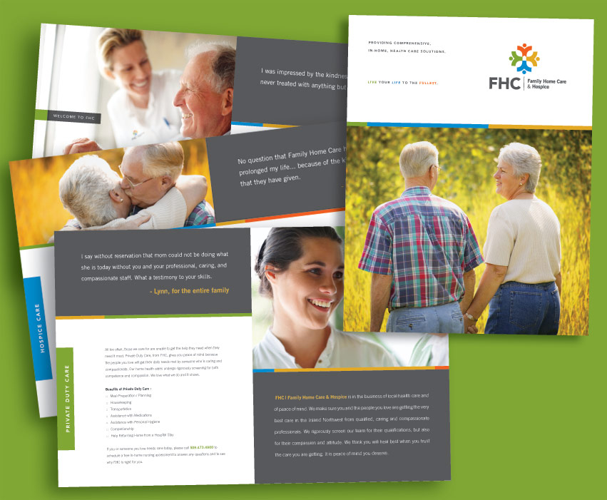
For over 40 years, people throughout the Inland Northwest have counted on Family Home Care & Hospice (FHC) to provide professional, compassionate medical and home health services. As the largest locally owned home health company in the area with over 400 employees and the only agency that provides private duty care, home health, hospice and mobile primary care services, FHC has a unique commitment to providing the finest care to clients and their families. FHC is growing, evolving, and moving forward as a company by expanding their services and their service areas. They felt the need to update their visual identity. FHC asked Tran Creative to provide them with a full branding package: corporate identity, brand audits, print collateral, brand standards guide, etc.
After nearly 4 months and hundreds of design explorations, Tran Creative & FHC are pleased and excited to introduce to you the new look.
FHC started inside a hospital setting. That is one reason their old logo carries a red cross with a home at center. For the new logo, we are able to keep the root of their origin, the cross with the home in the center. In addition, people sprouting out from the cross signifies that FHC is growing, serving and working with communities across the region. A vibrant color palette enhances the community aspect and add flavors to the brand. Overall, the new logo is friendly, communicates “Celebration of Life”, and is timeless.
The design execution is easily identifiable and produced on corporate collateral, web site, and other promotional products.
To learn more about FHC, please visit: www.familyhomecare.org.
Steve Omi Memorial Open Water Swim
Tran Creative is pleased to present the new Steve Omi brand identity. As a token of our love and appreciation for our local community, we have donated our service for this project.
Steve Omi was a celebrated member of the Coeur d’Alene community, who passed away from cancer in 1994. In honor of Masters swimmer Steve Omi’s life, the Steve Omi Open Water Memorial Swim was established. It’s an annual fund raiser to support High School swimming in Kootenai County.
The final chosen logo incorporates water and Steve Omi’s name. The clean and simple mark uses the S in a way that suggests water and waves, all pulled together in a circular O. The color Blue conveys intelligence and loyalty, which were strong characteristics of Steve. The Blue also represents the beautiful waters of Lake Coeur d’Alene, where the swim takes place annually.
To learn more about this great nonprofit organization, please visit
www.steveomi.org
Motopath
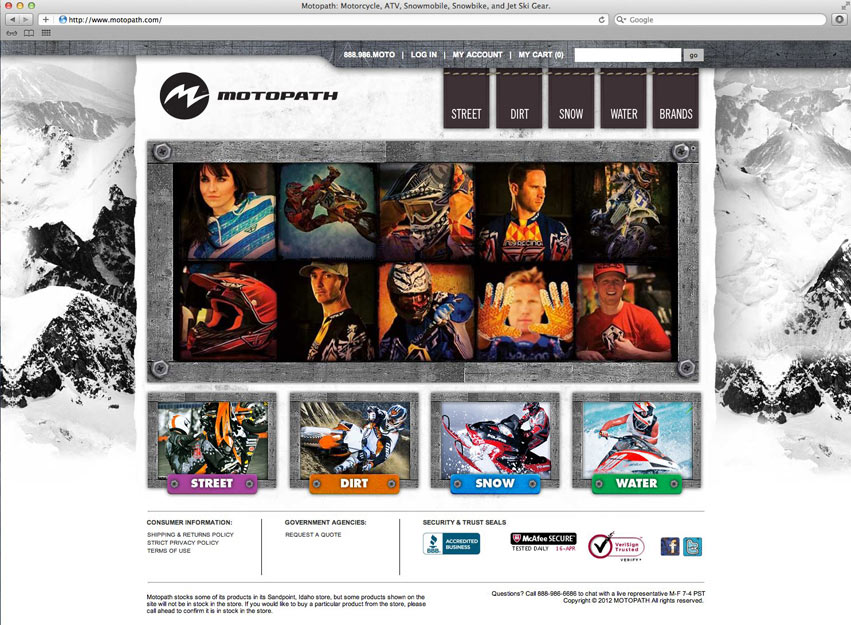
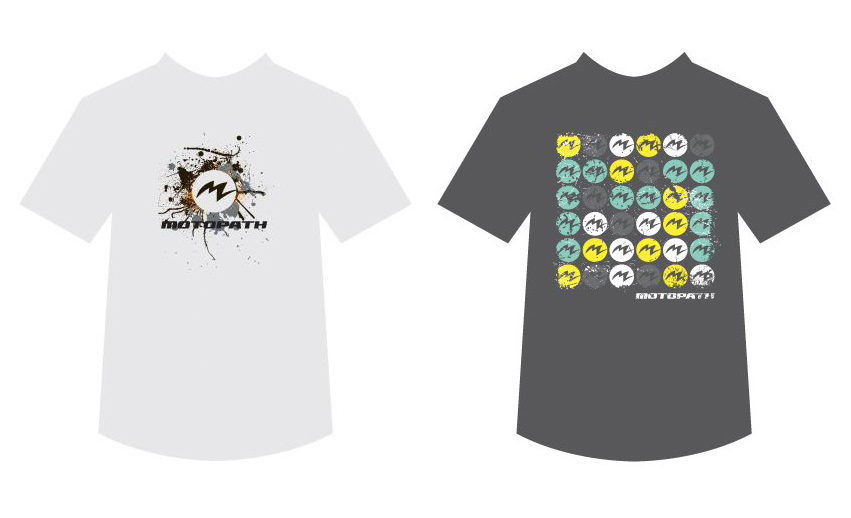
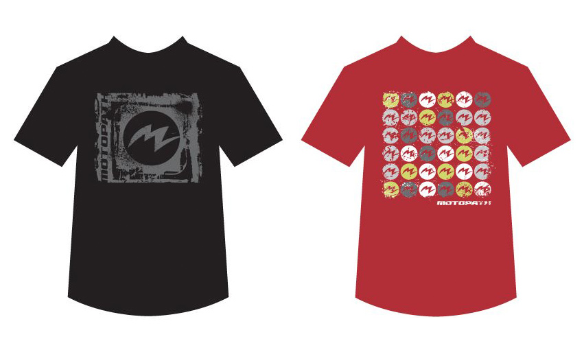
Tran Creative and MOTOPATH are thrilled to present the Brand Identity for MOTOPATH.
MOTOPATH is a high intensity motor sports hub, providing everything you need to know about motor sports. Our goal was to create an active and progressive visual, and to capture the feeling of the adrenaline within.
The final logo solution encompasses many ideas into one strong mark. The “m” shape represents water waves, mountain peaks, field of grass, rough edges, and the adrenaline heartbeat. With a specific color for each category within MOTOPATH, we have created a color code palette system. This helps identify the many categories in MOTOPATH: Snow, Dirt, Surf, etc.
Cycle Metrix
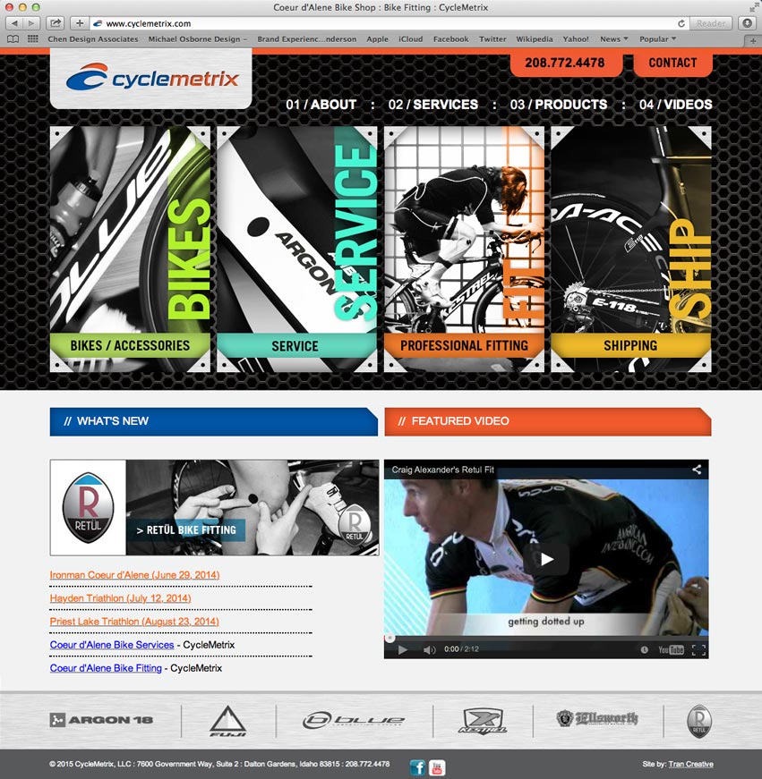
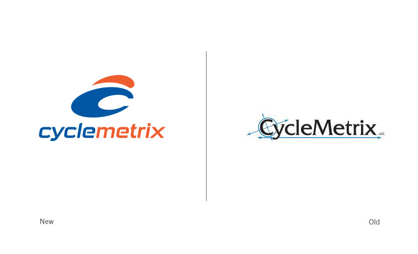
Research showed that most bike shops carried expected symbols in their logos. We wanted to move away from the specific images of chain links, wheels and gears. Because CycleMetrix deals with many aspects of cycling, we wanted to create a non-specific mark that would provide CycleMetrix with the flexibility to encompass all areas of services: sales, custom fitting and much more…
After many logo solutions, the final logo has been chosen. In only two simple shapes, the new logo communicates speed, precision, and innovation. These two shapes come together to form a person in an aerodynamic position, bicycle wheel, and letter C. The blue represents experience. The sporty orange embodies state-of-the-art innovation and passion for top-notch quality and service.
Visit the website: www.CycleMetrix.com
Think Green Promos
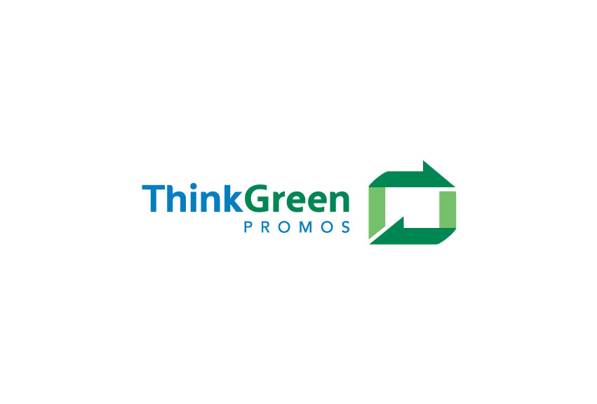
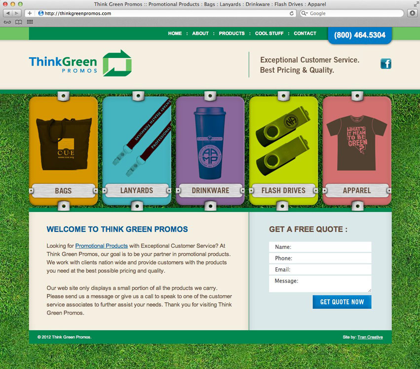
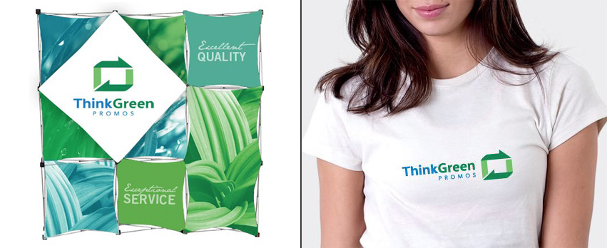
Think Green Promos provides promotional products that reflect a conscious concern for the environment, using organic, recycled and earth friendly materials. They are constantly looking for new ways to provide eco friendly materials to the customer, at a reasonable price. Our goal is to incorporate this way of thinking into the new brand identity system.
The green arrows show the complete process that Think Green Promos goes through to find the best possible solutions for consumers (and the earth). Think Green Promos provides the possibilities of printing on varieties of promotional products. The white space inside the logo mark conveys this imprint area. After careful color considerations, we chose green to symbolize consciousness and love for nature. Blue represents trust and loyalty, to deliver the best products at the best prices.
View the website: www.thinkgreenpromos.com
