Shedit hired Tran Creative to provide branding services. Research showed there were many generic looking shed logos. In creating a brand, we wanted the shed to be more conceptual and not so obvious and generic.
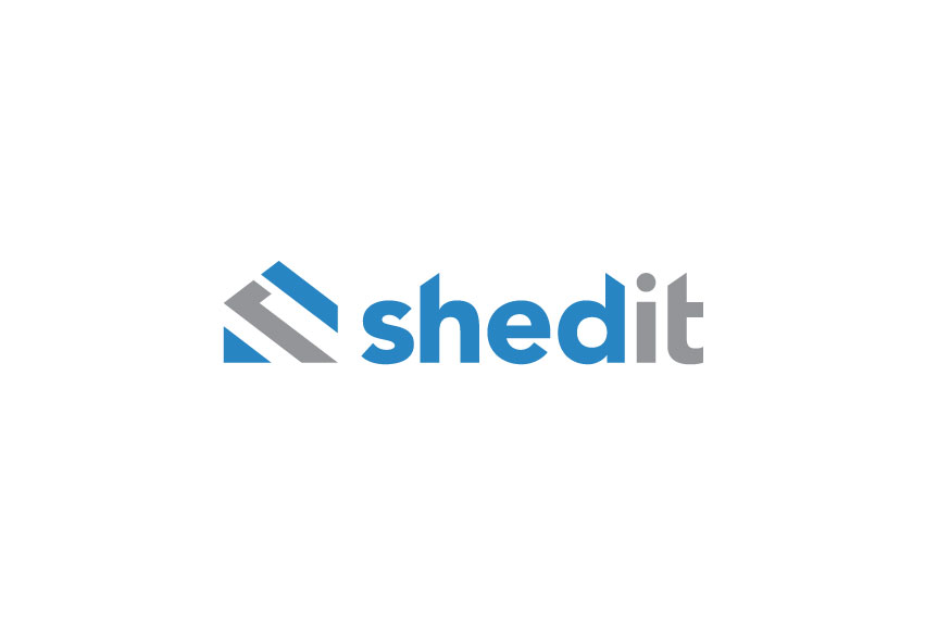
After many logo explorations, the chosen logo has 3 shapes lining up perfectly to form an “S” in a shed-like shape. It has depth through arrangement of negative space. Typography is customized to match the mark with slanted edges. Colors blue and gray convey stability, strength, durability and trust.
See the new site: www.shedit.com


