Shaver Home Inspection in CDA is constructed of letter S, target, scanning, inspecting the entire infrastructure of the building, grid, house, floor plan, pipe system.

Shaver Home Inspection in CDA is constructed of letter S, target, scanning, inspecting the entire infrastructure of the building, grid, house, floor plan, pipe system.
Monica Mastroianni Realty in Southern California. Comprising of letters M & M, building, structure, real estate.
DNA is the partnership between DADI Engineering and NISS with offices in Australia, China and the US. DNA has the largest global engineering team in the mining industry with more than 600 engineers, covers all aspects of mining supplies, materials and equipment for both surface and underground.
DNA hired Tran Creative to provide branding services. The final chosen logo is constructed with letters D, N, A, dna strand, network & connectivity, layers of construction & underground structure.
CDA Spokane HVAC, formerly known as CDA Sheet Metal & Heating has been doing great work across the Inland NW for over 45 years. We’re excited to launch the fresh new look. For the logo project, over 100 modern/abstract logo options were explored. The final chosen logo pay tributes to the longevity of the company with a classic concept of cooling and heat symbol, modernized into a crisp and clean logo, customized with letter “C” & “S” for “CdA” & “Spokane”. Blue is for air. Orange is for heat and innovation. Tran Creative also created a sleek, new website and videos to communicate the brand.
We’re excited to introduce Moose & Fig, a company that makes hand soap, bath & body products in Coeur d’Alene and distributes nationwide. The new logo is consisted of a moose in the negative space of the fig. The new logo will be incorporated into packaging and website.
Dog-N-It in Coeur d’Alene provides hotel & daycare for dogs. Research shows that most pet logos often showcase only animals. We crafted the new logo not only with a custom dog but also the letter “D” to give it a custom mark just for Dog-N-It.
Cozy Coffee & Bistro in Spokane Valley on Barker has coffee, sandwiches, salads, beer, wine and a menu of delicious food options. During research, we saw many coffee logos with overdone mug, cup… The new logo captures: letter C for Cozy, bowl, cup, aroma, leaf for salad, tea, beyond coffee. An earthy color palette adds flavors to the brand.
We’re excited to launch the new logo for IPS stores in Hawaii. The chosen logo captures: island flavor, tiki, pineapple, finger print for notary. Arrows and pathways convey shipping, postal service.
![]()
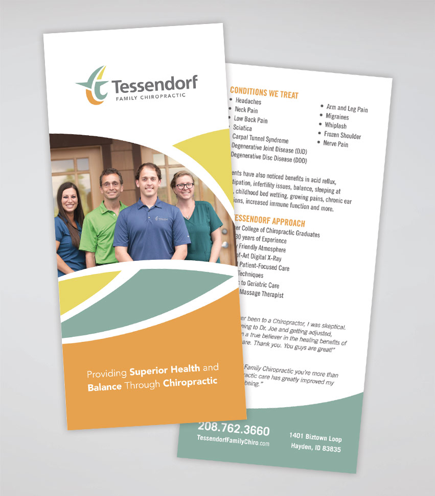
Tessendorf Family Chiropractic has over 30 years of combined experience between Dr. Joe and Dr. Tom Tessendorf. In a short time since opening up their practice in Hayden, Idaho, Tessendorf has made a positive impact in our local community through patient satisfaction, fundraising efforts and service to local nonprofits.
Tessendorf hired Tran Creative to provide branding services: Logo, Print Collateral, Web Site. After much research and over 100 logo variations, the final chosen logo features 2 “t” side by side. Working together, they form a united “t” with movement, flexibility, working one-on-one, spine, nerves.
We chose a multi earthy color palette to capture feelings of community, comfort, caring, passion for excellence and natural colors of the Pacific Northwest.
See new site: www.TessendorfFamilyChiro.com

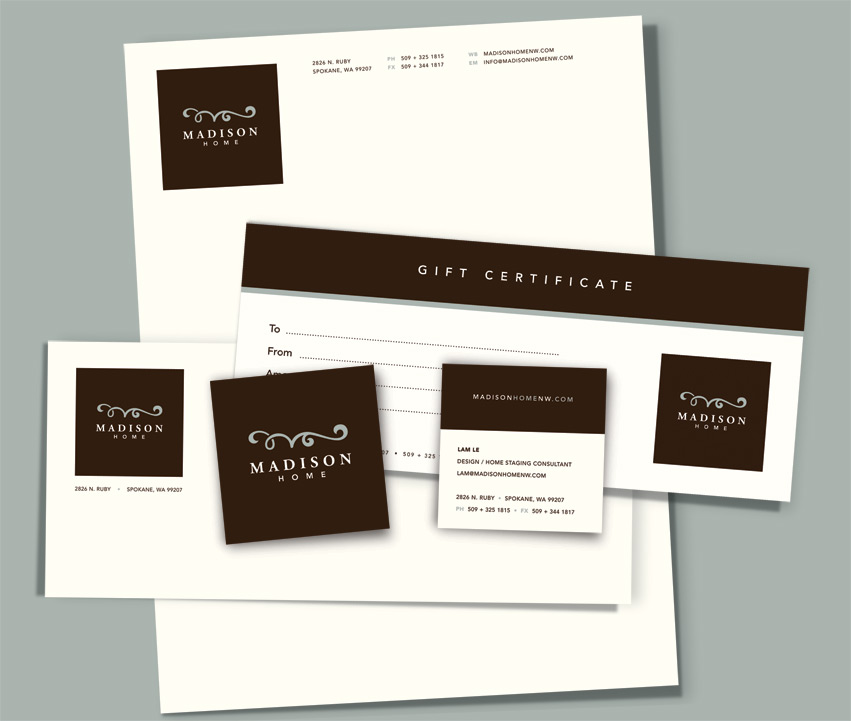
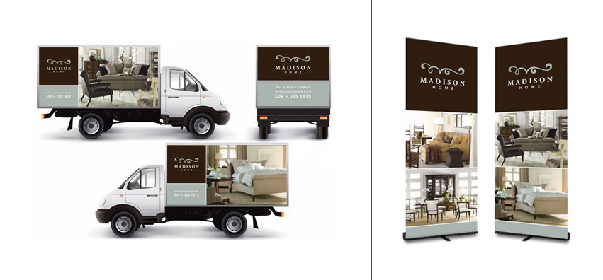
Madison Home is an upscale furniture store in Spokane, WA. It has been around for over 10 years. Madison asked Tran Creative to help create a new visual identity that is elegant, modern, and classy. The result is a stylized signature “M” for Madison positioned inside a square shape.
The idea: Square shape = Exactness, Precision. At Madison Home, we are committed to take great care of our customers by providing exceptional services + quality products. We put our signature mark on each home we design & each item we sell.
Thank you for checking out the new site: www.MadisonHomenw.com