Tran Creative creates the new identity for Game My Biz, a software platform that provides businesses with actionable insights to increase sales, grow revenue, and motivate employees. The new logo captures: multi-dimension letter G, play button.

 Admin
Admin 
Tran Creative creates the new identity for Game My Biz, a software platform that provides businesses with actionable insights to increase sales, grow revenue, and motivate employees. The new logo captures: multi-dimension letter G, play button.
Tran Creative creates the new identity for Origins Firearms Training in Utah. The new logo captures: letter “O”, parameter of safety and protection, target, bullet.
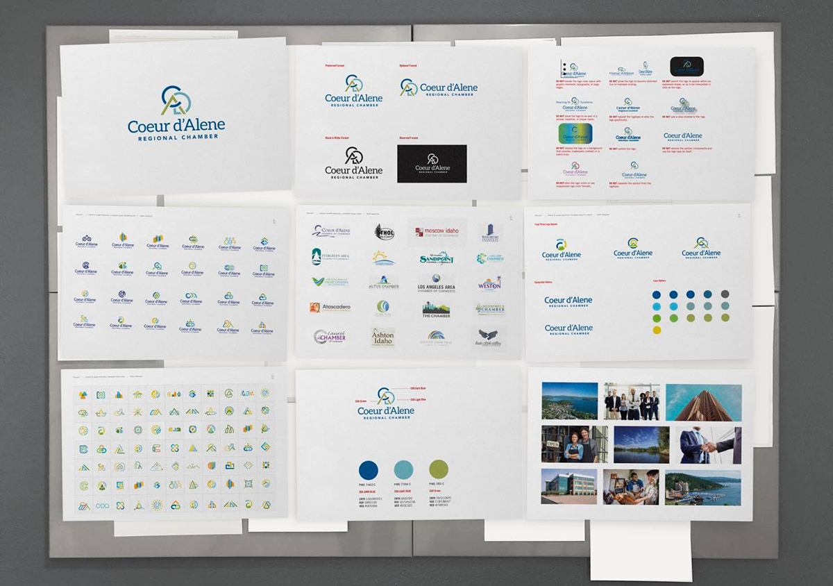
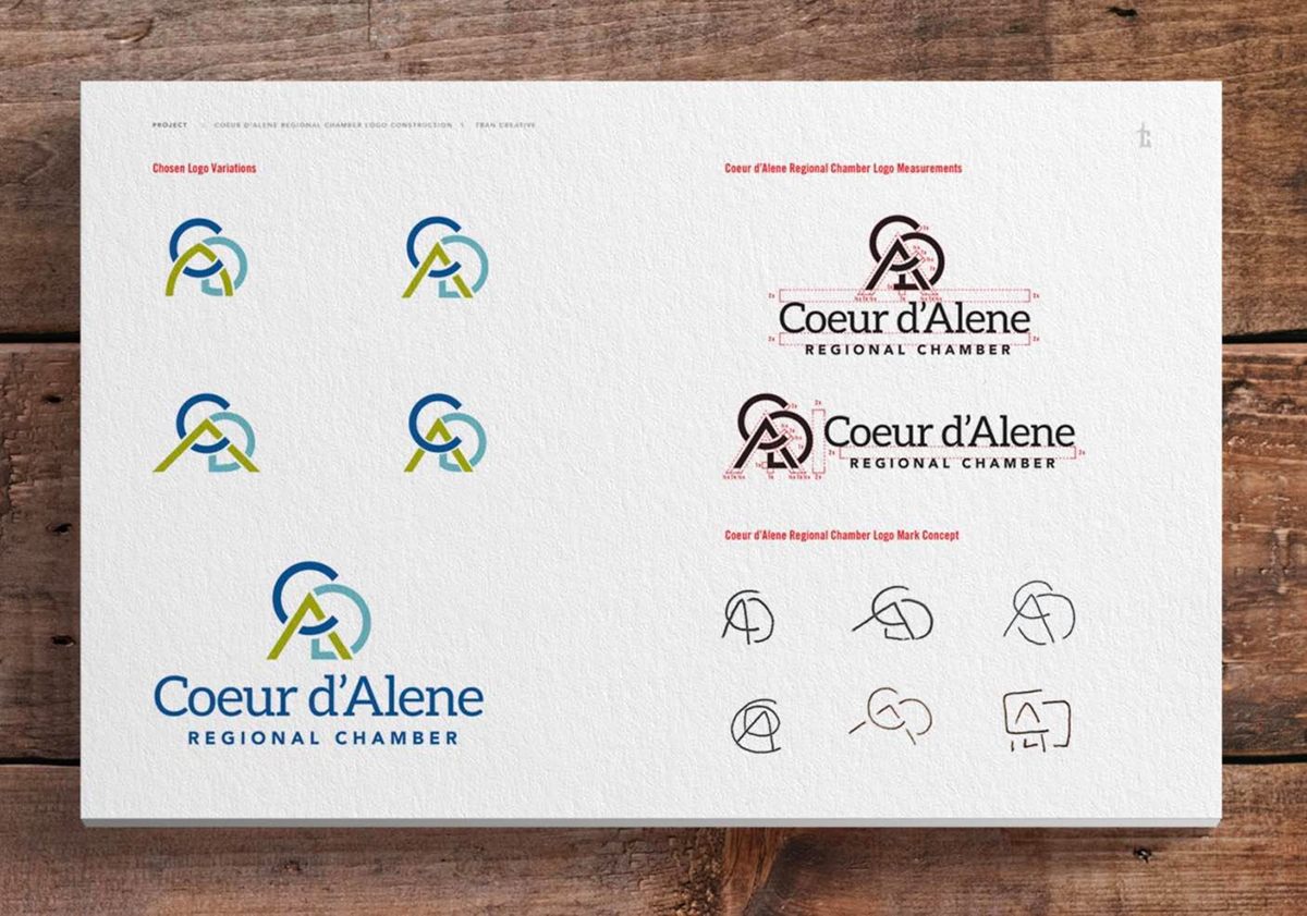
Tran Creative creates the new identity for Coeur d’Alene Regional Chamber. After comprehensive research, over 200 logo concepts and rounds of refinement, the final chosen new logo is constructed with letters C, D, A, networking and linking together to form CDA. Earth green brings out the mountain greenery. Dark blue is for business. Light blue is for water of the lakes. The new visual identity ushers in a new era of the Coeur d’Alene Chamber, now extending regionally serving businesses and communities.
Tran Creative creates the new identity for DJ Tom in North Idaho, who provides music, entertainment for events. The new logo captures audio sound wave frequency, turn table, music record, letter T. Now, let’s dance!
Tran Creative creates the new identity for Ace Construction. The new logo is constructed of: letter A, house, building, panels of drywalls to honor Ace’s root as a drywall contractor, arrow moving swiftly and efficiently to get the job done, ace of diamond values precious relationships with clients. New website launching soon.
Tran Creative creates the new identity for Keet Sweet Preschool and Kindergarten in CDA. This unique, award-winning school helps children develop a love for learning utilizing science, art, gardening, life skills, physical activity, animals. Students also learn how the fruits and vegetables are used around the world in different cuisines, giving them a global perspective about other cultures. Visit the new website: keetsweet.com


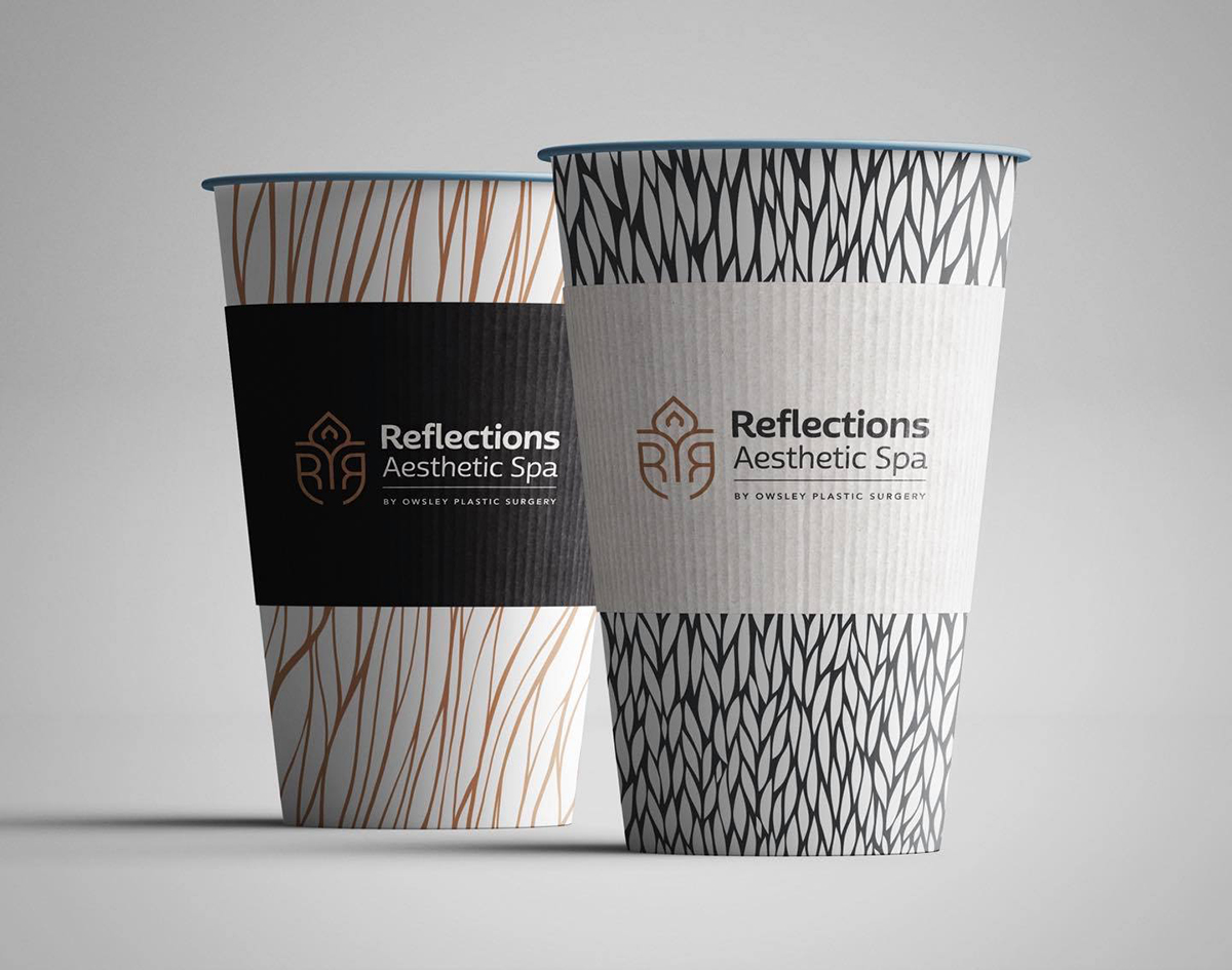
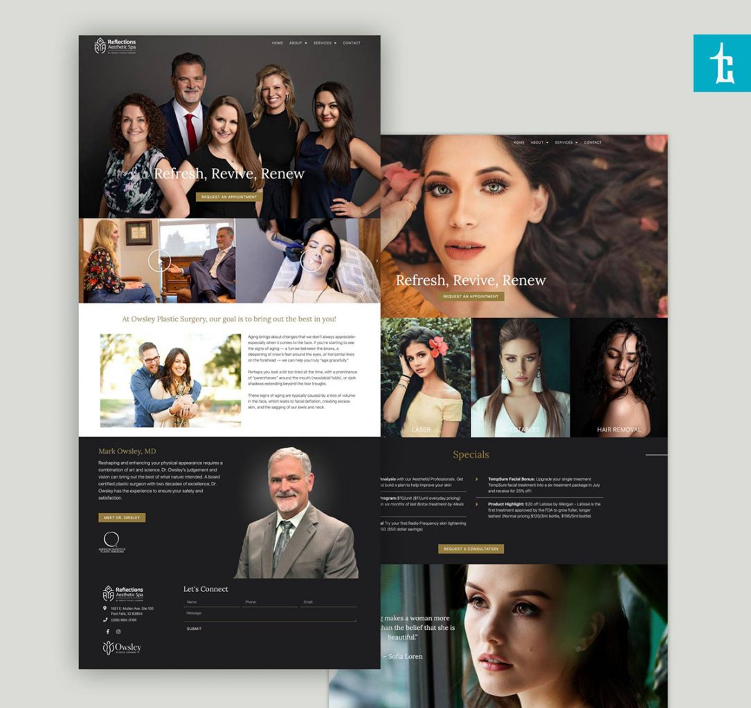
Tran Creative creates the new identity for Reflections Aesthetic Spa opening this summer in Post Falls. Dr. Owsley has over 25 years of experience, specialized in cosmetic plastic surgery in the Pacific Northwest with thousands of patients from all over the world. He is adding a team to provide additional aesthetic services. The new logo captures: letter R and its reflection, human figure with outstretched arms, spa lotus, all incorporated into an a spa crest. Elegant skin tone color palette completes the logo. We also created videos, product packaging and a new website: reflectionsbyowsley.com


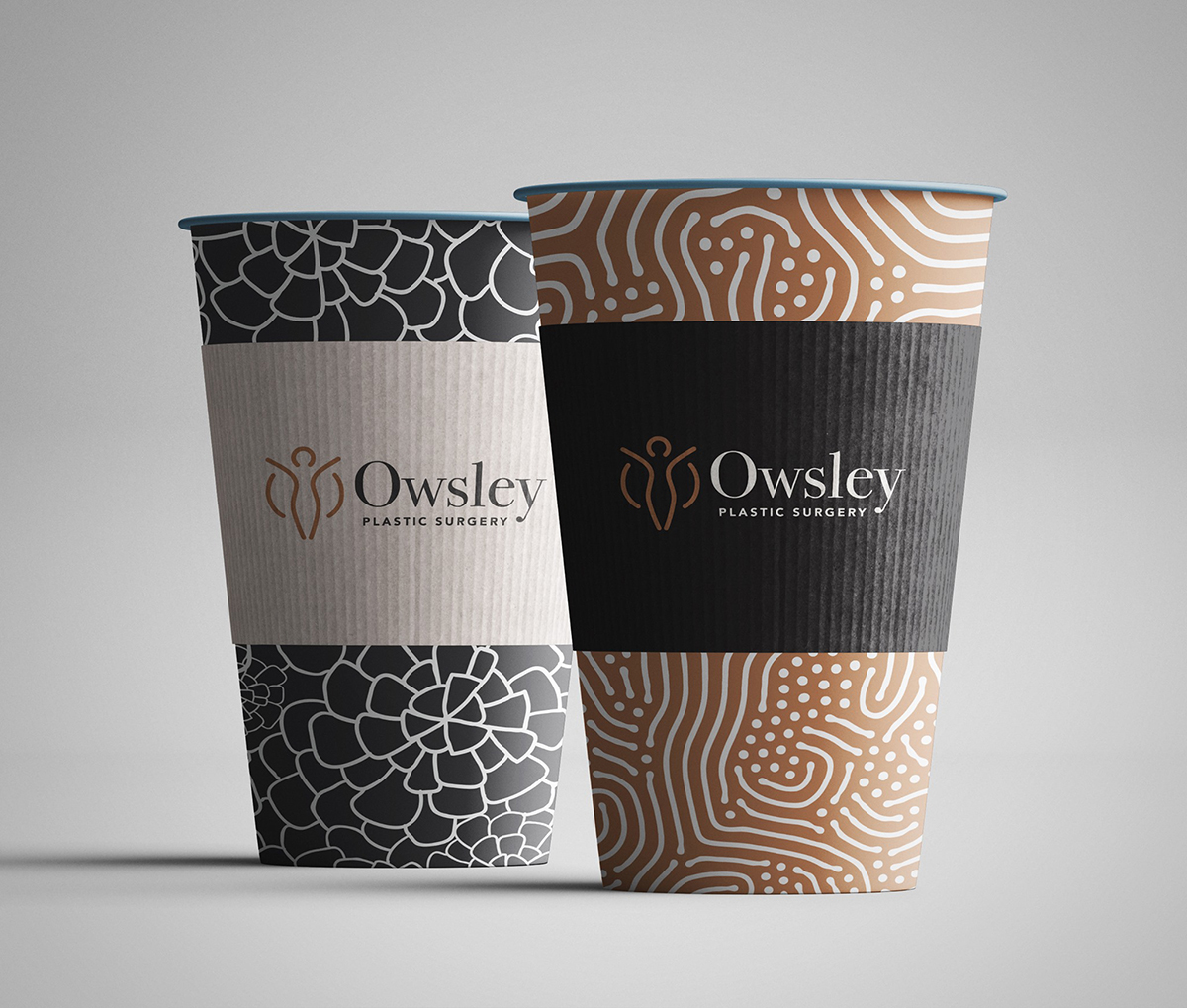
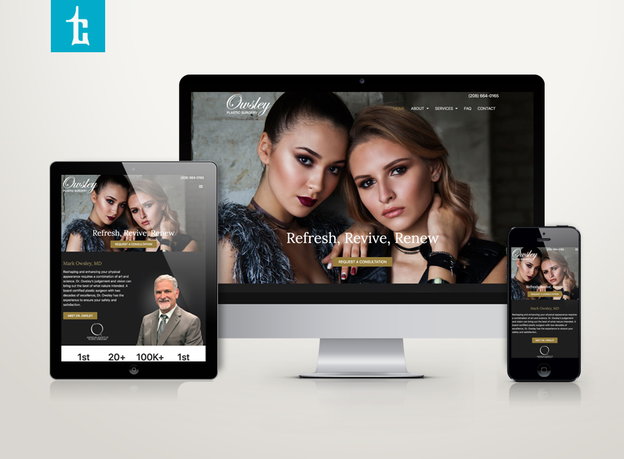
Tran Creative creates the new identity for Owsley Plastic Surgery. Dr. Owsley has over 25 years of experience, specialized in cosmetic plastic surgery in the Pacific Northwest with thousands of patients from all over the world. The new logo is consisted of a thriving human hourglass figure forming letter “O” for Owsley. The elegant skin tone color palette completes the logo.


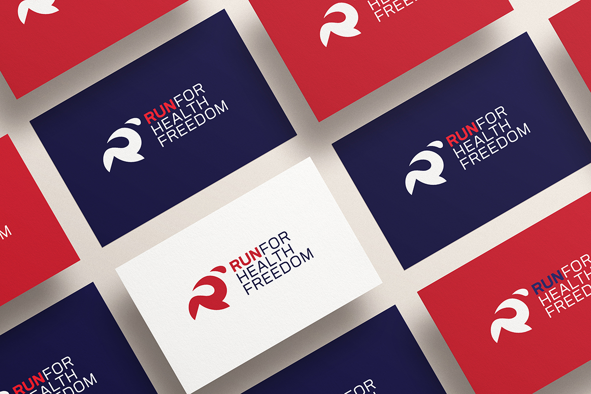
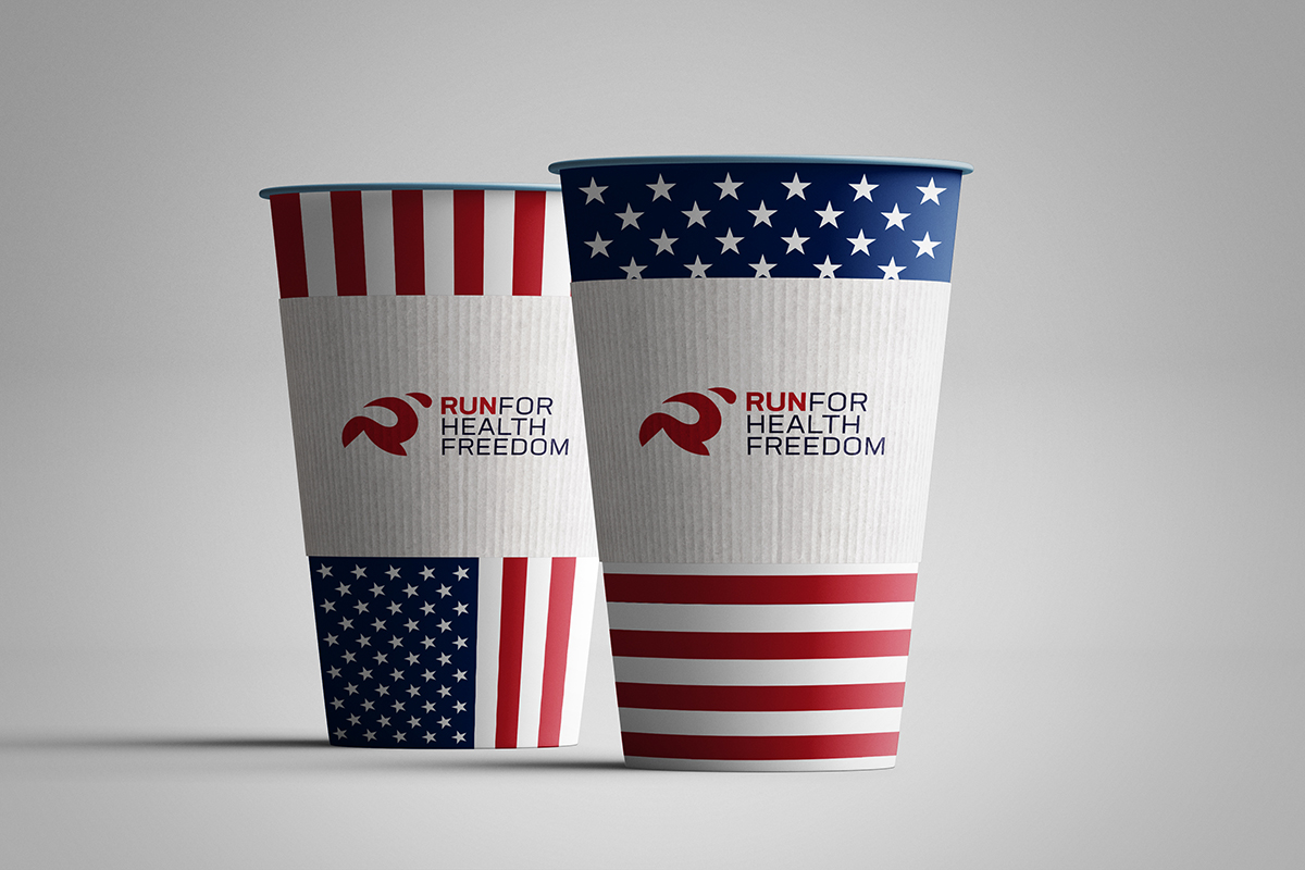
Tran Creative creates the new identity for Run for Health Freedom, virtual 5K run on July 4th, 2020. This is a virtual race to bring people together, stand up for protecting informed consent and health freedom, and raise support for the Stand for Health Freedom organization. The new logo captures the 1st letter of the event: R & runner with Independence Day color scheme.
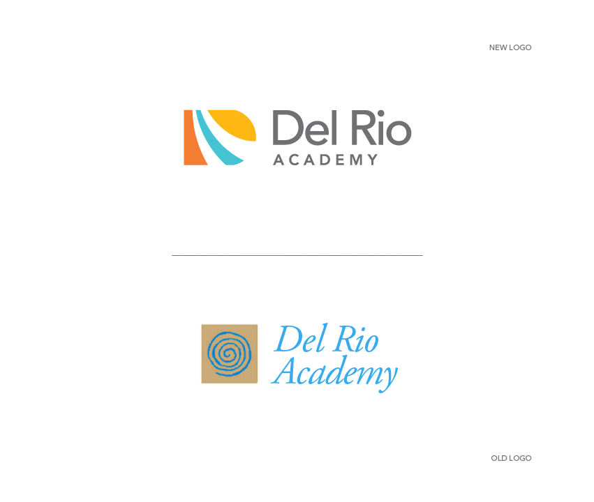
Del Rio Academy, a child development campus in New Mexico has hired Tran Creative to rebrand the organization. The new logo is constructed of letters D, R and River (Rio). The flavorful, earthy color palette communicates that the road to learning and education can be fun, enjoyable and is inspired by New Mexico colors with the river in fresh turquoise.