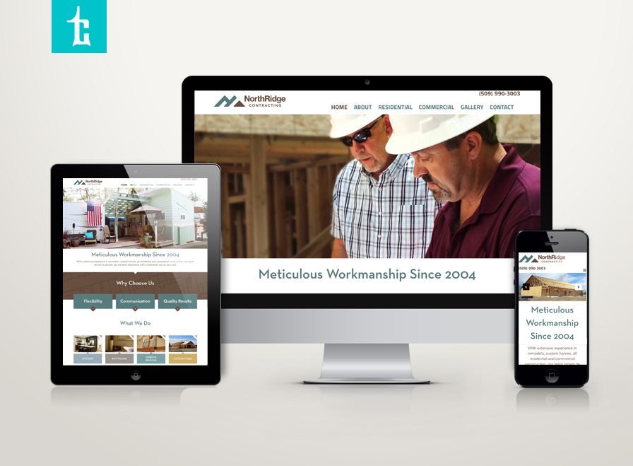
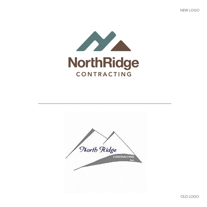
NorthRidge Contracting has hired Tran Creative to provide branding services including a new logo. The new chosen logo captures Letter N, arrow pointing North, construction elements: home, frame, structure and mountain ridge without showing the actual mountain. The new logo will be applied on all-new print materials and a brand new & responsive web site. Thank you for checking it out: www.NorthRidgeContracting.com
Blog
Orban Family Dental
Orban Family Dental is opening a new office in Coeur d’Alene (by Winco). Research shows that many dental logos often have overdone symbols: toothbrush, tree, leaf, teeth, molar… After visual audits and over 100 logo concepts, the final chosen logo captures 3 smiles (family dentistry) coming together to form letter O for Orban. Lowercase “orban” communicates the down-to-earth, friendly personality. All caps FAMILY DENTAL conveys professionalism combined with state-of-the-art equipments. Dental blue and minty fresh green completes the new logo for Orban Family Dental.
Vertical Earth
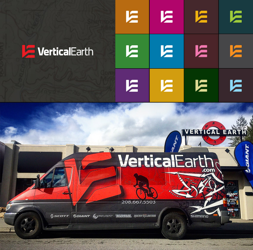
Vertical Earth, one of the most well-known bike shops in Coeur d’Alene, has hired Tran Creative to rebrand the shop. With much respect for the solid reputation of VE, we set out to create a fresh new look that would not only continue to strengthen the name but also provide VE with an iconic logo mark that can be used on race kits, merchandises, apparels, and different applications.
After over 100 different concepts, focus groups and feedbacks from cyclists and customers, the new chosen logo captures letters V, E, Vertical Edge and Layers of the Earth. We injected new color options to add flavors and flexibility to the brand, to extend beyond its core colors of red and black.
“Couldn’t resist the shameless self-promotion via our new sprinter van… We’ve been working on the re-branding of our shop for quite some time… Awesome job… to make a design even greater than what we imagined! Cheers guys!” – Mike Gaertner, Vertical Earth Owner
Triathlon Arts
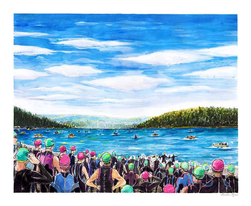
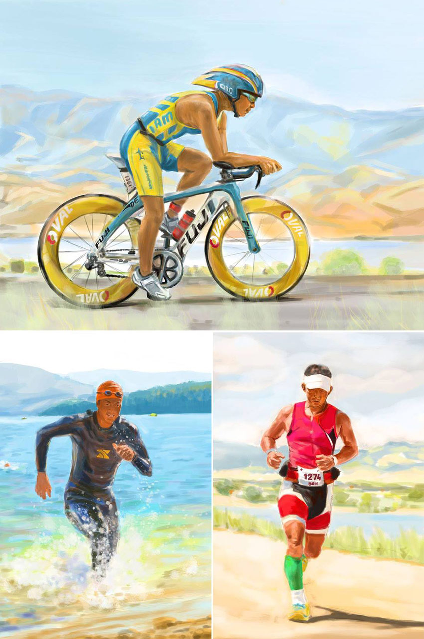
Triathlon Art is for people who love sport arts, especially triathlon. We create varieties of work based on unique art styles. Landon Ruan, BFA in illustration, painted these swim bike run pieces for Ben, Owner and Creative Director of Tran Creative.
Art by Triathlon Arts. Get your posters at: www.TriathlonArts.com
Mosaic Land Design
 Mosaic Land Design (MLD) is a landscape architecture and construction firm in Spokane, WA. They hired Tran Creative to develop a new logo. After research and exploring over 100 logo ideas, the final logo captures letters M, L, D, planning and looking at project from a wide perspective at birds eye view. Fresh blue captures water features. Gold conveys luxury, high-end, quality work. Brown is for soil and land.
Northwest Hospital Alliance
Northwest Hospital Alliance is a group of hospitals united to network, share resources, and provide better care for patients. Currently, the alliance includes 5 hospitals: Kootenai Health, Benewah Community Hospital, Bonner General Health, Boundary Community Hospital and Shoshone Medical Center, with room to add more hospitals in the future.
Tran Creative was hired to develop a branding system including: naming, logo, print collateral and logo standard guide.
After several months of extensive research and hundreds of logo concepts, the final logo was voted and chosen by the 5 CEOs of 5 hospitals. The new Northwest Hospital Alliance logo captures letters “H” and “A” (the short name will be referred to as the Hospital Alliance). The 2 linking hospital crosses convey working together, the bridge and connection between hospitals.
Blue and green capture the Northwest colors. Blue is for healthcare, experience and stability. Green is for healing and recovery. Orange radiates hope, energy, passion and innovation.
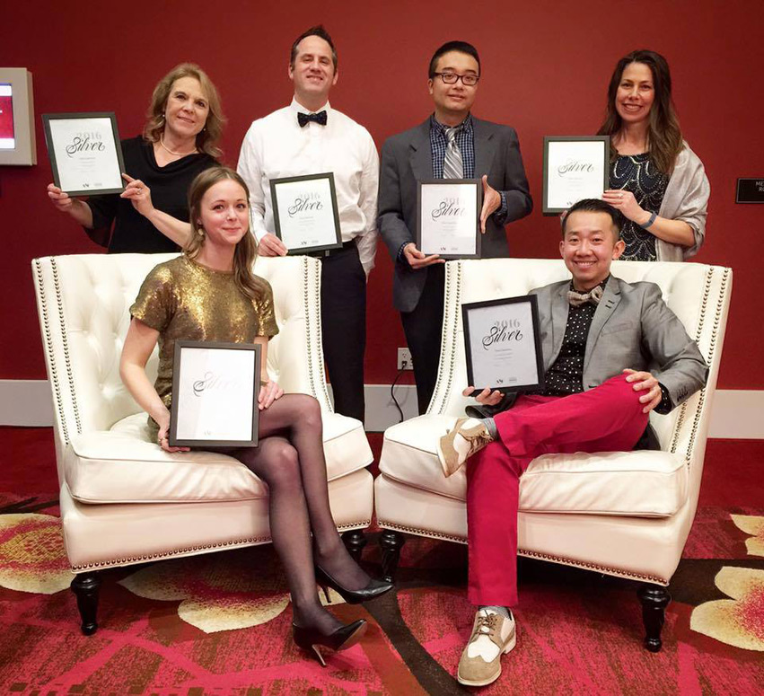
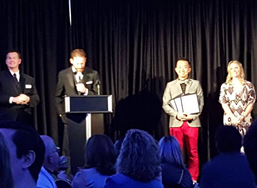
The logo was given an ADDY award at 2015 American Ad Fed.
Peach Orthodontics
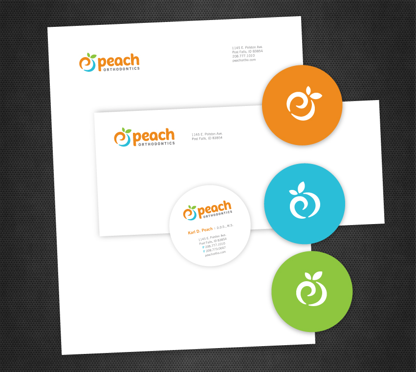
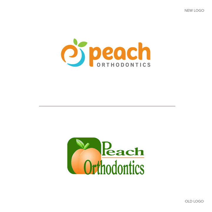
Peach Orthodontics hired Tran Creative to develop a new logo. After about 100 logo concepts, the final chosen logo captures more than just a peach – letter P, refreshing smile and a swirl of enthusiasm, passion and energy of an orthodontics group who truly cares about patients and loves what they do for over 20 years. Peach orange, refreshing aqua blue and nature green solidify and add flavors to the visual identity system.
The new logo will be applied onto all new marketing and communication materials, signage and a new web site.
Kupuna Monitoring Systems
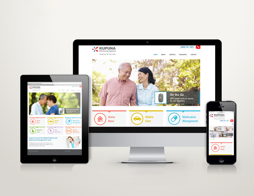
TUNSTALL Healthcare America ( www.tunstall.com ) has recently acquired KUPUNA Monitoring Systems in Hawaii, a company specialized in medical alarm and medical management tools. TUNSTALL hired Tran Creative to provide a brand refresh: logo, corporate print collateral and a new & responsive web site.
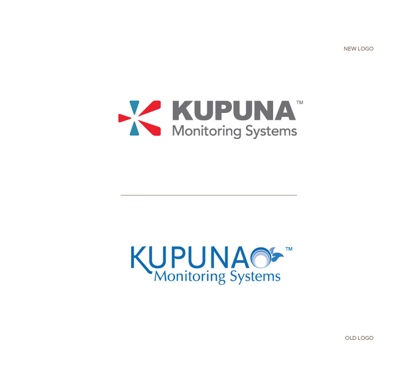
After extensive research and many logo variations, the final chosen logo captures the K, alert signal, and an abstract floral element to honor the company’s Hawaii root. Colors Blue & Red communicate experience in healthcare, alert, alarm and derive from Tunstall corporate logo colors.
SEE the new site: http://www.kupunamonitoring.com/
Enliven
Enliven is a healing center: holistic life coaching, nutrition counseling, meditation, yoga,… Tran Creative has been hired to create a new logo and tell the story. The new logo consists of 3 letters “e”. Weaving and working together, they convey: balance, flexibility, movement, nature, and flow of life. Sea foam Green provides healing, freshness and hope. Gray portrays stability and experience. The new logo will be applied on all printed materials and a new & responsive web site launching soon…
