Spokane Sports

Spokane Sports recruits, retains and facilitates sports events for the Spokane region.

Tran Creative was hired to create the new visual identity. From collaboration and working with the marketing/communications team of Spokane Sports, we crafted nearly 500 logo concepts from the olympic styles of athletes, thick and thin human elements, movement, speed. The final chosen logo is inspired by the track & field gem of the new Sportsplex – future home of USA Olympic, college conferences and national sports (spokanesportsplex.org). The sporty fluid lines forming letter S also convey movements, sports events in Spokane from Hoopsfest, Bloomsday to USA Track & Field Championship and so many more. Blue is for experience and stability. Orange ignites passion, energy and innovation. The custom business card shape is inspired by the shape of the track of the Sportsplex. From all of us at Tran Creative. We are grateful to be a small part of this monumental legacy project for the Spokane region.

The Spokane Sports Commission for the first time has won the Sports Events and Tourism Association’s Destination Branding and Marketing Campaign of the Year award. Read more here.

Cosmic Cowboy Grill

Tran Creative was hired to provide branding services for Cosmic Cowboy Grill. The logo consists of letters CC, forming the Cowboy hat. Shape of the Universe enhances the Cosmic concept – especially as distinct from the earth. The food at Cosmic Cowboy is unique. There is nothing like it in this area – fresh grill, delicious greens and appetizing side dishes for people of all ages. WHO’s hungry? www.cosmiccowboy.com

Marketing Series

We’ve enjoyed working with Cosmic Cowboy Grill since before they opened for business: from branding, logo, website to business strategy, social media strategy & marketing content like this.

North Idaho Dermatology

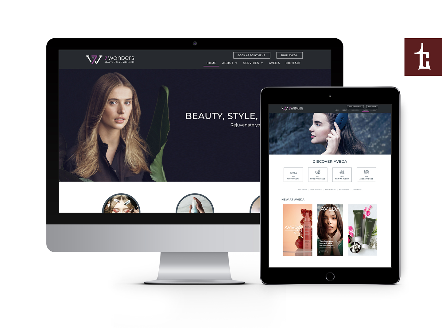
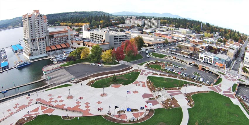
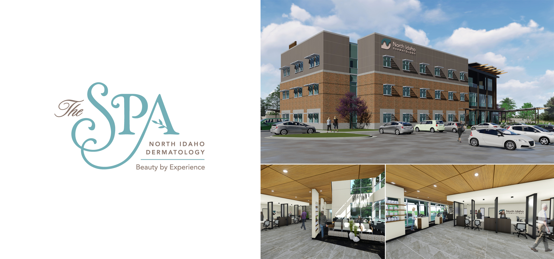
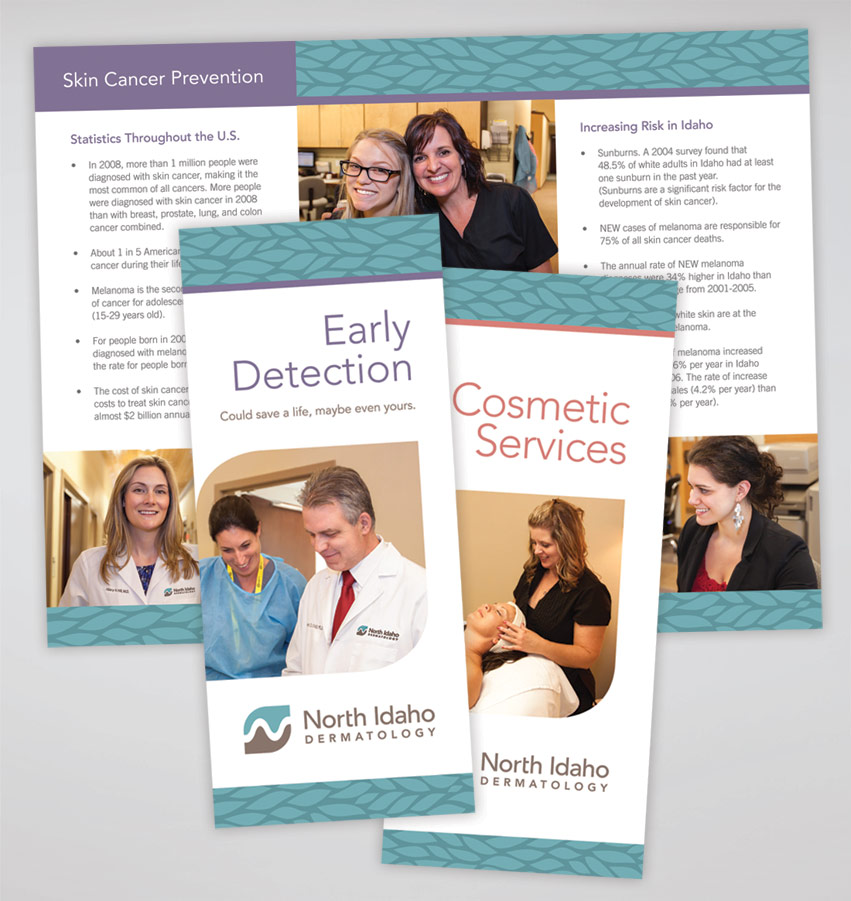
After months of working on this project, we are excited to launch the SPA at North Idaho Dermatology. The new SPA will be located in the brand new, nearly 30,000 sq ft state-of-the-art North Idaho Dermatology building on Northwest Blvd in Riverstone. The SPA, served by a team of experienced estheticians supervised by Board Certified Dermatologists, offers: Botox, chemical peels, laser treatments, waxing, facial, tattoo removal…

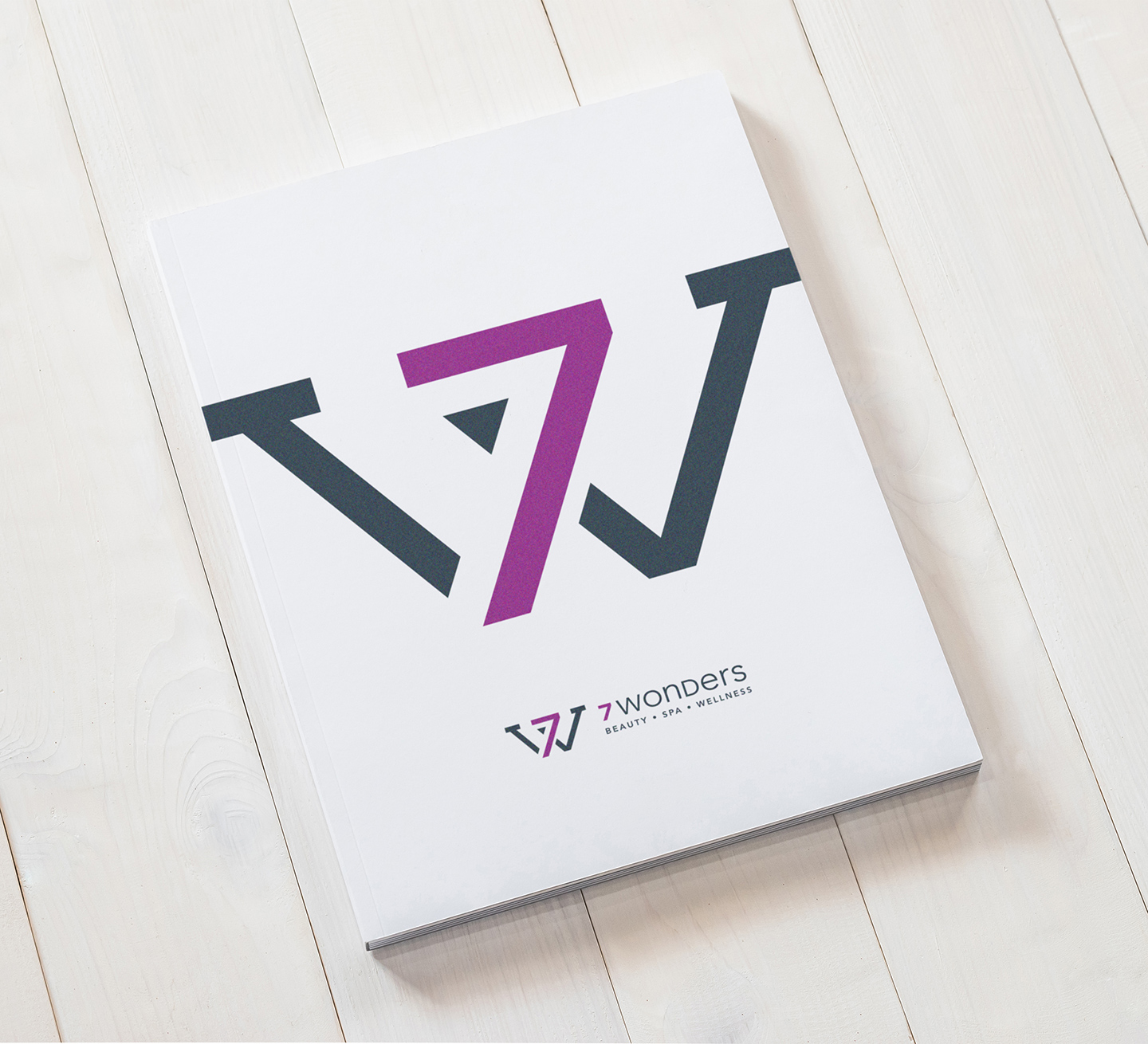
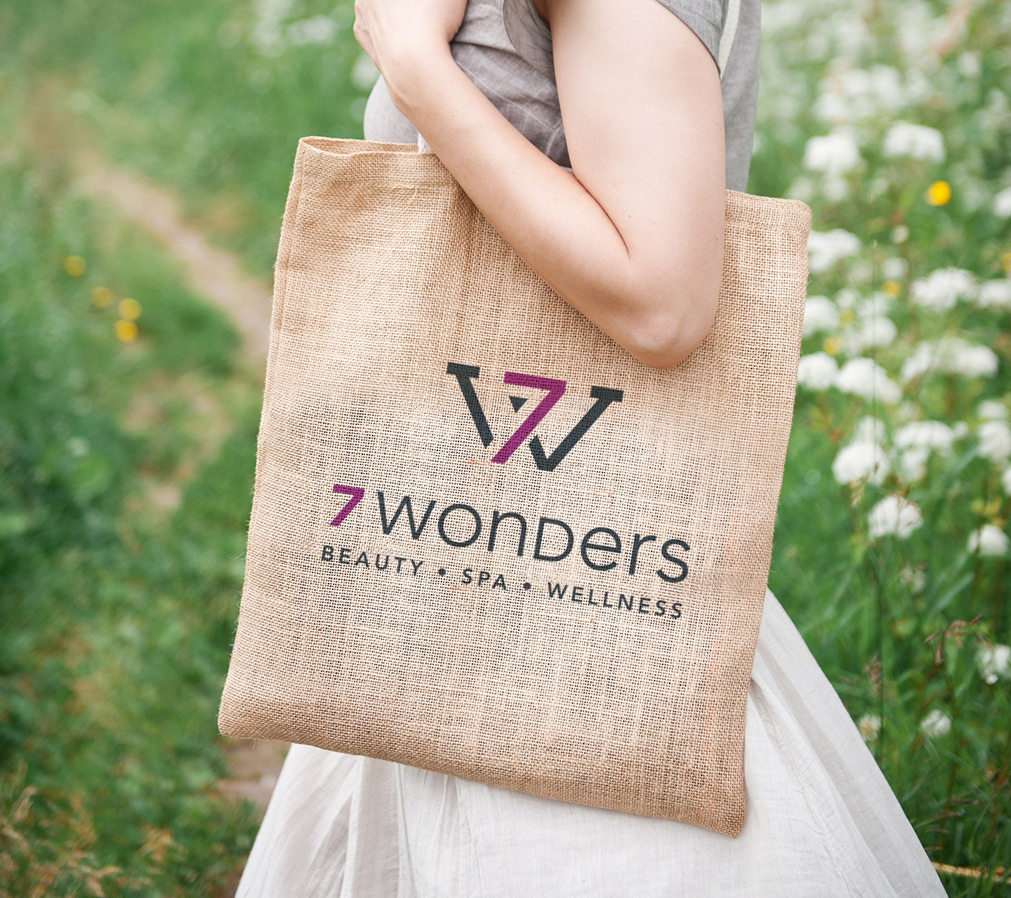
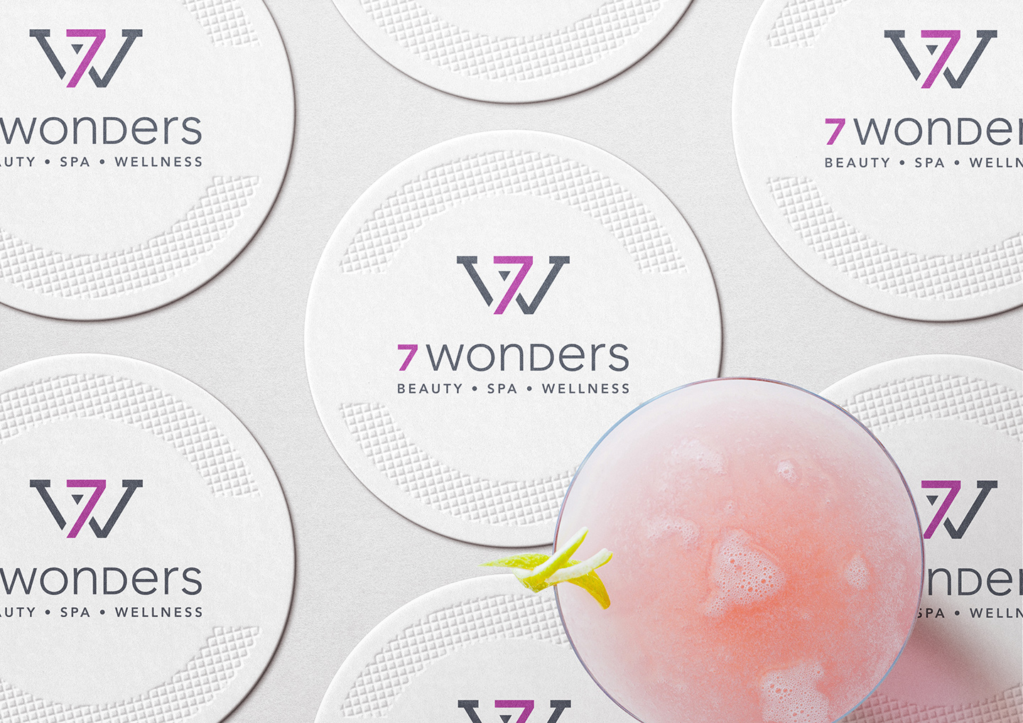
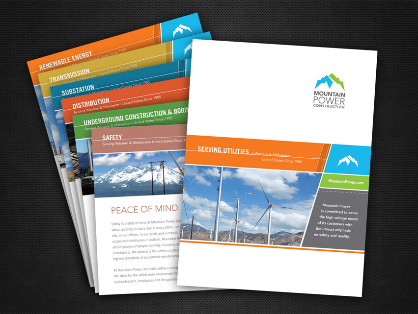
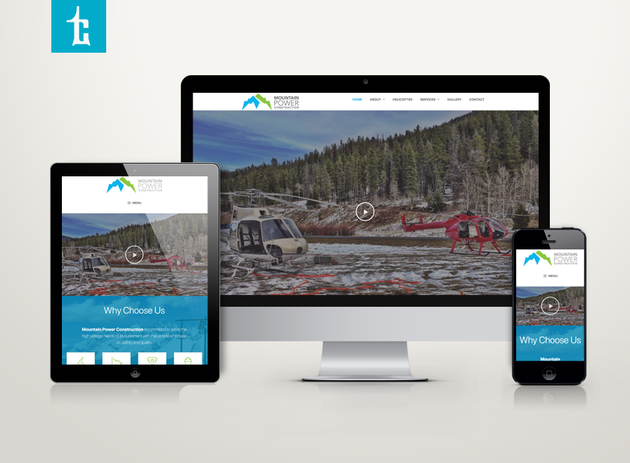
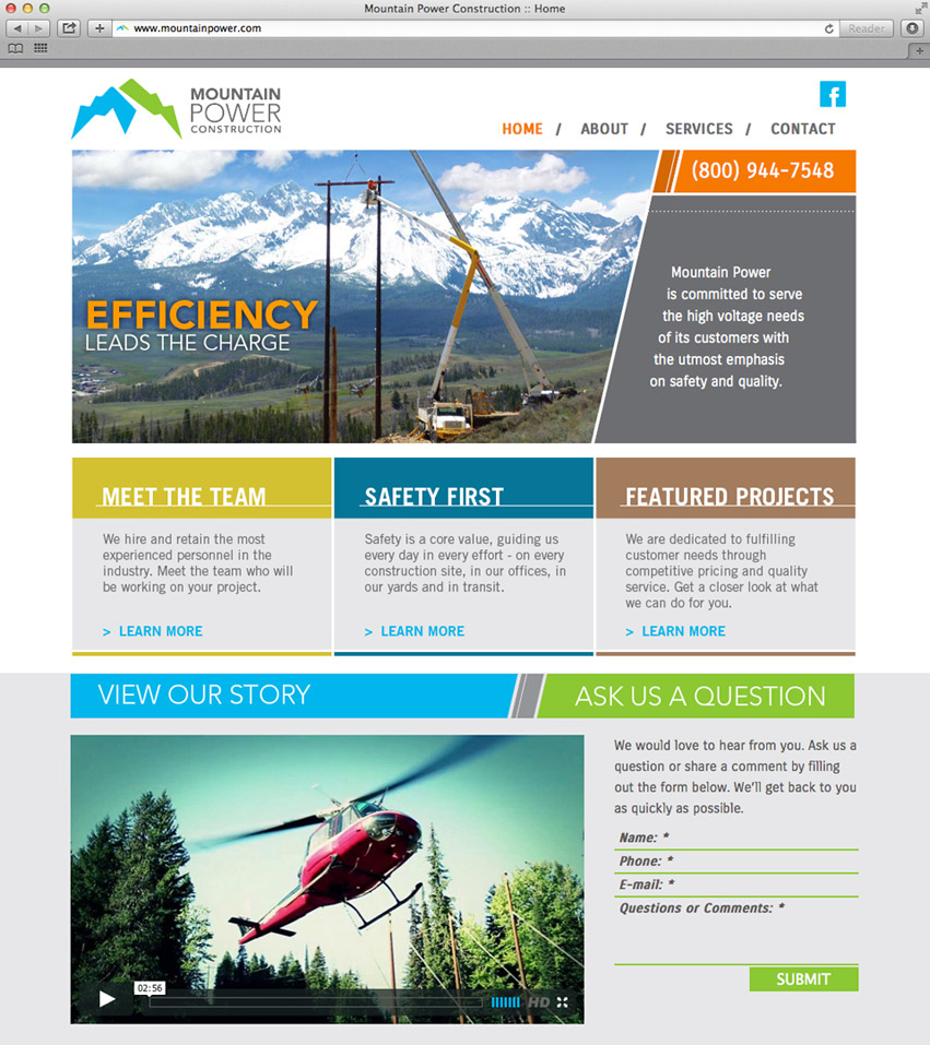
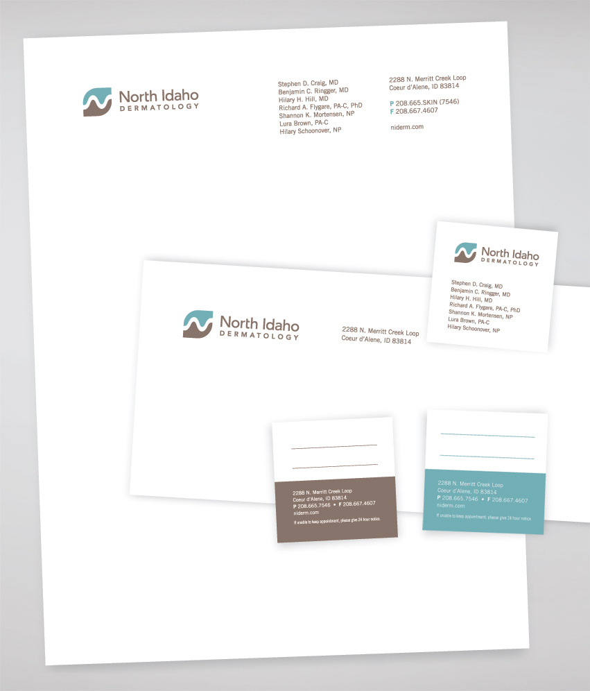
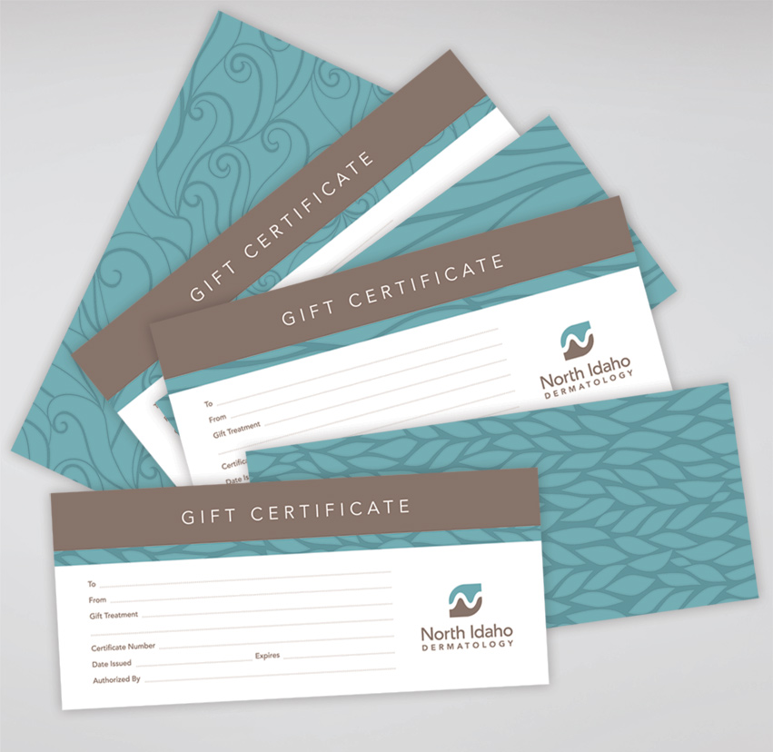
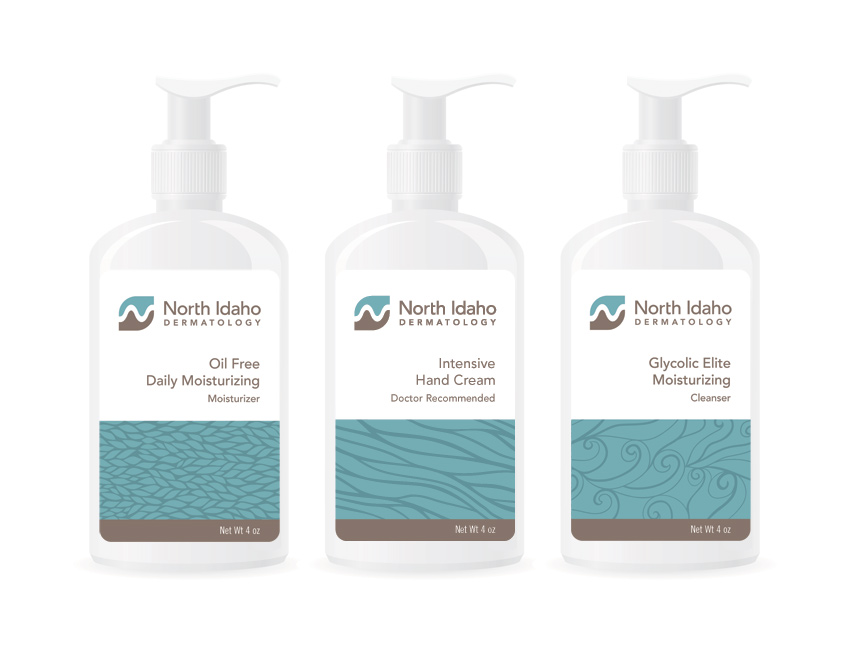
Tran Creative was hired by North Idaho Dermatology to provide full branding for the Spa: logo, website, marketing collaterals, brand guides, product packaging as NID is expanding with nearly 100 employees and 4 locations in Coeur d’Alene, Sandpoint, Moscow, and Liberty Lake, WA.

We are happy to launch a new website for our client/friends at North Idaho Dermatology. NID is constructing a brand new building on Northwest at Riverstone with the Grand Opening planned for this Fall: niderm.com

North_Idaho_Dermatology

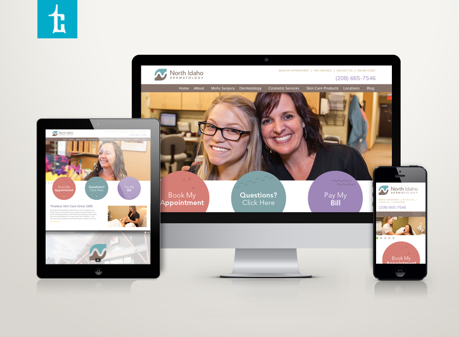
North Idaho Dermatology (headquarters in Riverstone) provides skin care and treatments in: skin cancer, laser treatments and more. With close to 70,000 patients served, nearly 100 employees, and 4 locations, North Idaho Dermatology is growing steadily, since 1999.

Tran Creative was hired to provide full branding services from logo, print materials, videos, marketing, to responsive website.

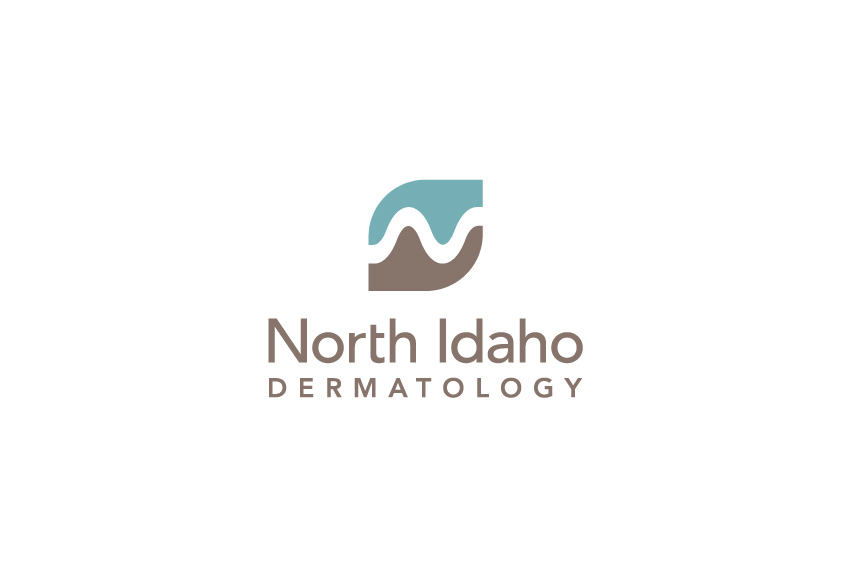
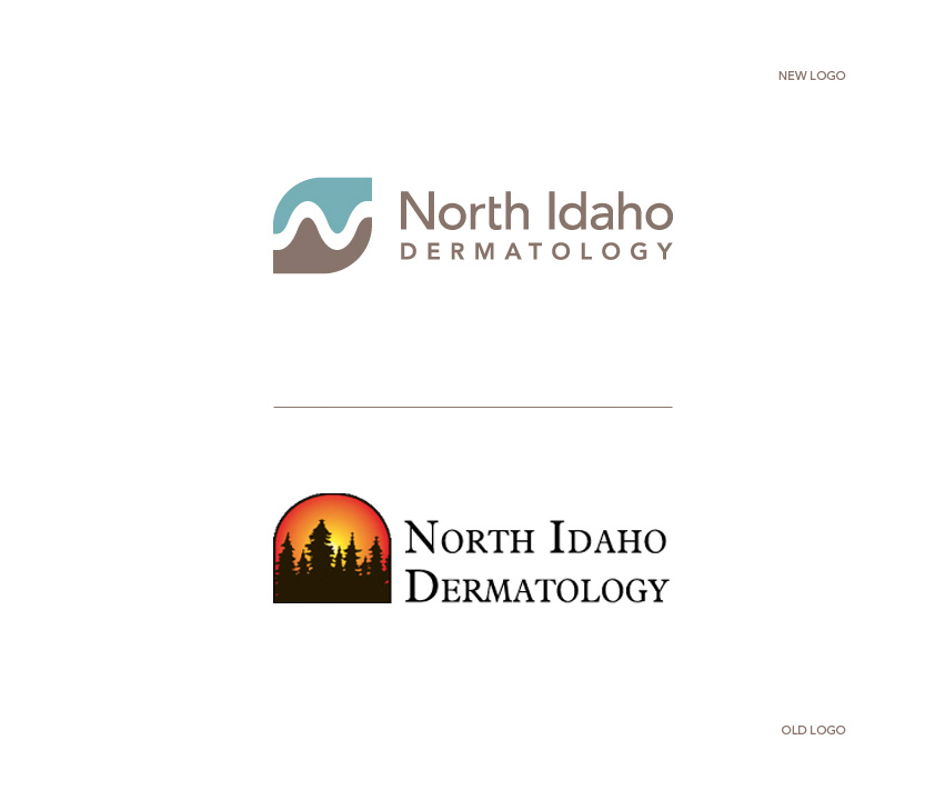
The new logo captures the N for “North” Idaho, skin layers, helping hands, and the mountain scenery of North Idaho without showing actual mountain and pine trees. All these elements are contained within a leaf-like shape to convey wellness, recovery and new life.

Color brown is for skin tone, experience, hard working, friendly & down-to-earth team of physicians and staff. Blue is for care and comfort.

See the new site: www.NiDerm.com

north_idaho_dermatology_tran_creative_website_design

NID_Stationery_tran_creativeNID_brochures_tran_creativeNID_giftcard_tran_creative_NID_bottle_mockup_tran_creativeNID_old_logo_tran_creative

Liberty_lake_dermatology_washington_logo_graphic_design_tran_creative

Liberty Lake Family Dermatology, a division of North Idaho Dermatology, provides skin care and treatments in: skin cancer, laser, mole, acne…

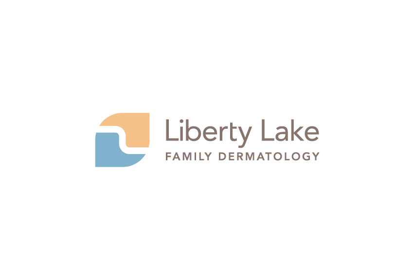
Tran Creative has been hired to provide branding services including a new logo. The new logo captures the L, skin layers and flowing water of Liberty Lake. All these elements are contained within a leaf-like shape to convey wellness, recovery and new life.

Color Blue is for care, comfort and healing. Golden Sand captures the skin tone. Brown is for experience, hard working, friendly & down-to-earth team of physicians and staff.

See the new and responsive site: www.LibertyLakeDerm.com

Mountain Power Construction

Congratulations to Mountain Power Construction on the launch of your new website. Mountain Power provides comprehensive powerline construction throughout the West & Midwest for decades. View their story: mountainpower.com

Mountain_Power_Construction_logo_design_old_new_tran_creative_graphic_design

Since 1985, Mountain Power Construction has served the Western and Midwestern United States with a complete range of powerline contracting services – including transmission, distribution, renewable energy, substation, underground. The company has been growing for the past 25 years with over 140 employees. Mountain Power hired Tran Creative to rebrand the company.

The old logo focused mainly on the powerline and mountain. Mountain Power has a wide range of experience from wind farms to submarine cable and much more. After much research and over 100 logo variations… the new logo captures strength and mountain aspect but also focuses on power/energy (the bolt in green). Together, they form a stylized letter “M”. The chosen colors capture the spirit of the Pacific Northwest, its headquarters.

Blue represents experience and hard working culture. Green symbolizes strength, energy and innovation. Gray typography conveys a solid foundation.

The design execution is easily identifiable and produced on all corporate collateral, web site, and other promotional products.

See the new website: MountainPower.com

Mountain_Power_Cconstruction_website_design_tran_creative Mountain_Power_Construction_packet_graphic_design_brochure_tran_creative

McEuen Park

McEuen_Park

In 2010, Tran Creative was hired to work with Team McEuen, Steering Committee and City of Coeur d’Alene for over a year on McEuen Park Renovation. Park upgrades feature a natural amphitheater, a new covered pavilion for group picnics and events, a donor wall, a grand plaza and waterfront promenade, scenic paved trails, new public art, a re-designed Veteran’s Memorial, an amazing interactive playground for kids of all ages, a new dog park, more user-friendly and efficient public parking, a new Front Avenue promenade with community gathering areas and an interactive splash pad with more than a dozen colorful water features.

The Ideas behind the Logo:

People + Letter “M” for McEuen. The CIRCLE in the middle represents the LAND where this project will be built upon. The color BROWN represents the color of the SOIL. The MULTI-COLOR palette represents the different parts of the COMMUNITY coming together to assist with this project. Each letter is individually customized to give McEuen its own distinctive personality.

On May 2, 2014, the community joined in for a soft Grand Opening. We know we are privileged to be a part of a special legacy project when we see our own children laughing, smiling, running around and playing at the park.


McEuen_Park_SoftOpening_tran_creativeMcEuen_Park_hat_tshirt_Coeur-dAlene_Web_Design_Tran_CreativeMcEuen_Park_photos_2_tran_creativeMcEuen_Park_photos_3_tran_creative
McEuen_Park_photos_tran_creative

Kootenai Health

With nearly 3,000 employees and continuous growth, Kootenai Health is one of the largest organizations in the Pacific Northwest region. Tran Creative was hired to rebrand the company. After about 1 year of comprehensive planning, research, focus groups, and hundreds of logo design explorations and revisions… together with Kootenai Health, we would like to introduce to you the fresh new look for Kootenai Health.

To update a brand like Kootenai Health’s requires comprehensive work and respect for the equity of the brand. We wanted to value Kootenai’s history (since 1960’s) but also visually represent who they are today. Visual audits of other health care organizations’ logos showed similar themes and colors. We wanted to develop a logo that represented Kootenai Health as: friendly, compassionate, reaching out and growing.

The new logo, “the Spark”, features the “K” and captures the spirit of service, health and compassionate care. It reaches up to set high standards and reaches down to lift and provide compassionate care. The new logo also conveys teamwork – weaving together. The balance symmetry of the logo conveys stability, experience, consistency, and growth for the future.

The Kootenai Blue is kept to preserve history. The fresh new Green provides hope and healing.

Kootenai Health’s vision is to be a comprehensive regional medical center by 2020. Visually, this new mark will take them there.

To learn more, visit: www.kootenaihealth.org

Design Process

For about 1 year, Tran Creative worked with Kootenai Health communications and leadership team on research, focus groups, interviews. Only after we’ve gathered these important data, we’ve moved forward on the design process. We’ve explored hundreds of logo concepts in many different directions. Once the “Spark” direction was chosen, the Kootenai Health mark began to take shape.

New Facility

Tran Creative was hired to rebrand Kootenai Health. We got to work with this amazing marketing & communications team, went through an extensive process of about one year from start to launch of the new brand: research, focus groups, interviews, concept, design, presentations… Last week, at the Grand Opening of the $57 million expansion, we had a chance to catch up, a reunion to reflect and marvel… A good friend at this event reminded us, “Years from now, we tell our kids and their kids that we got to work on this legacy project.” Wow!

Get In Touch

Interested in working with us?
We would love to help TELL YOUR STORY.

Logo

Create an identity to break the generic mold.

Web

Provide sleek and modern resources for your clients.

Marketing

Tell your story and increase your revenue.