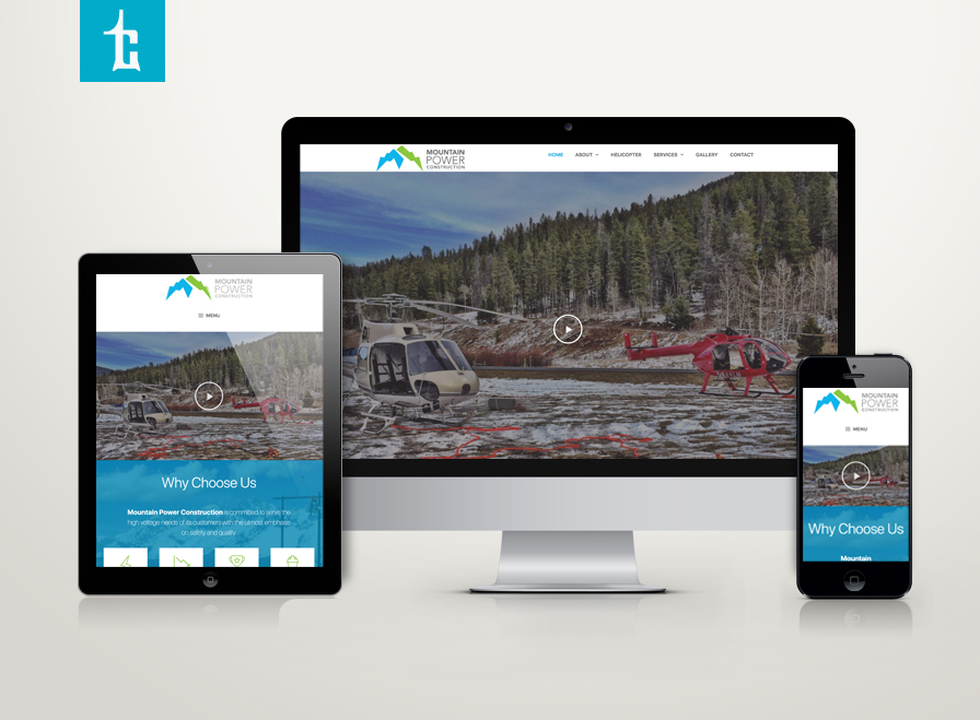
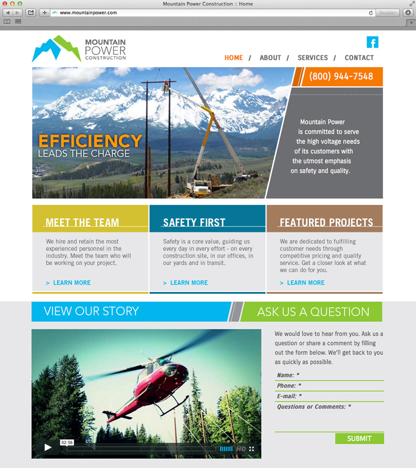
Congratulations to Mountain Power Construction on the launch of your new website. Mountain Power provides comprehensive powerline construction throughout the West & Midwest for decades. View their story: mountainpower.com
Since 1985, Mountain Power Construction has served the Western and Midwestern United States with a complete range of powerline contracting services – including transmission, distribution, renewable energy, substation, underground. The company has been growing for the past 25 years with over 140 employees. Mountain Power hired Tran Creative to rebrand the company.
The old logo focused mainly on the powerline and mountain. Mountain Power has a wide range of experience from wind farms to submarine cable and much more. After much research and over 100 logo variations… the new logo captures strength and mountain aspect but also focuses on power/energy (the bolt in green). Together, they form a stylized letter “M”. The chosen colors capture the spirit of the Pacific Northwest, its headquarters.
Blue represents experience and hard working culture. Green symbolizes strength, energy and innovation. Gray typography conveys a solid foundation.
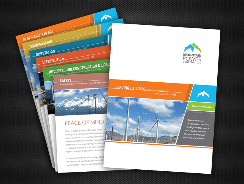
The design execution is easily identifiable and produced on all corporate collateral, web site, and other promotional products.
See the new website: MountainPower.com


