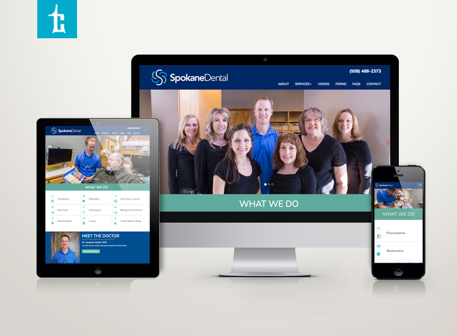
Spokane Dental is growing. Dr. Jon Smith and team hired Tran Creative to provide branding services including a new logo development. Research shows many dental logos with overdone tooth, molar, tooth brush, tree, leaf, etc. The final chosen logo captures letter S for Spokane, 4 smiles (family), cleansing swirl. New website: www.spokanedental.com
LaRiviere has joined forces with CNI (Contractors Northwest, Inc.) to form LaRiviere CNI with about 200 employees strong. Tran Creative was hired to help brand this new powerhouse, a company that connects the Northwest community with projects: McEuen Park, CDA Chamber of Commerce Building, Greensferry Bridge, Kootenai Health Cancer Center and many more. The new logo is constructed of letters L & C stacking up to form a 3D structure. LaRiviere’s strong background in excavation combined with CNI’s expertise in building provide clients with a complete source, a one-stop shop, as a general contractor and construction manager.
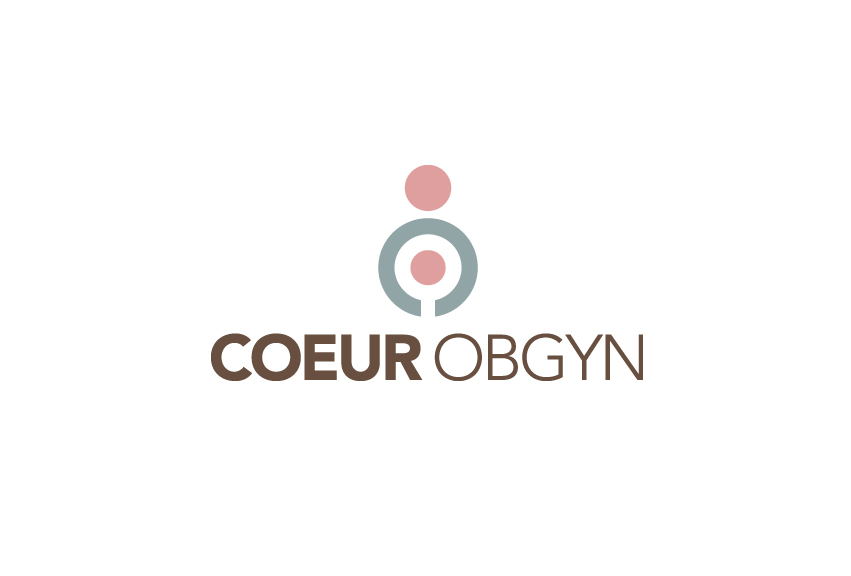
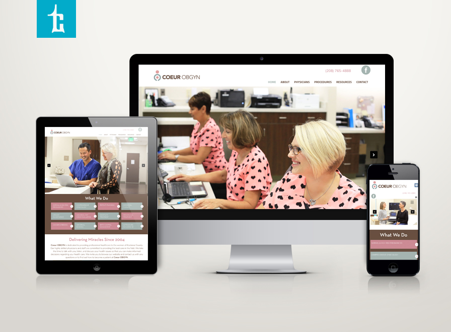
Henneberg & Kim OBGYN is expanding (no pun intended). We’d like to introduce COEUR OBGYN – a new name that encompasses a growing team of 6, soon to be 7 providers with exceptional nurses and staff. The name “COEUR” was chosen because it means “heart” – a reflection of love and heart that the COEUR team have for this specialty and all of their wonderful patients.
The logo represents a woman embracing her anatomy and a mother holding her child in her womb.
Corner Booth Media in Spokane, WA provides strategic integrated media, videos. You may have seen TV spots/videos in this region for STCU “Here for Good”, Greater Spokane Incorporated or Gonzaga Men’s Basketball at Gonzaga University. To celebrate 15 years of success, Corner Booth hired Tran Creative to create a new logo that tells a story: Letters c & b forming conversation bubble to reinforce Corner Booth’s simple idea of “Whoever tells the best story wins”. Congrats CB on your 15th and to the next 15.
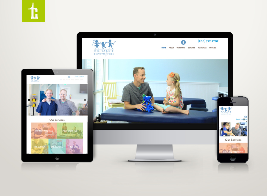
We are happy to launch a new website for Dance Dentistry for Kids. We love working with Dr. Tom, Dr. Dallin and staff. Thank you for checking it out: www.dancedentistry.com
Dr. Poulsen’s clinic in Post Falls, Idaho hired Tran Creative to provide branding services including a new logo. During research, we found many Periodontics logo with molar, tooth, implant. After many logo concepts, the final chosen logo captures letter P flowing with soft and curvy layer of the gum line. Minty, dental color palette completes the logo.
DiEPCo is the world’s largest independent diamond blank cutting and most high tech EDM (Electrical Discharge Machining) shop in the world. With its headquarters in Ohio, DiEPCo manufactures cutting tools and distributes the finest products for machining applications. DiEPCo hired Tran Creative to provide branding services including a new logo. After research and about 100 logo concepts, the chosen logo captures letter D, diamond shape, edgy for cutting/tools.
The new logo will be applied onto all new marketing materials and a new & responsive website launching soon.
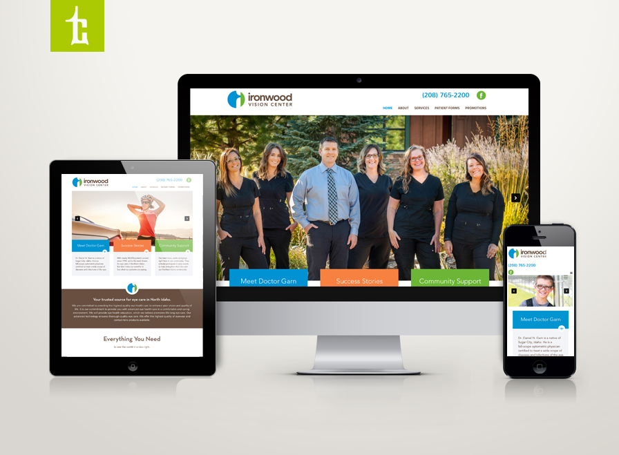
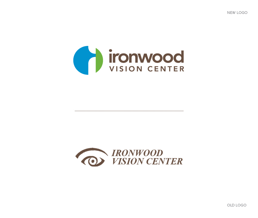
Ironwood Vision Center, office of Dr. Daniel Garn and staff, has hired Tran Creative to provide branding services including a new logo. During research, we found many eye clinic logos with the “football” shape of the eye. We researched and studied the eye shape & form carefully. The complexity of the eye was simplified into 2 shapes. After about 100 logo ideas, the chosen logo was crafted as a symbol that represented the Anatomy of the Eye: Vitreous body in blue and Cornea in green. Letter ‘i” for “ironwood” is in the white negative space.
The lowercase “ironwood” communicates friendliness, approachability and down to earth. “VISION CENTER” in cap reflects professionalism. Colors blue, green and brown are for eye colors, fresh and clear.
The new logo will be applied onto all new marketing materials and a new & responsive web site. Thank you for checking it out: www.cdaeyedoctor.com
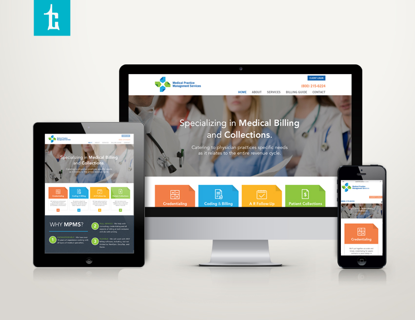
Tran Creative was hired to give Medical Practice Management Services a brand refresh. After many logo variations, the new logo has been chosen. It is crafted with 4 folded corner papers. It represents file management and organization. Together, they form a medical cross. Blue is for experience and stability. Green is for fresh thinking and problem solving. The new logo is implemented onto all marketing & communication materials, including a new web site: www.medpracmgmt.com
Logo designed by Tran Creative for Medical Practice Management Services has been given an award and published in Logo Lounge 9: International Identities by Leading Designer. Check it out next time you visit Barnes & Noble or any major bookstore. Congrats, team!
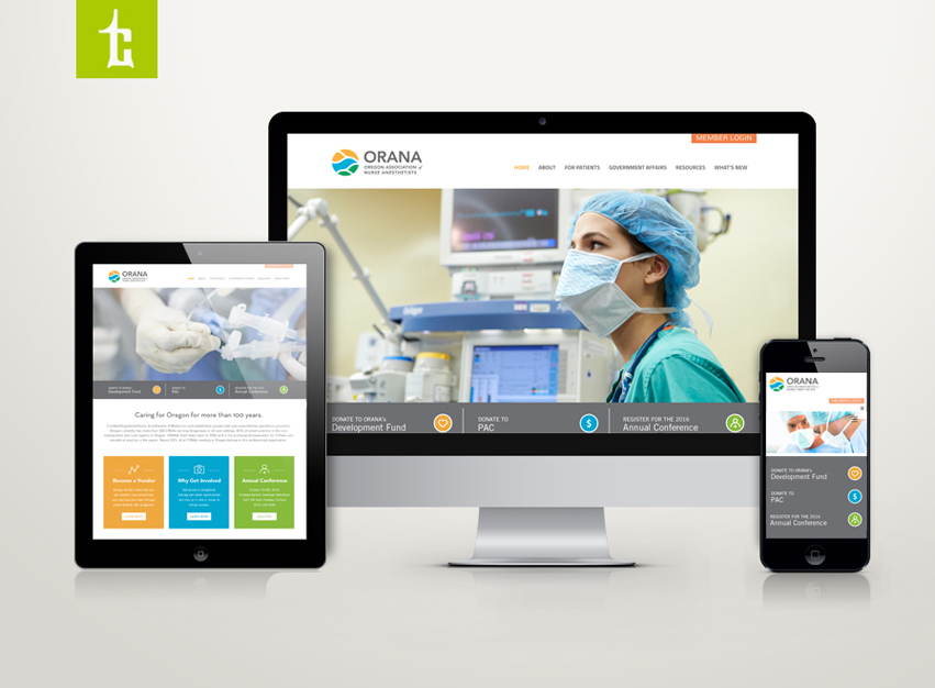
Oregon Association of Nurse Anesthetists, established in 1935 with nearly 400 members, has hired Tran Creative to provide branding services including a new logo. After extensive research and over 100 logo concepts, the ORANA Board has chosen the new logo. Letter O for Oregon, network, connection, unity, air/liquid drop flow through tube lines, cells, nature elements of Oregon: greenery, lake without being obvious.
The new logo will be applied onto all new marketing collaterals including a new & responsive web site with a custom members only portal. Thank you for checking it out: www.oregon-crna.org