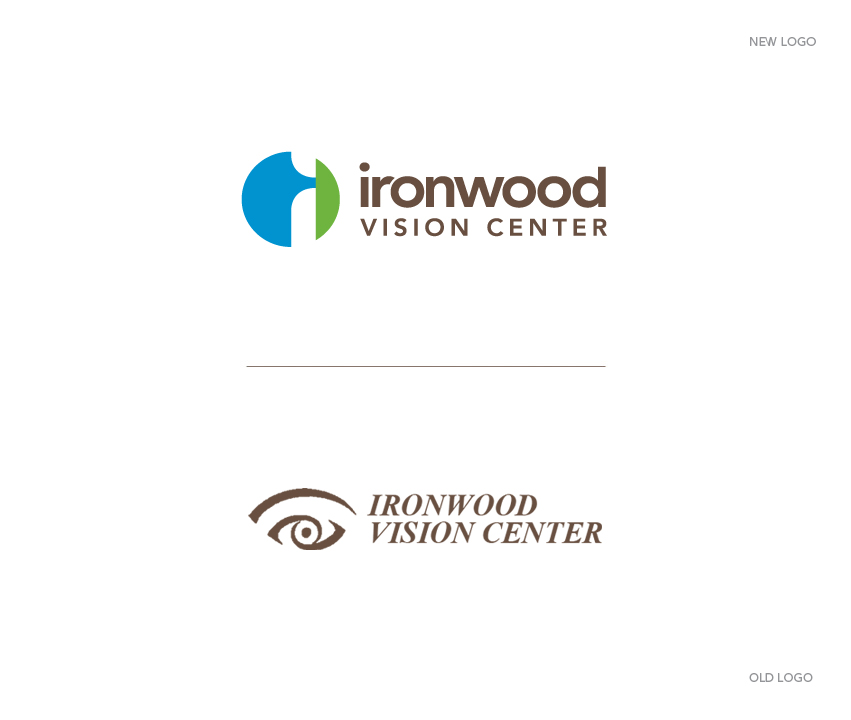
Ironwood Vision Center, office of Dr. Daniel Garn and staff, has hired Tran Creative to provide branding services including a new logo. During research, we found many eye clinic logos with the “football” shape of the eye. We researched and studied the eye shape & form carefully. The complexity of the eye was simplified into 2 shapes. After about 100 logo ideas, the chosen logo was crafted as a symbol that represented the Anatomy of the Eye: Vitreous body in blue and Cornea in green. Letter ‘i” for “ironwood” is in the white negative space.
The lowercase “ironwood” communicates friendliness, approachability and down to earth. “VISION CENTER” in cap reflects professionalism. Colors blue, green and brown are for eye colors, fresh and clear.
The new logo will be applied onto all new marketing materials and a new & responsive web site. Thank you for checking it out: www.cdaeyedoctor.com