Pinnacle Physical Therapy and Sports Medicine provides quality physical therapy with 2 locations in Post Falls and Coeur d’Alene.
Pinnacle PT is growing and evolving. They hired Tran Creative to provide branding services and help tell their story visually with a new logo. Research showed that many “Pinnacle” logos often have the mountain peaks. We wanted to be unique and stay away from the obvious mountain. After much research and about 100 logo concepts, the final chosen logo captures the “P” for Pinnacle. The logo also exudes movement, pinnacle of life in green (without being too obvious). The road to recovery (in blue) is typically not easy. But with persistence, patience and determination, and care from Pinnacle PT, one will be able to get back on top, to the pinnacle of their life.
Blue and green capture the region’s colors. Blue is for healthcare and experience. Green is for healing and recovery.
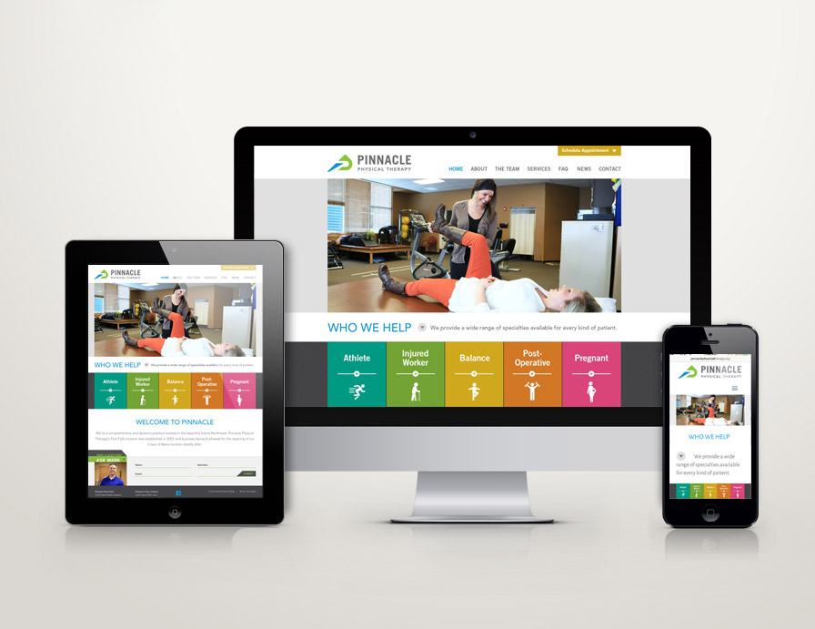
The new logo is applied onto all print collateral and a new & responsive web site: PinnaclePhysicalTherapy.org


