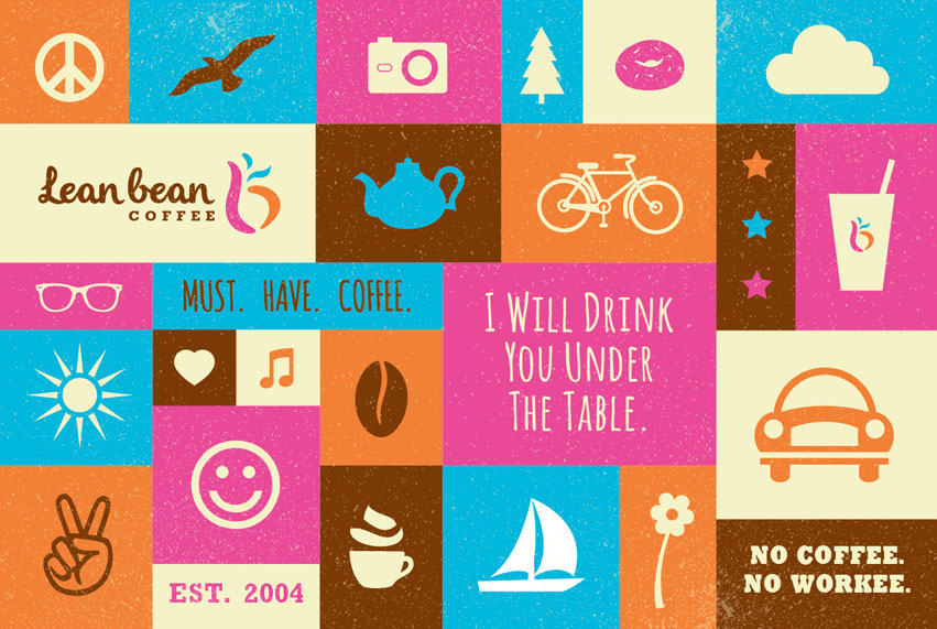
Lean Bean Coffee has 2 locations in Coeur d’Alene. There is more than just coffee. For the past decade, Lean Bean has been serving coffee, breakfast, tea, fruit smoothies, and delicious lunch. The company is growing steadily and is looking to expand. Lean Bean hired Tran Creative to create a new visual identity.
Through visual audits and research, we’ve found many existing coffee logos in circular shapes, cups, mugs, and coffee beans. After research, we’ve created over 100 logo variations. The chosen new logo captures the “L” & “b”. It is full of life, movement, and expression. The rising aroma adds flavor and tastiness to the brand.
Orange is for energy & passion. Hot pink is for fun & quirkiness. Blue is for balance & freshness. Brown preserves Lean Bean’s root – coffee.
Visit Lean Bean’s FB page to see what all the excitement is all about: www.facebook.com/


