Sol Spine & Injury

SOL Spine & Injury logo design on a navy blue T-shirt

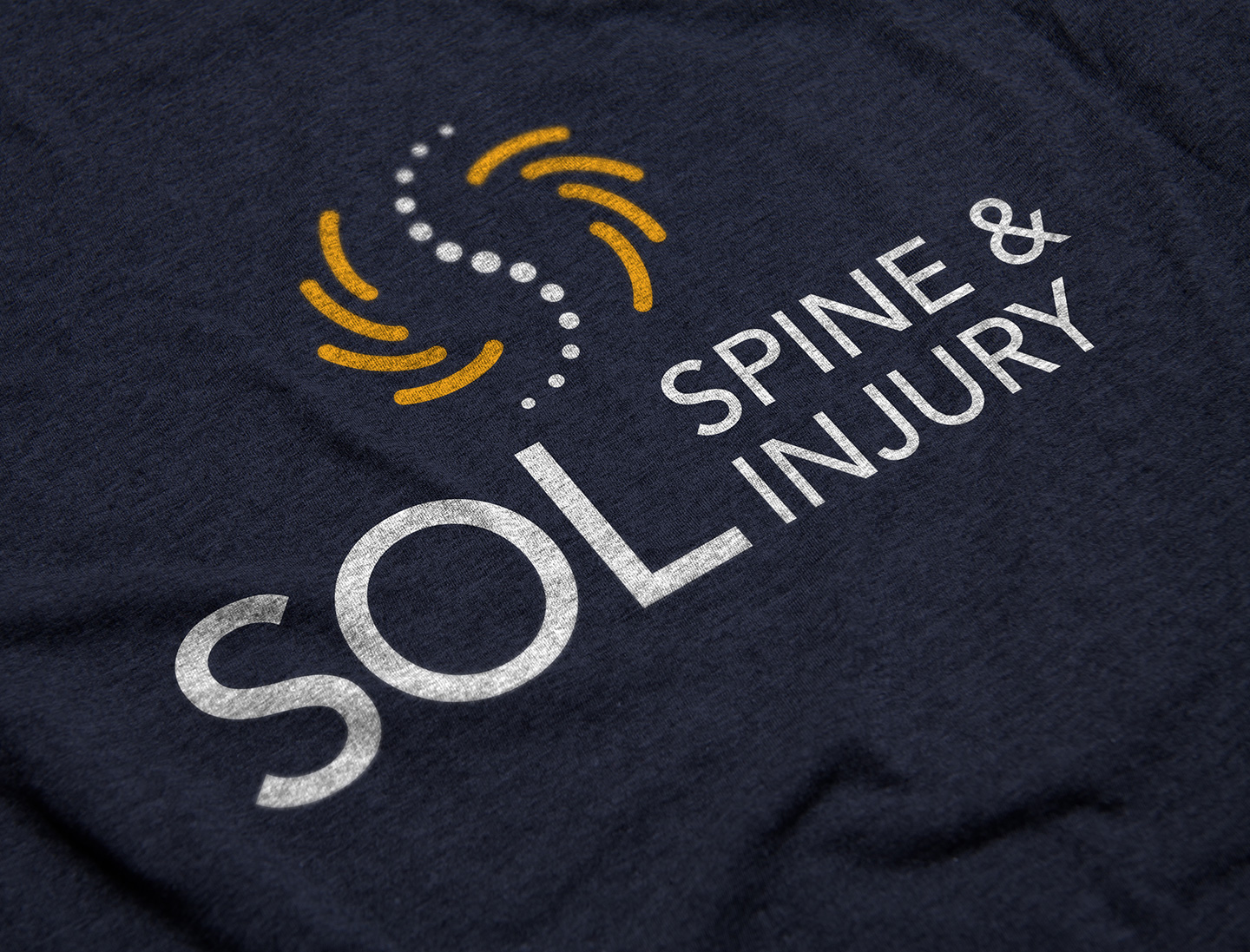
Tran Creative creates the new identity and website for Sol Spine & Injury in the Los Angeles area. Sol = sun light. The new logo captures: S, sun rays, spine, acupuncture with dynamic movement toward health, wellness. Blue = experience, healthcare, trust. Gold = gold standard, excellence, sun light. See the new website: solspineandinjury.com

Rite Passage

Rite Passage Website Design by tran creative

Rite Passage in Utah assists college students in the pursuit of healthy autonomy, independence and successful college education. The NEW LOGO created by Tran Creative is constructed of 3 shapes with movement forming the passage and letter R & P. The vibrant colors captures the excitement and hopefulness.
See the new website: ritepassage.com

Rite Passage Website Design

Unified Care

Unified Care logo on a coaster

Tran Creative creates the new identity for Unified Care, with almost 70 employees, five care facilities and headquarters in Spokane Valley. Unified Care provides help for people with mental health & developmental disabilities, substance abuse. We created a logo system that will allow the brand to grow more care facilities by keeping the logo mark the same but adding more colors to differentiate the facilities. The logo mark captures: a network of care and teamwork from the admin staff to caretakers, drivers. Unified to help people recover, heal and ultimately thrive, grow and blossom. The shield shape is for protection and guardian to make sure the residents have the best care possible. See the new website with videos: unifiedcaresystems.com

Stauffer & Associates

Stauffer & Associates brochure design by tran creative

Tran Creative provides Branding services for Stauffer & Associates, a steadfast growing team of CPAs with offices in Liberty Lake, WA and Lewiston, ID serving clients nationwide. The logo features letters S & A working together to form a shield shape which represents safety, protection in taxes and financial. Stauffer has the most equity in the name so we put more emphasis on Letter S with the A being smaller. Blue is for trust, experience and stability. Gold is for excellence and quality. We also created stationery set, brochures, proposals, tax packets, and a new website: Stauffer-CPA.com

Provisional Recruiting

Provisional Recruiting website design by tran creative

Tran Creative creates the new website for Provisional Recruiting with offices in Spokane, Seattle, Kennewick, Boise and Sandpoint, Idaho. When we took on this project, we identified the need to capture the human side of Provisional to go along with 30+ Best Business Awards and all their accomplishments. We interviewed the Provisional staff and featured some of the stories of how they helped people find work, employees, change lives. While being mindful of preserving the SEO from the old site to the new site with text/content, we also gave the site a fresh look that featured videos of real and authentic people. See for yourself: provisional.com

USA Strong

USA Strong Poster Design by tran creative

Tran Creative designed and launched a series of Community Strong posters to share positivity and uplift communities in the United States during the Covid-19 pandemic and other harrowing issues plaguing our nation. Our first design that started it all is our home town Coeur d’Alene, Idaho. From there we broadened the campaign to feature all 50 states and one other country that was hit particularly hard by the virus. Click through the gallery below to find your state.

We will get through this together.

Love,
Tran Creative

Liberty RV

Liberty RV Logo Design printed on a coaster

Tran Creative creates the new identity for Liberty RV: roofing and one stop shop for all things RV in Liberty Lake, WA. Many RV logos showcase the overdone, generic mountain road with trees. The new logo captures: L for Liberty, the endless road to shoot for the star and explore nature. Liberty USA color palette pays tribute to this local family of business owners who love and appreciate this country that their family members also serve. We’re looking forward to launching the new website soon.

Kroetch Premier Properties

Kroetch Premier Properties logo design on a coaster

Tran Creative creates the new identity for Kroetch Premier Properties in North Idaho. The new logo captures: K, floor plan, neighborhood, streets, map from aerial view, property, building, home. Black and Gold color palette communicates “premier”.

Pink Thumb Gardening

Pink Thumb Gardening Stationery Design by tran creative

Tran Creative creates the new identity for Pink Thumb Gardening in Boise, garden design and planning. The new logo captures: P, T, plants, leaf, garden, growth, above and below ground, gardening tools.

Spokane County Medical Society

Spokane County Medical Society logo design on a booklet

Tran Creative creates the new identity for Spokane County Medical Society, created in 1885 and comprised of close to 1,100 in membership of Physicians and PAs. The new logo captures: values and principles of the society aligning together to form two interlocking shapes creating letter S for Spokane. Leaf shape = growth and wellness.

Get In Touch

Interested in working with us?
We would love to help TELL YOUR STORY.

Logo

Create an identity to break the generic mold.

Web

Provide sleek and modern resources for your clients.

Marketing

Tell your story and increase your revenue.