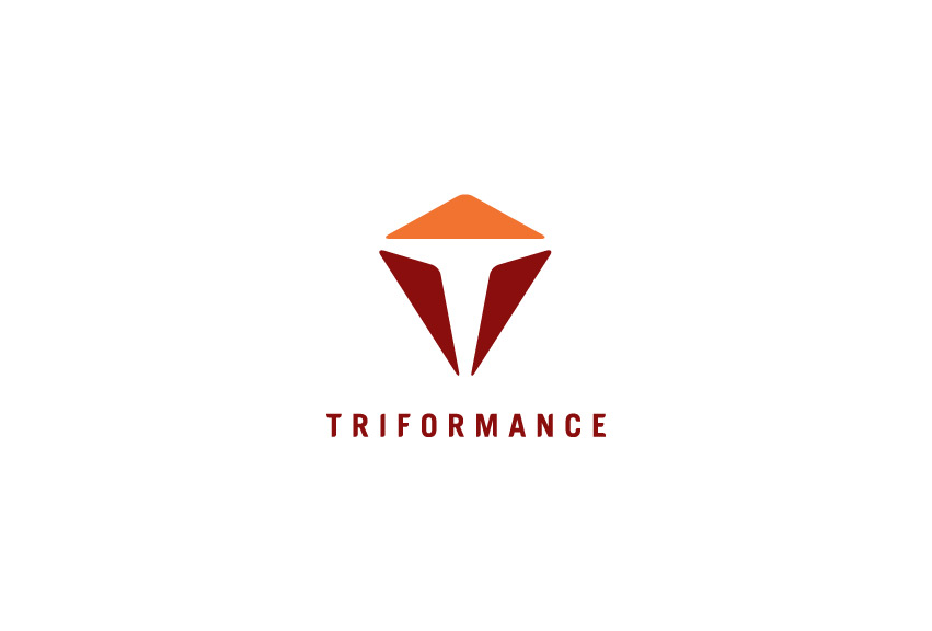
Tri = Three. Three shapes come together to form letter “T” for “TRIFORMANCE”. The 2 symmetrical red shapes represent the client & TRIFORMANCE working together equally. The orange arrowhead shape symbolizes when clients & TRIFORMANCE work together, they move upward into success. The orange shape also symbolizes a mountain. The road of challenges lies ahead on the horizon, whether in training, racing, or dealing with injury. But, with TRIFORMANCE, we are here every step of the way to walk with you side by side until you reach the top.
Orange = Energy. Red = Passion. We chose these two core colors so that when TRIFORMANCE athletes wear their race kits, gears, and apparels, they would likely stand out from the crowd and be different than their competitors at local races, events, and in the TRI community.


