![]()
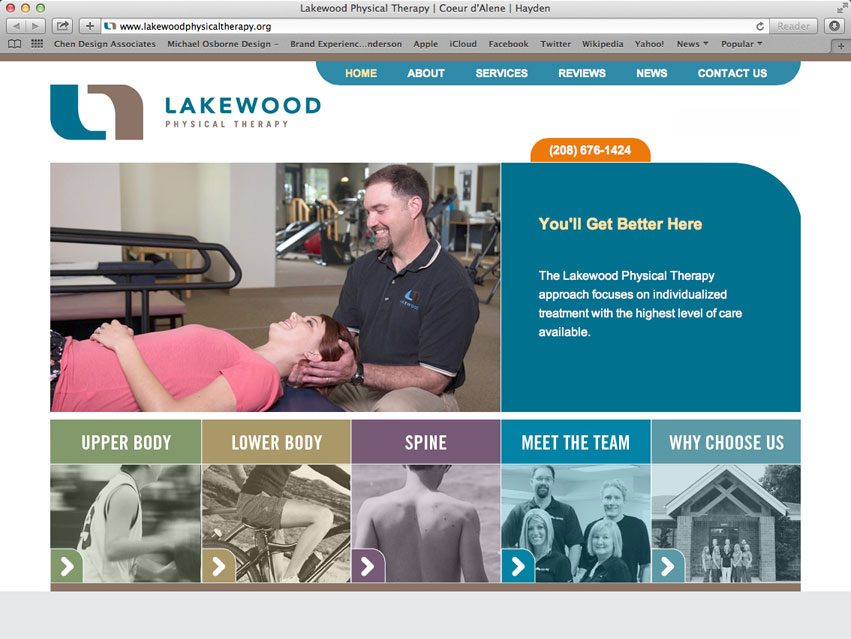
Lakewood Physical Therapy has grown and evolved into a special + well-known clinic in North Idaho. They asked Tran Creative to freshen up their visual identity to communicate the advancement.
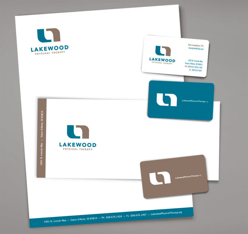
The Ideas: “L” in blue for Lakewood. The brown shape represents “the patients” and is also a reflection of “L”. Together, they go side by side and create a symmetrical icon to communicate “At Lakewood Physical Therapy, we walk with you every step of the way. We are the solution for Pain, Injury, and Healing.” Because the clinic is located in the Lake City of Coeur d’Alene, we chose Blue to represent the lake and Brown for the wood.