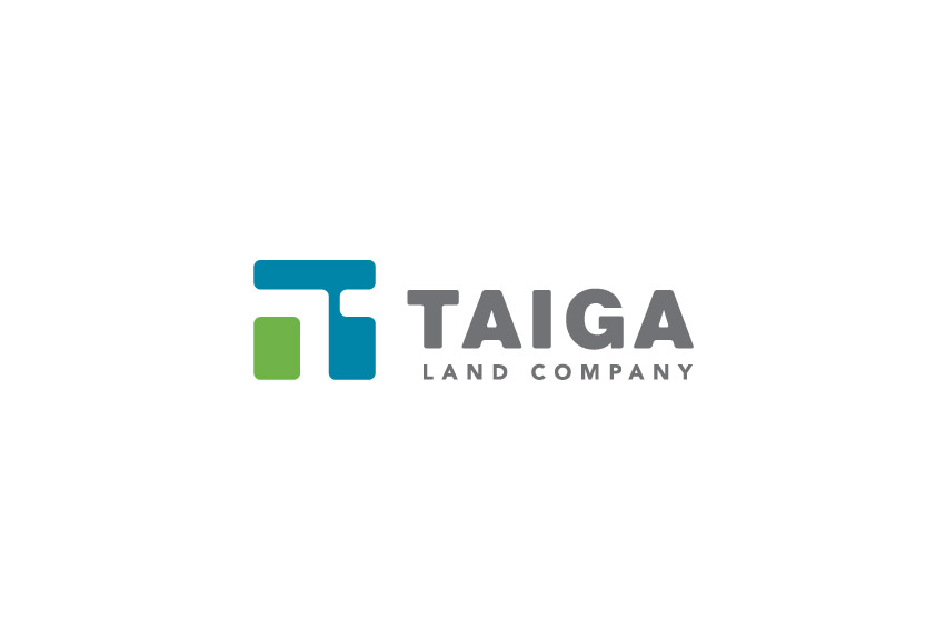
TAIGA Land Co. is a group of highly experienced professionals with proficiency in all major areas of real estate investments and development. TAIGA hired Tran Creative to provide branding services including the development of a new logo.
After much research and over 100 logo variations, the final chosen logo consists of 2 shapes organized to form a “T” for TAIGA in the negative space. The logo is also inspired by planning – plat map; looking down at a plan from high above provides a broader perspective. The logo is contain within a square to convey exactness and precision. Round corners communicate friendliness and approachability.
Color Green stands for land. Blue is for experience, trust and stability. Together, the blue and green also capture the Pacific Northwest.
The new logo is applied onto all future marketing collateral and a responsive web site set to launch first quarter of 2015.


