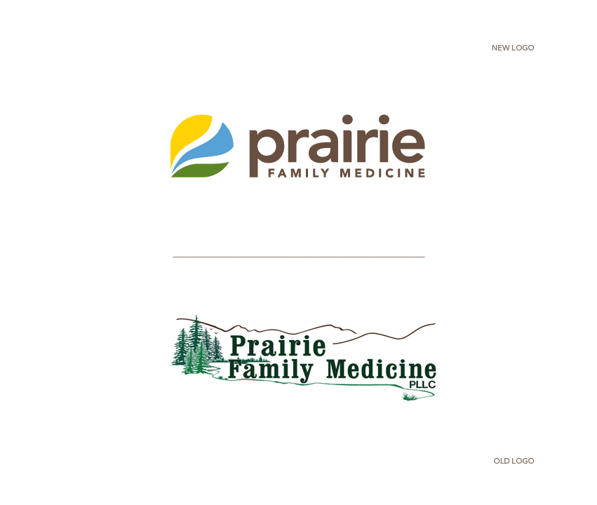
Congratulations to Prairie Family Medicine on your fresh new look. Thank you for hiring Tran Creative to provide branding services. After research (we saw thousands of tree/mountain logos) and explorations of about 50 logo concepts, the new chosen logo is constructed of the shape of letter P, prairie (green), lake (blue) and horizon (yellow), reaching toward healing, thriving and living life fully.
Lowercase prairie communicates friendliness, down to earth while FAMILY MEDICINE in cap conveys professionalism and experience in health care.
We love working with PFM because they are not only great at what they do, but they truly have lots of fun doing what they love. What a great culture as they continue to grow, expand and blossom: prairiefamilymed.com


