
![]()
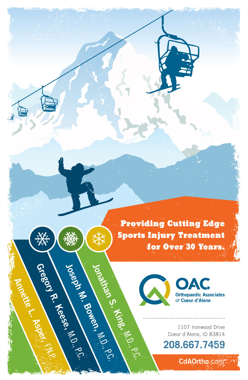
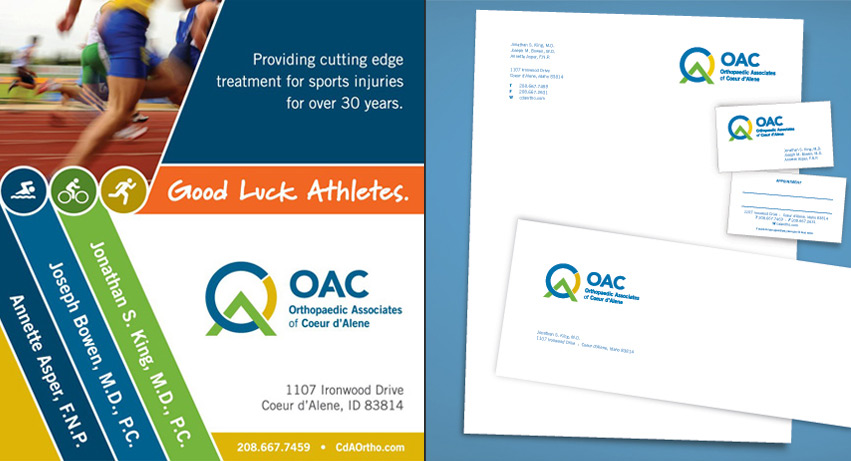
OAC | Orthopaedic Associates of Coeur d’Alene hired Tran Creative to provide branding services (Logo, Stationery, Print Collateral, and Web Site). Below is the story of OAC.
THE BACKGROUND:
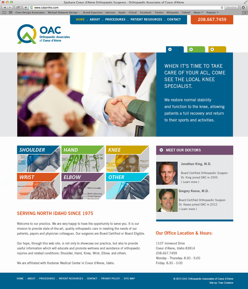
OAC | Orthopaedic Associates of Coeur d’Alene is a group of surgeons and healthcare professionals who thrive in serving patients by providing advanced & effective orthopaedic treatments. Located in Coeur d’Alene, OAC has been serving its patients since 1975.
Research showed that most orthopaedic logos often conveyed images of bones and joints. We wanted to move away from the obvious and pursue a more creative approach that would showcase OAC’s main objective – providing exceptional care and helping patients get back on track through treatments & recovery.
THE EXECUTION:
After many logo variations and research, a new visual identity was born for OAC. We crafted a representation of “stepping over the hurdle on your way to recovery”. We showed this concept by using a stylization of letters O.A.C. into a simple and clean visual.
Carefully selected colors convey positive feelings of healing and recovery. The green has a strong emotional correspondence with safety and wellness. The blue represents knowledge, because of OAC’s advanced training in sports medicine, joint replacement and arthroscopic surgery. Yellow provides a feeling of hope.
For more information about OAC, please visit: www.cdaortho.com


![]()


