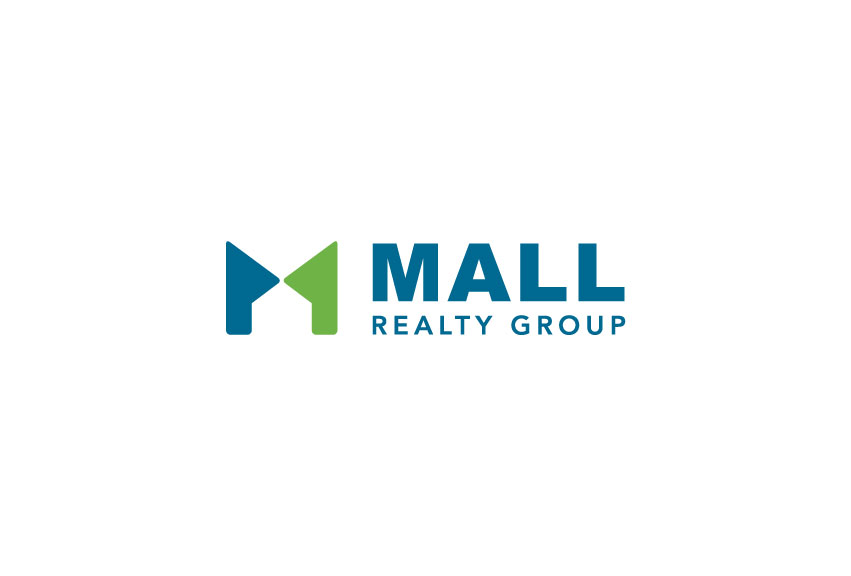
Mall Realty Group hired Tran Creative to provide branding services including a new logo. After research and about 100 logo ideas, the new chosen logo features 2 shapes coming together to form letter “M” for Mall and the shape of a home in the negative space. The 2 shapes facing each other represent the “Combination” of Father & Daughter and “Communication” between Mall Realty Group and client. Overall, we want to create a mark that capture working together to solve problem, fairness, professionalism, clear and precise communication with clients and also define the real estate industry.
Blue and green are colors of the Pacific Northwest. Green is for fresh ideas, new approach. Blue helps solidify credibility, trust and stability.
The new logo is applied on all marketing collateral, stationery, business cards and a new website launching soon.


