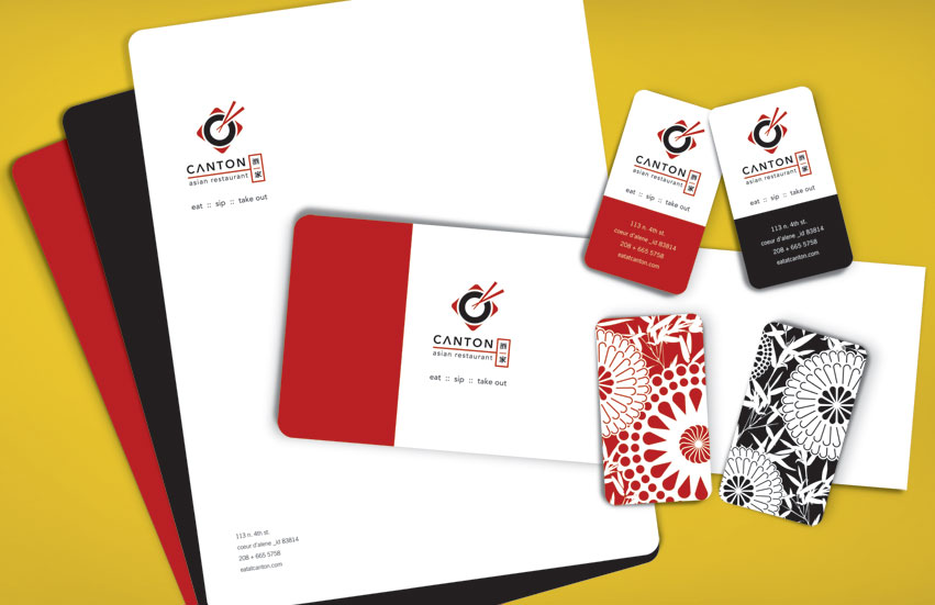
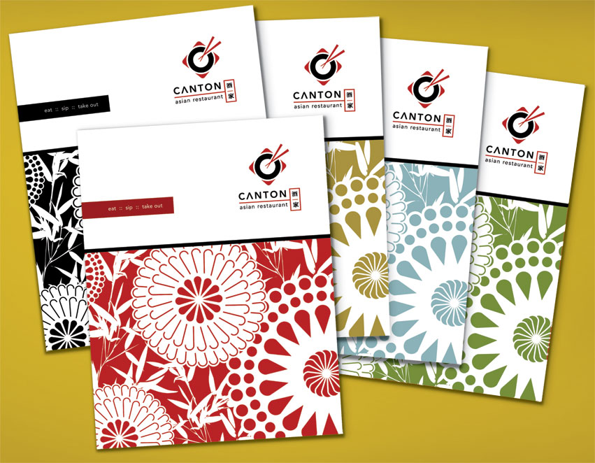
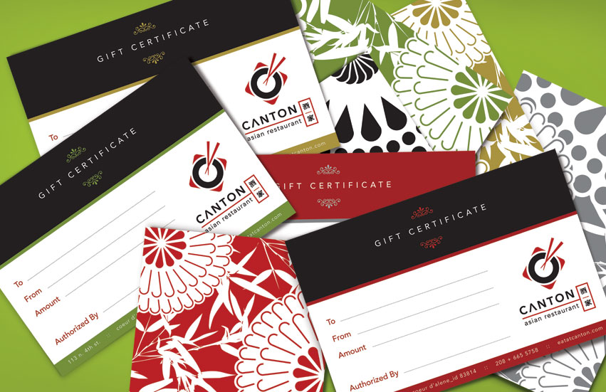
Tran Creative was asked to give Canton a fresh new Brand Identity awhile back. Canton recently asked Tran Creative to design a new menu system for them.
The Challenge:
How do you design a fresh asian restaurant visual identity without using Buddha, Dragon, or Bamboo?
The Ideas:
A pair of chopstick crossing into a round plate to form letter “C” for Canton. We also incorporated a series of design patterns into the brand to give it freshness, flavors, and flexibility to apply onto other design + marketing collateral. The typography is modern, clean, classy, timeless, and appeal to all demographic.


