Northwest Community Pediatrics

Northwest Community Pediatrics is an innovative pediatric practice that cares for families one child at a time in the comfort of patient’s home. During research, we saw many pediatric logos with overdone children figures, balloons, stethoscope, animals… The final chosen logo is constructed of the letters N, W, community link of people, family, infinite connection of mother and child.

CDA Summer Theatre

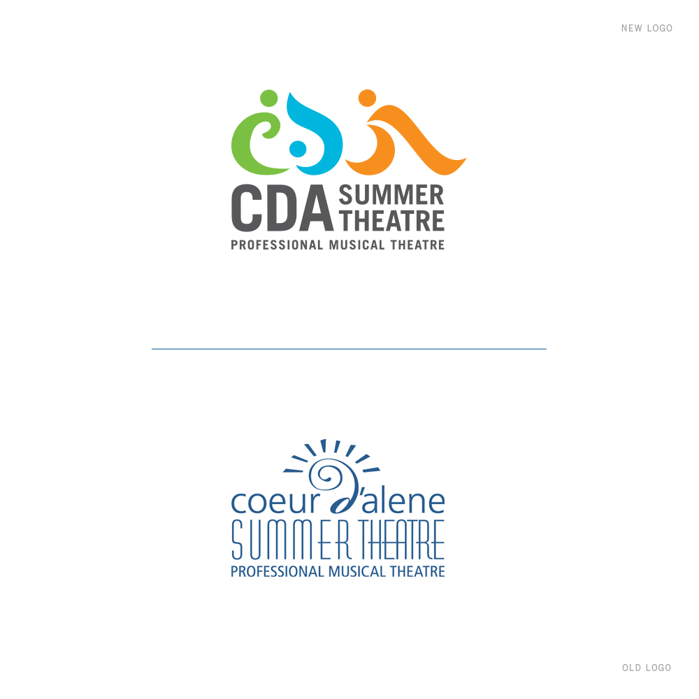
We are excited to provide branding services to the Coeur d’Alene Summer Theatre, professional Broadway-style musicals for over 50 years in North Idaho. Research shows that many theatre/musical logos have the spot light, comedy & tragedy masks, stage, curtain, etc… After crafting over 50 logo concepts, the final chosen logo is constructed of: letters C, D, A, human in motion, smile, frown, person with costume, cape… Instead of the overdone dark red, black, yellow like many theatre logos, we used Coeur d’Alene summer color palette of green, blue, and orange.

Get In Touch

Interested in working with us?
We would love to help TELL YOUR STORY.

Logo

Create an identity to break the generic mold.

Web

Provide sleek and modern resources for your clients.

Marketing

Tell your story and increase your revenue.