Inland Botanicals

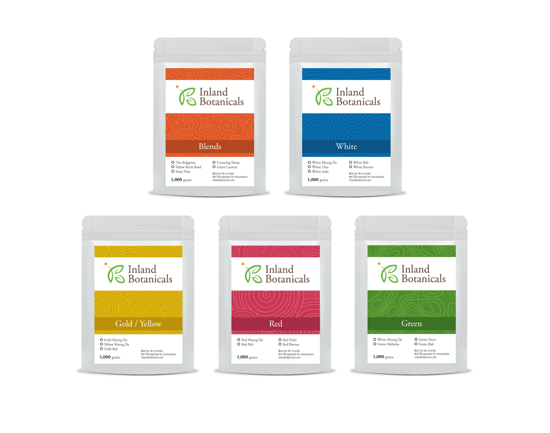
Congrats to Inland Botanicals on your fresh new look. Tran Creative has developed the new logo and packaging system. Inland Botanicals is an all natural health solutions company. After an extensive process, the newly chosen logo is constructed of letters I, B, fresh, natural, botanical. The clean yet meaningful logo accommodates IB to expand onto product packaging design for many new products as the company is experiencing rapid growth.

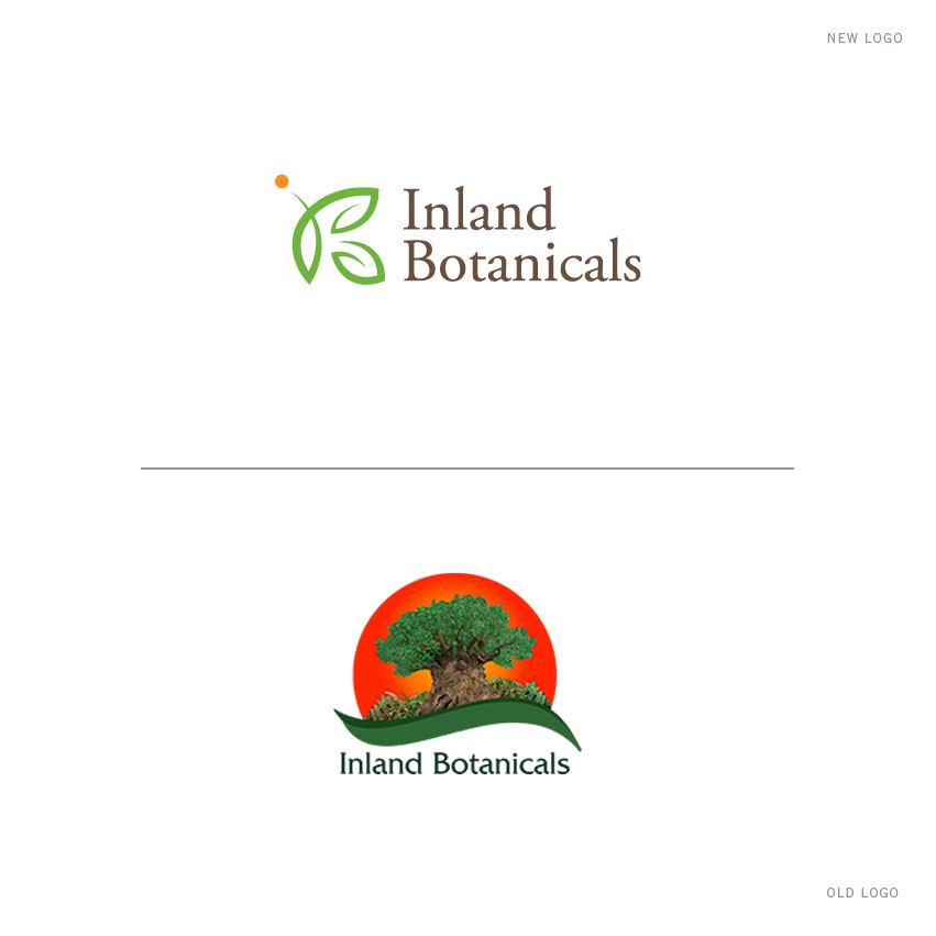
CONGRATULATIONS to Inland Botanicals on your new logo designed by Tran Creative. Inland Botanicals provides customers with the highest quality of all natural health solutions. After an extensive process, the newly chosen logo is constructed of letters I, B, fresh, natural, botanical. The clean yet conceptual look accommodates IB to expand onto product packaging design for many new products as the company is experiencing rapid growth.

Next Gen Electric, LLC

Congratulations Next Gen Electric, LLC on your fresh new look. Next Gen is growing and continually adding services: from solar panel design, installation and maintenance to onsite energy consultation and more. They hired Tran Creative for branding services. After nearly 100 different logo options, in 2 simples shapes, the new chosen logo is constructed of letters N, G, power bolt, arrow taking energy efficiency to the next level. Orange is for power and innovation. Green is for sustainability and energy efficiency. Gray is for experience and technology. We are happy to launch the new website: NextGenCDA.com

Neil Cox Law Group | James Vernon Weeks

Congrats to Neil Cox Law Group (auto accident specialists) in Clarkston, WA on your new logo. Tran Creative has been hired by Neil Cox Law Group to provide full branding services: logo, website, marketing, social media… During research, we saw many law/attorney logos with overdone courthouse columns, judge mallet, scale. The new logo is constructed of letters N, C in a shield shape to defend and protect justice and equality. Gold is for first class service. Blue represents trust and proven experience.

NEW LOGO – During research, we saw many law/attorney logos with overdone courthouse columns, judge mallet, scale… The new logo for Neil Cox is constructed of letters N, C in a shield shape to defend and protect justice and equality. The new logo for James, Vernon & Weeks is constructed of letters J, V, W. Together, they form an original symmetry that represents fairness, balance and equality.

Neil Cox Law Group has teamed up with James, Vernon & Weeks attorneys to form the most comprehensive auto accident law group in the Lewiston, Idaho & Clarkston, Washington region with a team of 10 attorneys and growing. Tran Creative was hired to provide full branding: logo, website, marketing, videos, social media… for the 2 law groups and help with the joint venture.

Johnny Tsunami

Congrats to Johnny Tsunami on your new logo designed by Tran Creative. During research, we saw many Johnny Tsunami logos with the wave. After exploring over 50 logo options, the newly chosen logo not only captures the wave but also letter J, cleansing splashes of water to fully communicate Johnny Tsunami as a cleaning company and not a big wave surfing company.

Located in Tacoma and Silverdale, WA, Johnny Tsunami provides exterior cleaning solutions for: Panera Bread, the YMCA, Hop Jack’s and many more.

Get In Touch

Interested in working with us?
We would love to help TELL YOUR STORY.

Logo

Create an identity to break the generic mold.

Web

Provide sleek and modern resources for your clients.

Marketing

Tell your story and increase your revenue.