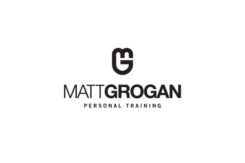
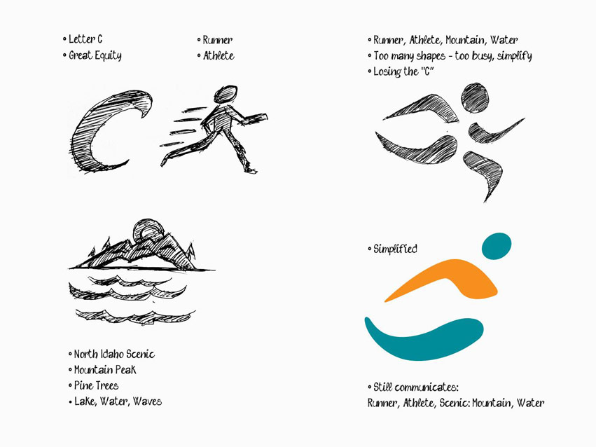
Congratulations to Snap Fitness International Personal Trainer of the Year, Matt Grogan, gets a new brand identity designed by Tran Creative. The new logo captures “the Power” in your hand, the classic & deeply rooted kettlebell. Together they form letter M & G. The success of each person’s journey to healthy living, fitness, competition lies within themselves. How badly do you want it?
Month: January 2018
Coeur d’Alene Marathon
Coeur d’Alene Marathon is one of the premiere marathons in the Inland Northwest. Tran Creative came up with a fresh new look that comunicates: growth, progressiveness, and quality in such a historic annual sporting event.
After much research, hundreds of logo variations, the chosen final logo conveys speed, movement, and simple enough to recognize and withstand the test of time for years to come. Our designers crafted letter “C” in a form of a runner. One important aspects of the race is the magnificient landscape of Lake Coeur d’Alene. We captured this with the bottom of the “C” that represents the water of Lake CdA. The Orange top of the “C” signifies the Mountain of CdA. Together we captured both the “Athlete & Performance” aspect along with “Scenic” aspect.
To learn more about the race, visit: www.CdAMarathon.com